Unlock a world of possibilities! Login now and discover the exclusive benefits awaiting you.
- Qlik Community
- :
- All Forums
- :
- QlikView App Dev
- :
- Re: How to create a pyramid graph containing KPIs ...
- Subscribe to RSS Feed
- Mark Topic as New
- Mark Topic as Read
- Float this Topic for Current User
- Bookmark
- Subscribe
- Mute
- Printer Friendly Page
- Mark as New
- Bookmark
- Subscribe
- Mute
- Subscribe to RSS Feed
- Permalink
- Report Inappropriate Content
How to draw a pyramid shape made of several shapes/text objects with each one of the objects containing a KPI?
Hi all,
I have been given the task of drawing a pyramid shape made up of several shapes/ text objects with each one of the objects containing a KPI.
The pyramid shall consist of a number of KPIs (each in a particular side of the pyramid). As per the requirement, the KPIs shall change color based on their values (I.e. yellow in case the value is below 50% and green in case it is above).
Can you guys advise how to proceed with creating the pyramid?
Any help/idea/advice in the above matter shall be highly obliged.
Regards,
Mohesh
- Mark as New
- Bookmark
- Subscribe
- Mute
- Subscribe to RSS Feed
- Permalink
- Report Inappropriate Content
- Mark as New
- Bookmark
- Subscribe
- Mute
- Subscribe to RSS Feed
- Permalink
- Report Inappropriate Content
Hi Mohesh Chandra,
Please check attached file for Pyramid Graph.
Regards,
Khasim.
- Mark as New
- Bookmark
- Subscribe
- Mute
- Subscribe to RSS Feed
- Permalink
- Report Inappropriate Content
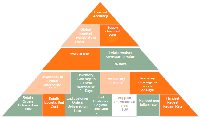
Thank you Khasim. Most probably I wrongly explained what I wanted. What I am expected to draw are a series of shapes when added together will be a pyramid (Each shape will contain a particular KPI).
Based on the screenshot attached in my original question, can you kindly advise me how to proceed ?
regards,
Mohesh
- Mark as New
- Bookmark
- Subscribe
- Mute
- Subscribe to RSS Feed
- Permalink
- Report Inappropriate Content
Thank you Settu. I did check it. However that's not the pyramid I am expected to draw.
In fact, I am expected to draw a series of shapes when combined together will look like a pyramid. Each particular shape shall contain a KPI. (as shown below)

Based on the above screenshot, can you kindly advise how to proceed with it?
- Mark as New
- Bookmark
- Subscribe
- Mute
- Subscribe to RSS Feed
- Permalink
- Report Inappropriate Content
I would recommend create the images (other than Squares or rectangles type) outside of Qlikview (in PPT) and store with different required colors. Yellow, Green, Red colors based on the requirement. Write the custom expression based on KPI value pick the correct image on the Text object expression.