Unlock a world of possibilities! Login now and discover the exclusive benefits awaiting you.
- Qlik Community
- :
- All Forums
- :
- QlikView App Dev
- :
- Re: How to group the hour to build a time series c...
- Subscribe to RSS Feed
- Mark Topic as New
- Mark Topic as Read
- Float this Topic for Current User
- Bookmark
- Subscribe
- Mute
- Printer Friendly Page
- Mark as New
- Bookmark
- Subscribe
- Mute
- Subscribe to RSS Feed
- Permalink
- Report Inappropriate Content
How to group the hour to build a time series chart
Hi,
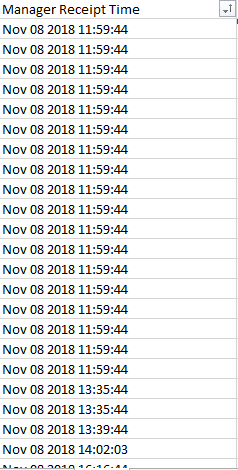
My data is as per the image attached. How do I build a line chart where the dimension is hour. Thanks.
- Mark as New
- Bookmark
- Subscribe
- Mute
- Subscribe to RSS Feed
- Permalink
- Report Inappropriate Content
Create an hour field from the Manager Receipt Time field when you load the data :
LOAD
...some fields,
Hour([Manager Receipt Time]) as Hour,
...some other fields...
FROM
...source table...
talk is cheap, supply exceeds demand
- Mark as New
- Bookmark
- Subscribe
- Mute
- Subscribe to RSS Feed
- Permalink
- Report Inappropriate Content
Yes, but the output is blank.
I believe the format is wrong. How do we change the format to ensure the hour function works
- Mark as New
- Bookmark
- Subscribe
- Mute
- Subscribe to RSS Feed
- Permalink
- Report Inappropriate Content
Perhaps your Manager Receipt Time field does not contain numeric timestamps, but string values that first need to be converted into timestamps. You can use the Timestamp#() function for that.
LOAD
...some fields,
Hour(TimeStamp#([Manager Receipt Time],'MMM DD YYYY hh:mm:ss')) as Hour,
...some other fields...
FROM
...source table..
talk is cheap, supply exceeds demand
- Mark as New
- Bookmark
- Subscribe
- Mute
- Subscribe to RSS Feed
- Permalink
- Report Inappropriate Content
Thank you, it works. However, this will only give the hours. Our desired final chart on the x-axis would be like below.
We want to see the hourly trending between the dates.
Appreciate your help, thanks.
- Mark as New
- Bookmark
- Subscribe
- Mute
- Subscribe to RSS Feed
- Permalink
- Report Inappropriate Content
Well, you asked for hours. I've you want to use dates then use dates instead. Change the Hour function to the Date function.
talk is cheap, supply exceeds demand
- Mark as New
- Bookmark
- Subscribe
- Mute
- Subscribe to RSS Feed
- Permalink
- Report Inappropriate Content
This might work.
load
Date(Date#(ManagerReceiptTime,'MMM DD YYYY hh:mm:ss')) & ' ' & Hour(Date(Date#(ManagerReceiptTime,'MMM DD YYYY hh:mm:ss'))) as datehour
- Mark as New
- Bookmark
- Subscribe
- Mute
- Subscribe to RSS Feed
- Permalink
- Report Inappropriate Content
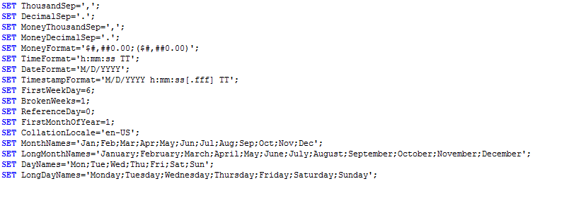
You can set the default date format in SET statement .
SET DateFormat='YYYY-MM-DD';
- Mark as New
- Bookmark
- Subscribe
- Mute
- Subscribe to RSS Feed
- Permalink
- Report Inappropriate Content
Thank you. However, now it shows only where the data is available.

- Mark as New
- Bookmark
- Subscribe
- Mute
- Subscribe to RSS Feed
- Permalink
- Report Inappropriate Content
above is example of the chart we built using Excel. You can see the chart will still shows all the hours regardless whether the data exist or not.
Thanks for your help


