Unlock a world of possibilities! Login now and discover the exclusive benefits awaiting you.
- Qlik Community
- :
- All Forums
- :
- QlikView App Dev
- :
- Re: Re: Re: Is it possible at all to get a summary...
- Subscribe to RSS Feed
- Mark Topic as New
- Mark Topic as Read
- Float this Topic for Current User
- Bookmark
- Subscribe
- Mute
- Printer Friendly Page
- Mark as New
- Bookmark
- Subscribe
- Mute
- Subscribe to RSS Feed
- Permalink
- Report Inappropriate Content
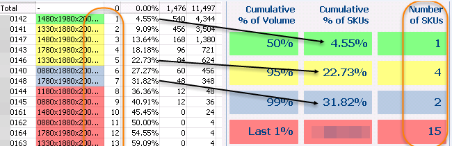
Is it possible at all to get a summary table?
Hi, I need to move this Excel solution into QV and make it dynamic. I got details but do not know how to get the summary table if at all possible. This is part of a general sales analysis QV app.
Issues:
1. Get the last cumulative % for each class (marked with black arrows)
2. Get the count of items by class (marked in orange circle)
If the initial idea is not doable to get these totals by class in the details table can also be solution.
Any idea is welcome. Thanks in advance
- « Previous Replies
-
- 1
- 2
- Next Replies »
- Mark as New
- Bookmark
- Subscribe
- Mute
- Subscribe to RSS Feed
- Permalink
- Report Inappropriate Content
If you want use a chart for this instead of several textboxes you will need a dimension but thes could you dynamically create within the gui. There are functions like valuelist(), valueloop(), concat(), getfieldselections() ... most wrapped in a aggr() which you could use to build such a dynamically dimension.
- Marcus
- Mark as New
- Bookmark
- Subscribe
- Mute
- Subscribe to RSS Feed
- Permalink
- Report Inappropriate Content
Thx Marcus. I'll check the functions you listed. Please note that those are text objects placed into a container. Does this change the approach?
- Mark as New
- Bookmark
- Subscribe
- Mute
- Subscribe to RSS Feed
- Permalink
- Report Inappropriate Content
A container doesn't change the approach - it is generally a clever possibility to collect several objects, not only textboxes and you could also use nested container in other containers.
If you have only a few KPI's which are always the same then is the effort to create the textboxes manageable and you have the advantage to use more different formatings - if not a chart is more favourable.
- Marcus
- Mark as New
- Bookmark
- Subscribe
- Mute
- Subscribe to RSS Feed
- Permalink
- Report Inappropriate Content
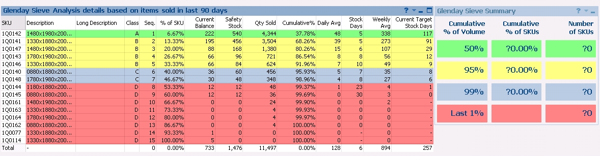
Here you can find this questionable part extracted from a multi-sheet, multi-object qvw with only one of hundreds of possible data.
If anyone can populate text objects with two different set of values for each Class I would be very much grateful. Thx
- Mark as New
- Bookmark
- Subscribe
- Mute
- Subscribe to RSS Feed
- Permalink
- Report Inappropriate Content
Nenad,
your problem is way too much complicated for anyone to try and untangle it, in the boundaries of a community discussion.
In general, what you are trying to can be done with a nested AGGR - first, at the SKU level, and then, at the Class level, and I'd recommend to simplify the initial premise by a lot before trying to formulate the AGGR fucntions.
cheers,
Oleg Troyansky
www.masterssummit.com
- Mark as New
- Bookmark
- Subscribe
- Mute
- Subscribe to RSS Feed
- Permalink
- Report Inappropriate Content
Hi Oleg,
It's good to hear from you. I've been trying to sort this out in last 3 days, including weekend.
This is all about getting both the details (which I got) and the summary of the "Glenday Sieve" analysis.
I can't use the aggr() function as I need to use a calculated dimension.
I'll have to tell users to continue using Excel but this time they can get full details from QV and then manually fill in only the summary table.
With all being said I think the answer to my initial question is "no, it's not possible in this case".
Cheers
Here is the complete part related to this based on one selection out of n (the Class column is not needed and it present as this is still in development). In addition there is also the option for users to select/enter a different days of sale:
- Mark as New
- Bookmark
- Subscribe
- Mute
- Subscribe to RSS Feed
- Permalink
- Report Inappropriate Content
Maybe it is easier for you to do the calculation in excel but I'm quite sure that it could be calculated in qv, too. Especially if you could calculate single-parts in textboxes will it be possible to do the same in a table-chart. I see no reason why aggr() shouldn't work - the aggr() function will be most often used for dynamically dimensions - you will find many examples here in the community.
- Marcus
- Mark as New
- Bookmark
- Subscribe
- Mute
- Subscribe to RSS Feed
- Permalink
- Report Inappropriate Content
This is something I'll definitely not let go as it is against my nature. Here you can find more details. Note this is just a small part of one general sales dashboard and analyses app.
I want to get these parts on the individual text fields but do not have all elements stored in the QV data model. I have only base data needed to perform various calculations over dynamically selected data as you can see in the last screenshot provided.
Re Aggr() & Calculated Dimensions: I've found this in the QV help file for the Aggr() function: "... Each dimension must be a single field. It cannot be an expression (calculated dimension). ... "
Why I use a calculated dimension? You can end up with some rows where all 3 fields, which btw provide different quantity sources (qty sold in n days, current balance and safety stock), can be 0 I need to eliminate them to only show a meaningless data and at the same not to distort the calculations. Here is the actual one labeled SKU:
=if(aggr(sum(GlendayBalance), [Stock Item]) > 0
or aggr(sum(GlendaySafetyStock), [Stock Item]) > 0
or aggr(sum({<Date={'>=$(=date(today() - $(vLastXDays)))'}>} if(Qty < 0, 0, Qty)), [Stock Item]) > 0, [Stock Item])
Why I put this part? "... if(Qty < 0, 0, Qty) ..." Because there is a request that negative quantities of sold items (credit notes) should be shown as 0.
I've modified the test app so you can try get it.
Thanks to all for looking into this.
P.S. And there is a similar problem which is also not answered. You can find it under
count elements by pareto class
- Mark as New
- Bookmark
- Subscribe
- Mute
- Subscribe to RSS Feed
- Permalink
- Report Inappropriate Content
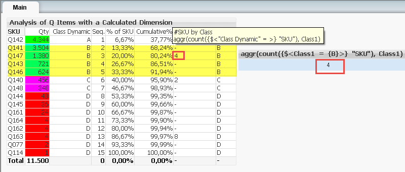 As expected in both cases I would need to find a way to have the Class value stored into the QV data model (Class1) which is, at least I think, impossible if I want to give users ability to play with selections which changes the Classification:
- Getting the number of SKUs by Class into the text objects I can't use the expression ("Class Dynamic")
- Getting the number of SKUs by Class in the detail table itself I also can't use the expression ("Class Dynamic"). This is why I wrote aggr() can be used only with dimensions and not calculated expressions.
- Mark as New
- Bookmark
- Subscribe
- Mute
- Subscribe to RSS Feed
- Permalink
- Report Inappropriate Content
I was inspired today and once more answered my own question  .
.
The needed totals by Class are shown in the TOTAL line above 8 extra columns added to be able to get those max items and max percentages.This is the best I can get to satisfy all requests and retain it dynamic with no extra fields in the data model. Only columns marked in orange exist in the data model used in this table.
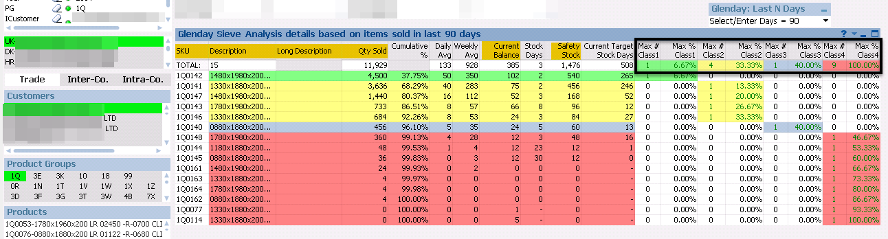
Thanks to everyone who tried to help me out as any idea is helpful.
- « Previous Replies
-
- 1
- 2
- Next Replies »