Unlock a world of possibilities! Login now and discover the exclusive benefits awaiting you.
- Qlik Community
- :
- All Forums
- :
- QlikView App Dev
- :
- Re: Need pie chart help - gap between pie chart re...
- Subscribe to RSS Feed
- Mark Topic as New
- Mark Topic as Read
- Float this Topic for Current User
- Bookmark
- Subscribe
- Mute
- Printer Friendly Page
- Mark as New
- Bookmark
- Subscribe
- Mute
- Subscribe to RSS Feed
- Permalink
- Report Inappropriate Content
Need pie chart help - gap between pie chart regions
Hi,
Can U tell me how to increase the space/gap between different regions in pie chart?
I have attached a screen shot of my pi chart and also I have couple of questions out there. Please give me suggestions on that questions.
Thanks,
Sandip
- « Previous Replies
- Next Replies »
- Mark as New
- Bookmark
- Subscribe
- Mute
- Subscribe to RSS Feed
- Permalink
- Report Inappropriate Content
Look here:
- Mark as New
- Bookmark
- Subscribe
- Mute
- Subscribe to RSS Feed
- Permalink
- Report Inappropriate Content
Hi Sandip,
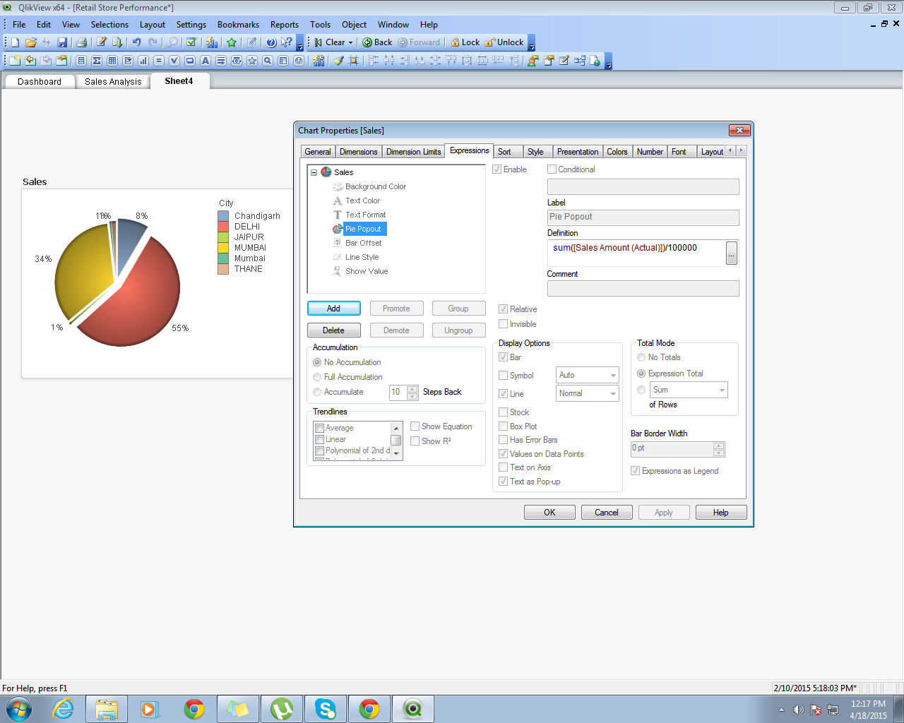
Go to expression and expand + sign and in that go to Pie popout option and write your expression there.
See the below image-
Regards,
Neha S.
- Mark as New
- Bookmark
- Subscribe
- Mute
- Subscribe to RSS Feed
- Permalink
- Report Inappropriate Content
Hi,
It works, but I want this in below screen shot:
Please give me a screenshot - how to do legend with data.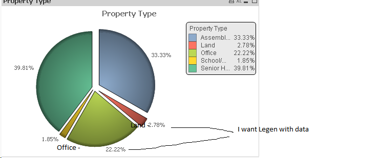
- Mark as New
- Bookmark
- Subscribe
- Mute
- Subscribe to RSS Feed
- Permalink
- Report Inappropriate Content
Hi Sandip,
I think it is not possible you can only show values.
And any how on right hand side legend showing the colour and its description.
Regards,
Neha S.
- Mark as New
- Bookmark
- Subscribe
- Mute
- Subscribe to RSS Feed
- Permalink
- Report Inappropriate Content
Hi Sandip,
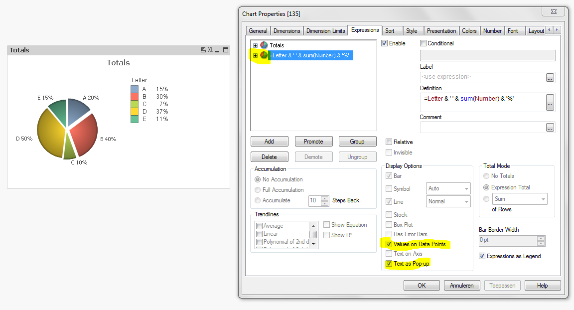
Looks like it's possible, but there's a difference in the result.
Legend: A is 15% and
Text as Popup: A 20%.
If you can figure out why there's a difference, your problem is solved 😉
Grtz Fred
- Mark as New
- Bookmark
- Subscribe
- Mute
- Subscribe to RSS Feed
- Permalink
- Report Inappropriate Content
Sorry, Text as Popup was showing my values instead of % .. duhhh
This one was better:
=Letter & ' ' & num(sum(Number) / Sum(TOTAL Number) , '#0%')
See attachment.
Grtz Fred
- Mark as New
- Bookmark
- Subscribe
- Mute
- Subscribe to RSS Feed
- Permalink
- Report Inappropriate Content
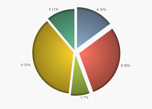
I love it myself 🙂
This one is without "Show Legend" on the presentation properties.
- Mark as New
- Bookmark
- Subscribe
- Mute
- Subscribe to RSS Feed
- Permalink
- Report Inappropriate Content
Hi,
So you want to say that I have to add a second expression in the chart?
I have added a second expression as
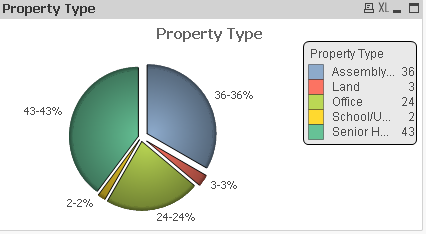
=[Property Type] & '-' & Count([Property Type]) & '%'
and the chart is showing as below. But I want that values on data point will come like this: Office - [36%], Land - [34%]
and I have used first expression as 'Count([Property Type])'
Thanks,
Sandip Ghosh
- Mark as New
- Bookmark
- Subscribe
- Mute
- Subscribe to RSS Feed
- Permalink
- Report Inappropriate Content
Do you have a Qlikview license / is it possible for you to view my file?
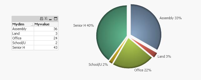
My first expression: =sum(Myvalue)
Values on datapoints and Text as Popup, unchecked
My second expression: =Mydim & ' ' & num(sum(Myvalue) / Sum(TOTAL Myvalue) , '#0%')
Values on datapoints and Text as Popup, checked
- « Previous Replies
- Next Replies »