Unlock a world of possibilities! Login now and discover the exclusive benefits awaiting you.
Announcements
Save $650 on Qlik Connect, Dec 1 - 7, our lowest price of the year. Register with code CYBERWEEK: Register
- Qlik Community
- :
- All Forums
- :
- QlikView App Dev
- :
- Re: Negative value with different Color in Gauge C...
Options
- Subscribe to RSS Feed
- Mark Topic as New
- Mark Topic as Read
- Float this Topic for Current User
- Bookmark
- Subscribe
- Mute
- Printer Friendly Page
Turn on suggestions
Auto-suggest helps you quickly narrow down your search results by suggesting possible matches as you type.
Showing results for
Not applicable
2017-03-21
06:20 AM
- Mark as New
- Bookmark
- Subscribe
- Mute
- Subscribe to RSS Feed
- Permalink
- Report Inappropriate Content
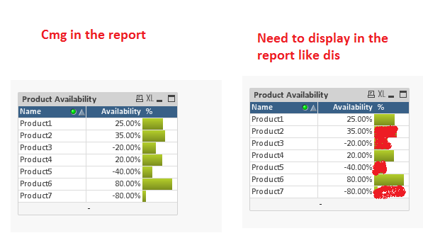
Negative value with different Color in Gauge Chart
HI All,
Trying to display Bar chart in a straight table.
Is there any possibility to display positive value and negative value in the same side with different Colors.
1,327 Views
3 Replies
Master
2017-03-21
06:21 AM
- Mark as New
- Bookmark
- Subscribe
- Mute
- Subscribe to RSS Feed
- Permalink
- Report Inappropriate Content
yes using the background formula of the expression (click the + next to the expression on the expressions tab)
if(yourexpression <=0,lightred(),green())
or insert your own rgb colours in there
982 Views
Creator III
2017-03-21
08:34 AM
- Mark as New
- Bookmark
- Subscribe
- Mute
- Subscribe to RSS Feed
- Permalink
- Report Inappropriate Content
HI,
For the percentage values use this formula as background color
if(yourexpression <=0,red(),green())
for the linear gauge chart set the lower bound is -1 and lower bound color is red
upper bound is 0 and color is green
982 Views
Master II
2017-03-21
11:06 AM
- Mark as New
- Bookmark
- Subscribe
- Mute
- Subscribe to RSS Feed
- Permalink
- Report Inappropriate Content
attached sample might be helpful
982 Views