Unlock a world of possibilities! Login now and discover the exclusive benefits awaiting you.
- Qlik Community
- :
- All Forums
- :
- QlikView App Dev
- :
- Re: OpenLayers mapping - containter boxes causing ...
- Subscribe to RSS Feed
- Mark Topic as New
- Mark Topic as Read
- Float this Topic for Current User
- Bookmark
- Subscribe
- Mute
- Printer Friendly Page
- Mark as New
- Bookmark
- Subscribe
- Mute
- Subscribe to RSS Feed
- Permalink
- Report Inappropriate Content
OpenLayers mapping - containter boxes causing strange placement of map
Hi all,
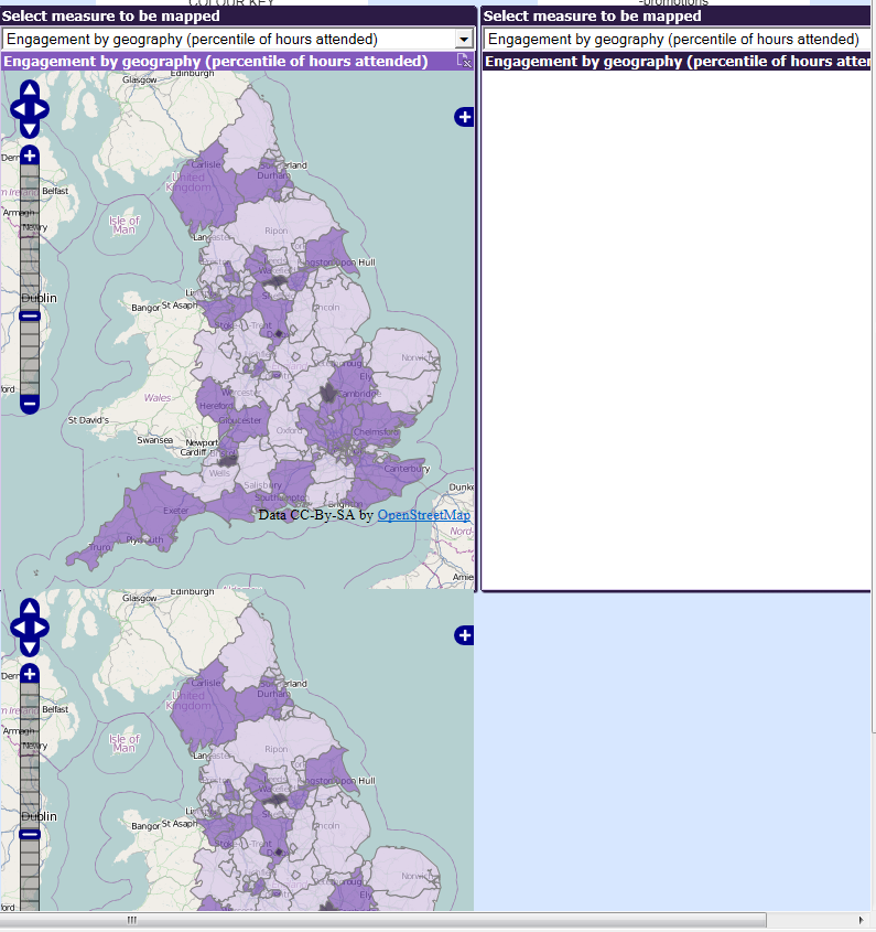
I am mapping some information on a map of the UK and want to compare multiple versions of the mapped info using side by size container boxes. I have this strange occurance that when I try and do this, the immage from the seccond container box sits outside of the container and instead is located benieth the 1st container. The below picture will descibe what I mean. Does anyone know how I can fix this issue? (Please bear in mind my QlikView skills are not yet very advanced - I did not write the code the mapping - this was done by a colleauge).
Many thanks,
Isabel
- « Previous Replies
-
- 1
- 2
- Next Replies »
- Mark as New
- Bookmark
- Subscribe
- Mute
- Subscribe to RSS Feed
- Permalink
- Report Inappropriate Content
Ok, so I have uploaded that file into the script, but I only put the first expression in as I this may make it easier to check if it's beginning to work.... and hurar, it does! Thank you for your patience here, this is a great help and I'm certainly picking up some good tips.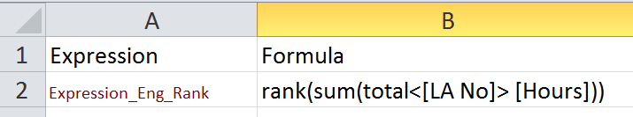
So the final part is how do I set this us so that I can select Expression1,2,3... from something like a drop-down menu? I am imagining having two maps side by side, and being able to select the expression to be mapped on each one.
Thanks,
Isabel
- Mark as New
- Bookmark
- Subscribe
- Mute
- Subscribe to RSS Feed
- Permalink
- Report Inappropriate Content
If you want to have to listboxes, one for each map and show both maps, then load the table twice with different names and create two variables. Same way.
- Mark as New
- Bookmark
- Subscribe
- Mute
- Subscribe to RSS Feed
- Permalink
- Report Inappropriate Content
Ok, that makes sense. So even on one map, how to I set up up so that I can select which variable to plot?
- Mark as New
- Bookmark
- Subscribe
- Mute
- Subscribe to RSS Feed
- Permalink
- Report Inappropriate Content
I showed it in the 2nd screenshot of the above post.
Listbox with the Expression field.
Variable vExpression containing "=only(Formula)"
Map using $(=vExpression) in the meausre (or Opacity Expression depending on the extension you are using) property.
- Mark as New
- Bookmark
- Subscribe
- Mute
- Subscribe to RSS Feed
- Permalink
- Report Inappropriate Content
I had completely missed that point before! Thank you so much for you patience - this solution works just great!
- Mark as New
- Bookmark
- Subscribe
- Mute
- Subscribe to RSS Feed
- Permalink
- Report Inappropriate Content
Hi agian,
I am trying to put set analysis in the Formula (in my Expression and Formula table in Excel) but it does not display the right shading in QlikView. Do you have any suggestions as to how to get that to work?
Thanks,
Isabel
- « Previous Replies
-
- 1
- 2
- Next Replies »