Unlock a world of possibilities! Login now and discover the exclusive benefits awaiting you.
- Qlik Community
- :
- All Forums
- :
- QlikView App Dev
- :
- Re: Outlier Detection
- Subscribe to RSS Feed
- Mark Topic as New
- Mark Topic as Read
- Float this Topic for Current User
- Bookmark
- Subscribe
- Mute
- Printer Friendly Page
- Mark as New
- Bookmark
- Subscribe
- Mute
- Subscribe to RSS Feed
- Permalink
- Report Inappropriate Content
Outlier Detection
Hi,
Need your help in outlier detection by chart through standard deviation,
I have multiple GL accounts like payroll, cash, banking, fixed asset that have monthly amount posted. I am trying to see if there was any higher than normal value posted to a particular account in a month.
E.g. if every month payroll has 100, 110, 90, 110, 100 values and all of a sudden 600 pops up, then that should be the outlier.
I have attached the image also with an outlier showing at the top.
Hope I am able to explain what's needed. Appreciate the help
Thanks,
- « Previous Replies
-
- 1
- 2
- Next Replies »
Accepted Solutions
- Mark as New
- Bookmark
- Subscribe
- Mute
- Subscribe to RSS Feed
- Permalink
- Report Inappropriate Content
Hi,
regarding your questions:
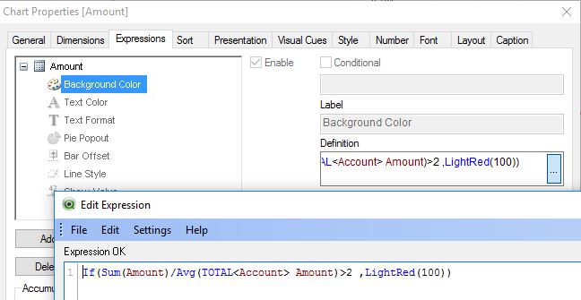
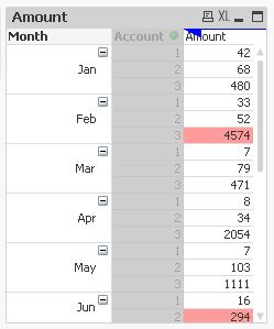
The pivot chart highlights are defined by a background colour expression:
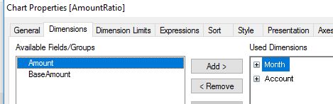
To pivot a dimension to the top you just drag and drop the dimension column to the upper right side of the chart:
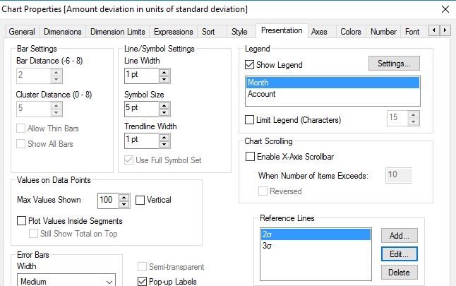
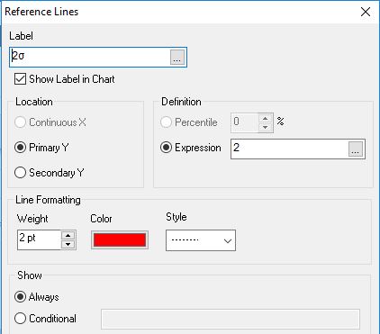
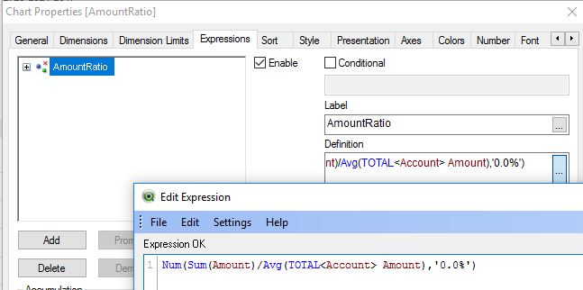
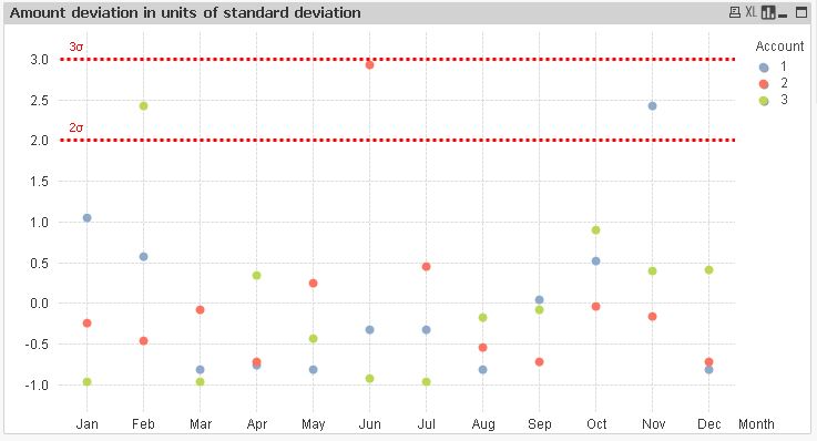
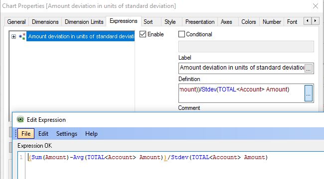
The 2and 3σ limit lines are using the "Reference Lines" chart option:
The chart dimension value selection is left to standard, no special settings applied here.
Please close your thread if your initial question is answered:
Qlik Community Tip: Marking Replies as Correct or Helpful
thanks
regards
Marco
- Mark as New
- Bookmark
- Subscribe
- Mute
- Subscribe to RSS Feed
- Permalink
- Report Inappropriate Content
I think this will be helpful: Recipe for a Box Plot.
- Marcus
- Mark as New
- Bookmark
- Subscribe
- Mute
- Subscribe to RSS Feed
- Permalink
- Report Inappropriate Content
Marcus I would prefer something like what I attached, that's easier to interpret by the users
- Mark as New
- Bookmark
- Subscribe
- Mute
- Subscribe to RSS Feed
- Permalink
- Report Inappropriate Content
You don't need to use the box plot chart - you could add the logic to a line- or barchart, too.
- Marcus
- Mark as New
- Bookmark
- Subscribe
- Mute
- Subscribe to RSS Feed
- Permalink
- Report Inappropriate Content
Hi,
maybe one example could be:
hope this helps
regards
Marco
- Mark as New
- Bookmark
- Subscribe
- Mute
- Subscribe to RSS Feed
- Permalink
- Report Inappropriate Content
Thanks Marcus, I will try that
- Mark as New
- Bookmark
- Subscribe
- Mute
- Subscribe to RSS Feed
- Permalink
- Report Inappropriate Content
Thanks a lot Marco, I will try this and let you know
- Mark as New
- Bookmark
- Subscribe
- Mute
- Subscribe to RSS Feed
- Permalink
- Report Inappropriate Content
Marco, this is great, can you suggest if we can use standard deviation in the expression? The outlier will be anything greater than 2 or 3 times the standard dev
- Mark as New
- Bookmark
- Subscribe
- Mute
- Subscribe to RSS Feed
- Permalink
- Report Inappropriate Content
maybe something like this?
hope this helps
regards
Marco
- Mark as New
- Bookmark
- Subscribe
- Mute
- Subscribe to RSS Feed
- Permalink
- Report Inappropriate Content
Thanks a lot Marco, this is really awesome
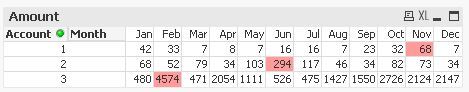
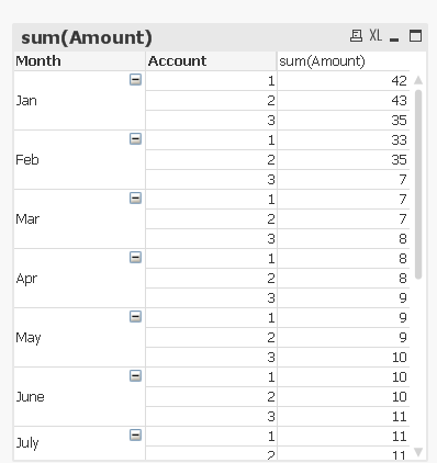
Quick question on the pivot though , how did you get the colors in for the outliers and how did you transpose it to columns? mine looks like this
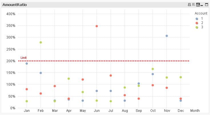
And about the std dev chart, how did you get the 2, 3 sigma line and also when I click on a particular outlier, say for account 2, all the account numbers show up, but in your chart, just that value gets selected which is what I want, what am I missing?

- « Previous Replies
-
- 1
- 2
- Next Replies »