Unlock a world of possibilities! Login now and discover the exclusive benefits awaiting you.
- Qlik Community
- :
- All Forums
- :
- QlikView App Dev
- :
- Re: Please help on my gauge chart
- Subscribe to RSS Feed
- Mark Topic as New
- Mark Topic as Read
- Float this Topic for Current User
- Bookmark
- Subscribe
- Mute
- Printer Friendly Page
- Mark as New
- Bookmark
- Subscribe
- Mute
- Subscribe to RSS Feed
- Permalink
- Report Inappropriate Content
Please help on my gauge chart
Hi experts,
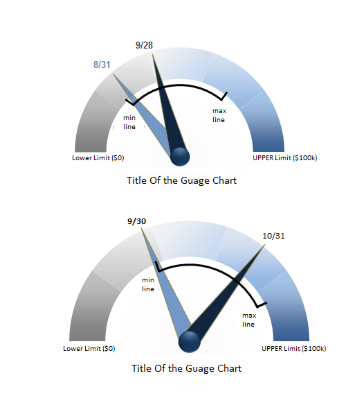
May I know how I can create a gauge chart like below? The two needles indicates the values as of 8/31 and 9/28 separately.
Note that there's a black arch which indicates the max value and min value during this period..
The data looks something like below:
Date, Value
8/31, 26000
9/28, 35000
min line value = 25000
max line value = 65000
The lower chart is for another period, so we can see the black arch changes as the min/max line values change.
I understand that the two needles can be created using two gauge charts one on top of another, but not sure how to create that black arch, could anyone help please?
- Tags:
- gauge chart
- Mark as New
- Bookmark
- Subscribe
- Mute
- Subscribe to RSS Feed
- Permalink
- Report Inappropriate Content
Hi,
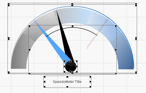
I am able to use multiple objects to achieve this effect, as you can see, I'm using 5 objects (3 charts, two text boxes).
Now my question is, how can I export the charts into an image file, or copy/paste to a ppt file?
Thanks,
Michael