Unlock a world of possibilities! Login now and discover the exclusive benefits awaiting you.
- Qlik Community
- :
- All Forums
- :
- QlikView App Dev
- :
- Re: Plot values on a graph
- Subscribe to RSS Feed
- Mark Topic as New
- Mark Topic as Read
- Float this Topic for Current User
- Bookmark
- Subscribe
- Mute
- Printer Friendly Page
- Mark as New
- Bookmark
- Subscribe
- Mute
- Subscribe to RSS Feed
- Permalink
- Report Inappropriate Content
Plot values on a graph
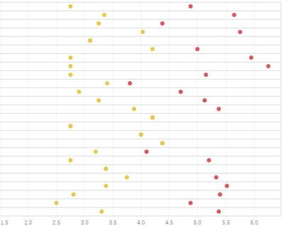
I have a Value Field. I need to plot Min(Value) and Max(Value) across the range over Company in the below way. The yellow points are Minimum and Red data points represent Maximum. How do I achieve this in QlikView?
Accepted Solutions
- Mark as New
- Bookmark
- Subscribe
- Mute
- Subscribe to RSS Feed
- Permalink
- Report Inappropriate Content
Hello,
1) Create a Combo chart
2) Dimension Company
3) Expressions
3.1) max(Value)
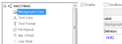
+ Background Color = red() (see screenshot)
+ Display as Symbol -> Dots
3.2) min(Value)
+ Background Color = yellow() (see screenshot)
+ Display as Symbol -> Dots
4) Increase Size of Points in Presentation Tab
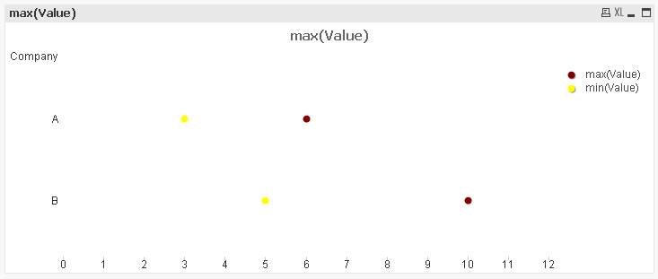
there you go. Should look like this:
regards
tim


