Unlock a world of possibilities! Login now and discover the exclusive benefits awaiting you.
- Qlik Community
- :
- All Forums
- :
- QlikView App Dev
- :
- Possible to show 2 bars one behind the other in a ...
- Subscribe to RSS Feed
- Mark Topic as New
- Mark Topic as Read
- Float this Topic for Current User
- Bookmark
- Subscribe
- Mute
- Printer Friendly Page
- Mark as New
- Bookmark
- Subscribe
- Mute
- Subscribe to RSS Feed
- Permalink
- Report Inappropriate Content
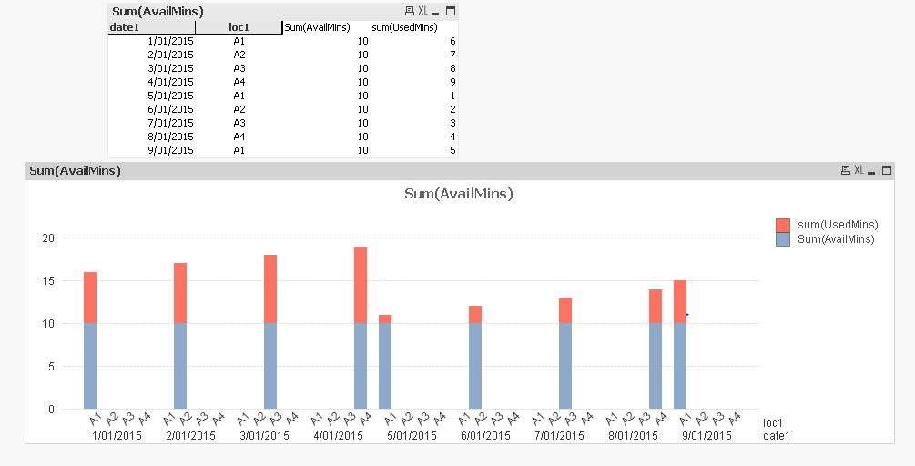
Possible to show 2 bars one behind the other in a chart?
Hi
I have a chart - but I want the UsedMins to be in front of the AvailMins - to show how much of the minutes have been used. Can I force this in QlikView? I have 2 dimensions on the x axis - I could combine them but I would prefer not to.
Thank you for any help you an give.
Jo
- « Previous Replies
-
- 1
- 2
- Next Replies »
- Mark as New
- Bookmark
- Subscribe
- Mute
- Subscribe to RSS Feed
- Permalink
- Report Inappropriate Content
Try to exchange the order of your expressions, then use this for Available Mins:
=sum(AvailableMins) - sum(UsedMins)
- Mark as New
- Bookmark
- Subscribe
- Mute
- Subscribe to RSS Feed
- Permalink
- Report Inappropriate Content
u can,promote whichever the expression u want to see first on chart object from expression tab.
else still looking for something different,from Style tab select radio button as grouped.
let us know, if u are not got still wht ur expecting!
- Mark as New
- Bookmark
- Subscribe
- Mute
- Subscribe to RSS Feed
- Permalink
- Report Inappropriate Content
Go to the Style tab , in the area "look" , choose the last bar graph pic right at the bottom
- Mark as New
- Bookmark
- Subscribe
- Mute
- Subscribe to RSS Feed
- Permalink
- Report Inappropriate Content
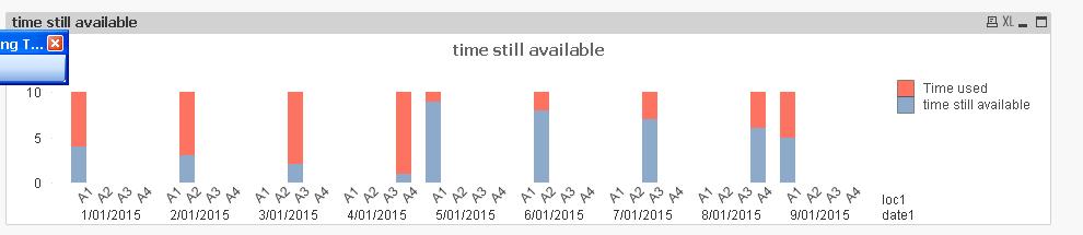
If you make the available minutes expression = available minutes - used minutes. Then make it a stacked bar.
The only disadvantage is that the available minutes will not show as 10 when you export etc. You may want to change its name to 'unused minutes' or similar.
Alternatively you can add an third, hidden expression with a label or similar with available minutes.
- Mark as New
- Bookmark
- Subscribe
- Mute
- Subscribe to RSS Feed
- Permalink
- Report Inappropriate Content
grouped and stacked do not change the graph?
- Mark as New
- Bookmark
- Subscribe
- Mute
- Subscribe to RSS Feed
- Permalink
- Report Inappropriate Content
I see I have to change my thinking ....
- Mark as New
- Bookmark
- Subscribe
- Mute
- Subscribe to RSS Feed
- Permalink
- Report Inappropriate Content
Julian sorry if this is my second reply ... I replied but must not have saved it sent it up.
So The look is now correct - and the wording on the legend. I would like to know more about a third hidden expresssion though - what do you mean?
Jo
- Mark as New
- Bookmark
- Subscribe
- Mute
- Subscribe to RSS Feed
- Permalink
- Report Inappropriate Content
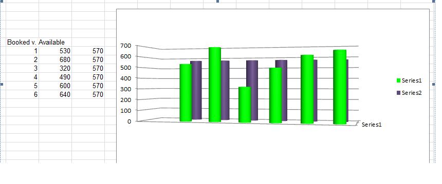
Hi all - this is what i want (taken fro Exel) ... do I need to do 2 layers???/
Jo
- Mark as New
- Bookmark
- Subscribe
- Mute
- Subscribe to RSS Feed
- Permalink
- Report Inappropriate Content
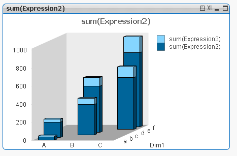
Your example in Excel only has 1 dimension - but your qlik example has 2 dimensions...
This is how it would look like in qlik (and I guess also in Excel?)
please find attached
- « Previous Replies
-
- 1
- 2
- Next Replies »