Unlock a world of possibilities! Login now and discover the exclusive benefits awaiting you.
- Qlik Community
- :
- All Forums
- :
- QlikView App Dev
- :
- Re: Qlikview pivot table - Cumulative calculation ...
- Subscribe to RSS Feed
- Mark Topic as New
- Mark Topic as Read
- Float this Topic for Current User
- Bookmark
- Subscribe
- Mute
- Printer Friendly Page
- Mark as New
- Bookmark
- Subscribe
- Mute
- Subscribe to RSS Feed
- Permalink
- Report Inappropriate Content
Qlikview pivot table - Cumulative calculation without using Above() and Rangesum() functions
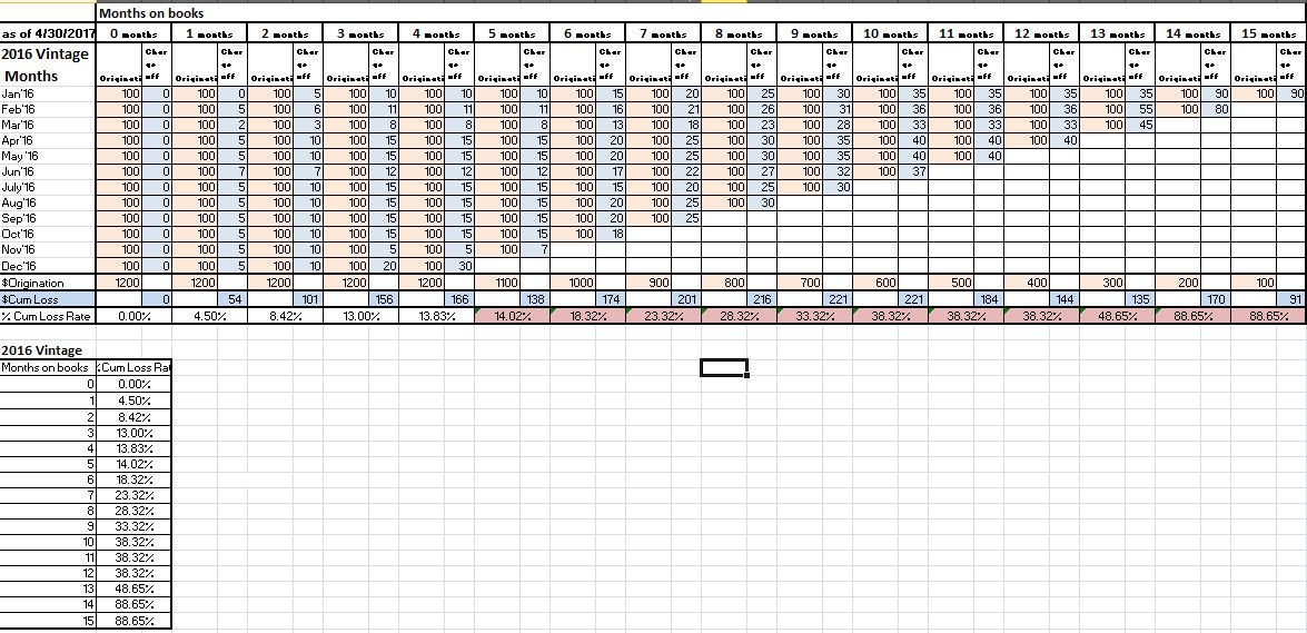
I have the attached summary loan data consisting of originated month, total originated $ in the month and total cumulative Charge off $ from month to month. expected output is the second table where cumulative loss rate for the entire loan Vintage is shown. I have developed this pivot using above() and rangesum() functions but when I convert the pivot table to a line chart, the above() and rangesum() wont retain their functionality and I see completely different %'s. It would be soo easy to convert these pivot into graphs instead of manually exporting the pivot to excel and graphing
- « Previous Replies
-
- 1
- 2
- Next Replies »
- Mark as New
- Bookmark
- Subscribe
- Mute
- Subscribe to RSS Feed
- Permalink
- Report Inappropriate Content
That worked. So this is coming from incorrect data type of TOB_calculated?
Should I change it in the data model while loading ( num#(tob_calculated) as TOB_calculated ) instead of set analysis?
- Mark as New
- Bookmark
- Subscribe
- Mute
- Subscribe to RSS Feed
- Permalink
- Report Inappropriate Content
Not the incorrect data, but the incorrect sorting
- Mark as New
- Bookmark
- Subscribe
- Mute
- Subscribe to RSS Feed
- Permalink
- Report Inappropriate Content
ok. thanks
- Mark as New
- Bookmark
- Subscribe
- Mute
- Subscribe to RSS Feed
- Permalink
- Report Inappropriate Content
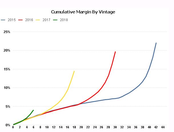
stalwar1 Hi your suggestion on using (TOB_calculated, (NUMERIC))) worked last time. But with the same expression, this time curves started spiking up. Not sure if this is coming from same incorrect sort order problem within the application. Please take a look. Thanks
- Mark as New
- Bookmark
- Subscribe
- Mute
- Subscribe to RSS Feed
- Permalink
- Report Inappropriate Content
Siva - it would be easier if you open a new thread for this, this way you get more set of eyes on this. Also, I suggest you to share an updated app where we can actually see the problem.
Thanks,
Sunny
- Mark as New
- Bookmark
- Subscribe
- Mute
- Subscribe to RSS Feed
- Permalink
- Report Inappropriate Content
Agree! I have looked at the data again and looks like I was missing some data. Fixed it and the graph looks good now. Appreciate your help
- « Previous Replies
-
- 1
- 2
- Next Replies »