Unlock a world of possibilities! Login now and discover the exclusive benefits awaiting you.
- Qlik Community
- :
- All Forums
- :
- QlikView App Dev
- :
- Quadrants in Scatter Plot (QlikView)
- Subscribe to RSS Feed
- Mark Topic as New
- Mark Topic as Read
- Float this Topic for Current User
- Bookmark
- Subscribe
- Mute
- Printer Friendly Page
- Mark as New
- Bookmark
- Subscribe
- Mute
- Subscribe to RSS Feed
- Permalink
- Report Inappropriate Content
Quadrants in Scatter Plot (QlikView)
Hi
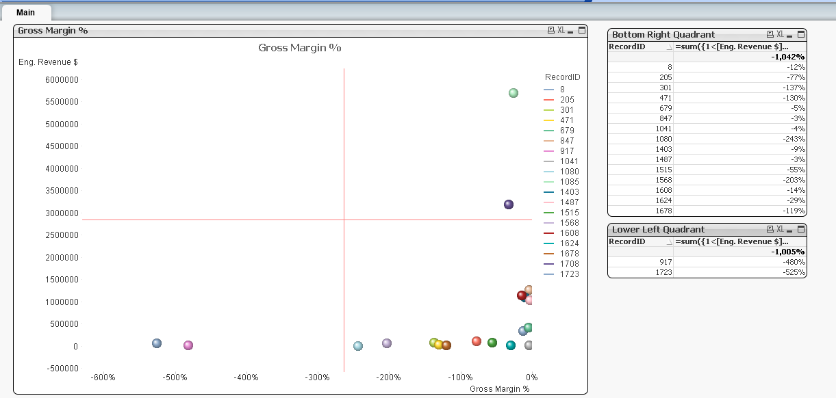
I attached the sample scatter plot which compares Revenue vs GM %.
I also added quadrants.
Is there a way to get the list of bubbles from lower left quadrant into a table?
I added fast change option to straight table and asked the user to click and open the details. But no luck
Please help
- « Previous Replies
-
- 1
- 2
- Next Replies »
- Mark as New
- Bookmark
- Subscribe
- Mute
- Subscribe to RSS Feed
- Permalink
- Report Inappropriate Content
It is basically the same thing. I think you would want calculations (tables or set analysis) to represent each quadrant. The bottom left quadrant would be less than the x-axis and less than the y-axis
=sum({1<[Eng. Revenue $]={"<$(=(Max(Aggr(Sum([Eng. Revenue $]),RecordID))+Min(Aggr(Sum([Eng. Revenue $]),RecordID)))/2)"},
[Gross Margin %]={"<=$(=(Max(Aggr(Sum([Gross Margin %]),RecordID))+Min(Aggr(Sum([Gross Margin %]),RecordID)))/2)"}>}[Gross Margin %])
- Mark as New
- Bookmark
- Subscribe
- Mute
- Subscribe to RSS Feed
- Permalink
- Report Inappropriate Content
Out of the box what if Gross Margin % is a calculated field instead of direct field?
- « Previous Replies
-
- 1
- 2
- Next Replies »