Unlock a world of possibilities! Login now and discover the exclusive benefits awaiting you.
- Qlik Community
- :
- All Forums
- :
- QlikView App Dev
- :
- Re: Rename Class and Specify Buckets
- Subscribe to RSS Feed
- Mark Topic as New
- Mark Topic as Read
- Float this Topic for Current User
- Bookmark
- Subscribe
- Mute
- Printer Friendly Page
- Mark as New
- Bookmark
- Subscribe
- Mute
- Subscribe to RSS Feed
- Permalink
- Report Inappropriate Content
Rename Class and Specify Buckets
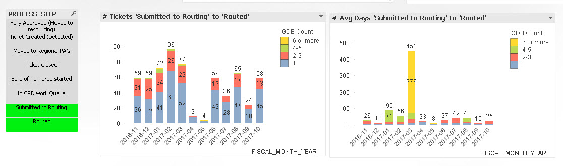
Right now I am using the following Dimension for my interval buckets:
=replace(aggr(Class(count(GOV_DECISION_BODY_SUB),2), DEFECT_ID), '<= x <','-')
What I am trying to accomplish is 3 things:
- Hardcode the PROCESS_STEP selections so the user does not need to select them from the list box. I will have several versions of this graph with different selections to be used in an Nprinting export.
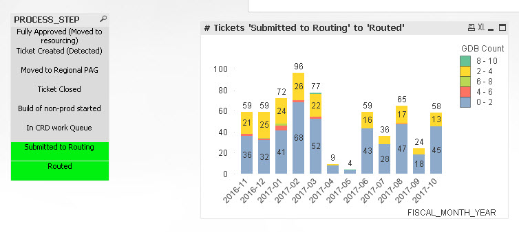
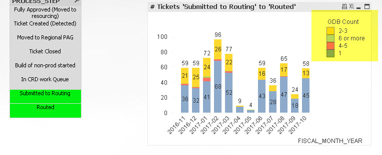
- I would think 0-1, 2-3, 4-5, 6 or more or whatever a frequency distribution suggests. Or, maybe 0, and 1 should be broken out separately. . . . and then the other categories.
- If possible, rename the 0-1 bucket to Low Complexity, rename 2-3 to Medium etc
Any suggestions?
Thanks in advance!
- Mark as New
- Bookmark
- Subscribe
- Mute
- Subscribe to RSS Feed
- Permalink
- Report Inappropriate Content
Awesome!! Thank you! How do I change the sort order for the Legend?
- Mark as New
- Bookmark
- Subscribe
- Mute
- Subscribe to RSS Feed
- Permalink
- Report Inappropriate Content
Just the legend or the bars also? What order do you want?
- Mark as New
- Bookmark
- Subscribe
- Mute
- Subscribe to RSS Feed
- Permalink
- Report Inappropriate Content
And what about hard coding the selections? Any ideas?
- Mark as New
- Bookmark
- Subscribe
- Mute
- Subscribe to RSS Feed
- Permalink
- Report Inappropriate Content
both..if possible, in numerical order?
- Mark as New
- Bookmark
- Subscribe
- Mute
- Subscribe to RSS Feed
- Permalink
- Report Inappropriate Content
I have use dual function to create the dimension, I think all you need to do is to select numerical sorting on the sort tab for this dimension (GDB Count)
- Mark as New
- Bookmark
- Subscribe
- Mute
- Subscribe to RSS Feed
- Permalink
- Report Inappropriate Content
So you would need 8 charts, one for each PROCESS_STEP?
- Mark as New
- Bookmark
- Subscribe
- Mute
- Subscribe to RSS Feed
- Permalink
- Report Inappropriate Content
the chart returns values based on two PROCESS_STEP selections and either the number of tickets from one step to the other or, in another chart, avg # days. I will be creating views for Submitted to Routing to Routed, Routed to Fully Approved (Moved to resourcing) and Routed to Ticket Closed.
- Mark as New
- Bookmark
- Subscribe
- Mute
- Subscribe to RSS Feed
- Permalink
- Report Inappropriate Content
Duh thanks.
- Mark as New
- Bookmark
- Subscribe
- Mute
- Subscribe to RSS Feed
- Permalink
- Report Inappropriate Content
I am confused.... you want to PROCESS_STEPS then in this first view (let's take one view at a time) 
- Mark as New
- Bookmark
- Subscribe
- Mute
- Subscribe to RSS Feed
- Permalink
- Report Inappropriate Content
The calculations are based on the selection of 2 PROCESS_STEP.
Here is my first selections of Submitted to Routing and Routed. Is there a way to hardcode these selections in the charts so the user doesn't have to select them in the list box? These charts will be exported to a PPT file via Nprinting. The other views I will need are: Routed to Fully Approved (Moved to resourcing) and Routed to Ticket Closed