Unlock a world of possibilities! Login now and discover the exclusive benefits awaiting you.
- Qlik Community
- :
- All Forums
- :
- QlikView App Dev
- :
- Re: Show different expression in Legend in a pie c...
- Subscribe to RSS Feed
- Mark Topic as New
- Mark Topic as Read
- Float this Topic for Current User
- Bookmark
- Subscribe
- Mute
- Printer Friendly Page
- Mark as New
- Bookmark
- Subscribe
- Mute
- Subscribe to RSS Feed
- Permalink
- Report Inappropriate Content
Show different expression in Legend in a pie chart
Hi experts,
I have a data set with four fields - Group, Person, ProductId, Amount. Basically there are two groups, A and B, in each group there are many persons. And each person can control several productId with a certain amount. Now I need to show a pie chart for each group. The pie should show the number of productId controlled by each person, also, in the legend I want to show the total amount for each person.
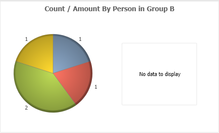
What I'm doing is, for each group, I create two pie charts, and put one on top of another. In the bottom chart, I show the pie with number of productId and do not show legend in this chart. In the top chart, I show the legend only with amount in the legend. This solution works well for Group A (see below screenshot).
However, for Group B, since all amount values are zero, the top pie chart does not show anything.
So my question is, is there a solution to show the legend still when the amount values are all zero in the top chart?
Or is there an alternative to create a chart like this? The idea is just create show the pie in one expression and show the legend in another expression.
I have attached my qvw for your reference.
Thanks,
Michael
Accepted Solutions
- Mark as New
- Bookmark
- Subscribe
- Mute
- Subscribe to RSS Feed
- Permalink
- Report Inappropriate Content
hi @msmichael ,
You can use the RangeMax function to "fake" a Zero value and trick the pie chart (with rounding count to the nearest Integer)...
RangeMax(0.00000001, your measure)
can you try the below expression?
expression:
RangeMax(0.00000001, num(sum({<group={'B'}>}amount),'##0'))
regards,
raji
- Mark as New
- Bookmark
- Subscribe
- Mute
- Subscribe to RSS Feed
- Permalink
- Report Inappropriate Content
hi,
could you please share your data and expression you used? (i am not able to open QVW file)
regards,
raji
- Mark as New
- Bookmark
- Subscribe
- Mute
- Subscribe to RSS Feed
- Permalink
- Report Inappropriate Content
Hi @raji6763
sure. This is the data:
'data':
LOAD * Inline [
'group', 'person', 'productId','amount'
'A', 'Mike', 'BBB001', 100
'A', 'Jake', 'BBB002', 100
'A', 'Jake', 'BBB005', 100
'A', 'Jake', 'BBB003', 100
'A', 'Jane', 'BBB003', 1000
'A', 'Sand', 'BBB005', 10
'B', 'Mike', 'BBB001', 0
'B', 'Mike', 'BBB002', 0
'B', 'Jake', 'BBB002', 0
'B', 'Jane', 'BBB003', 0
'B', 'Sand', 'BBB005', 0
]
;
below are the expressions:
For group A,
in the bottom chart, expression =count({<group={"A"}>} distinct productId), do not show legend.
in the top chart, expression =sum({<group={"A"}>} amount), show legend
For group B, expressions are similar, just replace "A" with "B".
Thanks,
Michael
- Mark as New
- Bookmark
- Subscribe
- Mute
- Subscribe to RSS Feed
- Permalink
- Report Inappropriate Content
hi @msmichael ,
You can use the RangeMax function to "fake" a Zero value and trick the pie chart (with rounding count to the nearest Integer)...
RangeMax(0.00000001, your measure)
can you try the below expression?
expression:
RangeMax(0.00000001, num(sum({<group={'B'}>}amount),'##0'))
regards,
raji
- Mark as New
- Bookmark
- Subscribe
- Mute
- Subscribe to RSS Feed
- Permalink
- Report Inappropriate Content
Thank you @raji6763, I used a straight table instead for the top chart as legend. But I think your solution should work well.

