Unlock a world of possibilities! Login now and discover the exclusive benefits awaiting you.
- Qlik Community
- :
- All Forums
- :
- QlikView App Dev
- :
- Re: Re: Show the Max/Min values in an Average Line...
- Subscribe to RSS Feed
- Mark Topic as New
- Mark Topic as Read
- Float this Topic for Current User
- Bookmark
- Subscribe
- Mute
- Printer Friendly Page
- Mark as New
- Bookmark
- Subscribe
- Mute
- Subscribe to RSS Feed
- Permalink
- Report Inappropriate Content
Show the Max/Min values in an Average Line Chart
Hello,
I have the following line chart for sales as an average - you can find the QVW file attached:
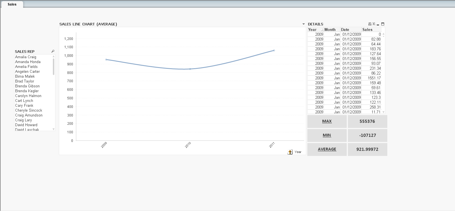
My expression for the line chart is AVG(Sales).
The dimension is a hierarchical group with year, month and date.
What I show in the line chart is an average for every year, month and date.
The thing is that I need to show the MAX and MIN values, that you can see on the right as text objects.
Do you know how could I do that?
Thank you!
- Tags:
- new_to_qlikview
- Mark as New
- Bookmark
- Subscribe
- Mute
- Subscribe to RSS Feed
- Permalink
- Report Inappropriate Content
add in another expression of =max(TOTAL Sales) if you want the maximum across the selected data or simply =max(Sales) if it is the maximum for each YMD.
- Mark as New
- Bookmark
- Subscribe
- Mute
- Subscribe to RSS Feed
- Permalink
- Report Inappropriate Content
Hi,
You may try something like below,
Max(Aggr(Sum(Sales), Year))
Min(Aggr(Sum(Sales), Year))
- Mark as New
- Bookmark
- Subscribe
- Mute
- Subscribe to RSS Feed
- Permalink
- Report Inappropriate Content
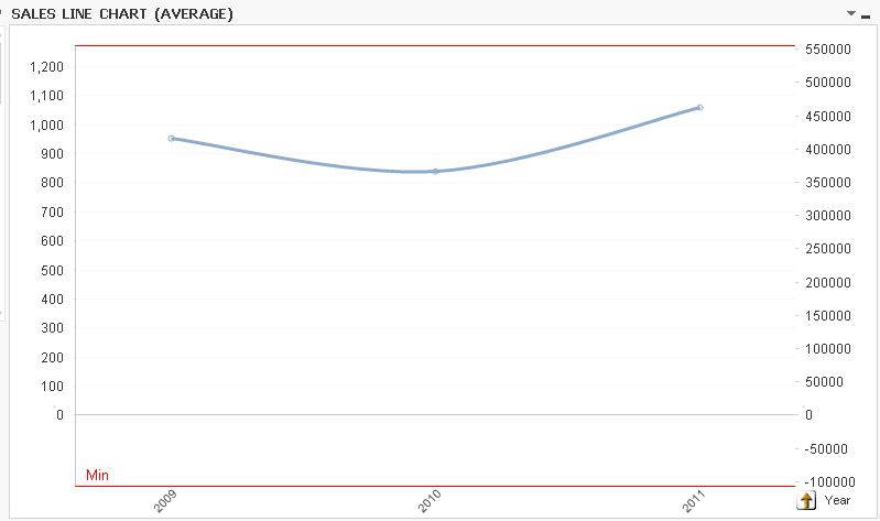
Hi,
just use the overal Min and Max expressions as reference lines:
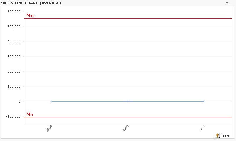
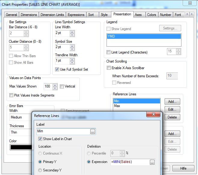
hope this helps
regards
Marco
- Mark as New
- Bookmark
- Subscribe
- Mute
- Subscribe to RSS Feed
- Permalink
- Report Inappropriate Content
Hi,
see attachment, the values are shown in axis x.
Regards
- Mark as New
- Bookmark
- Subscribe
- Mute
- Subscribe to RSS Feed
- Permalink
- Report Inappropriate Content
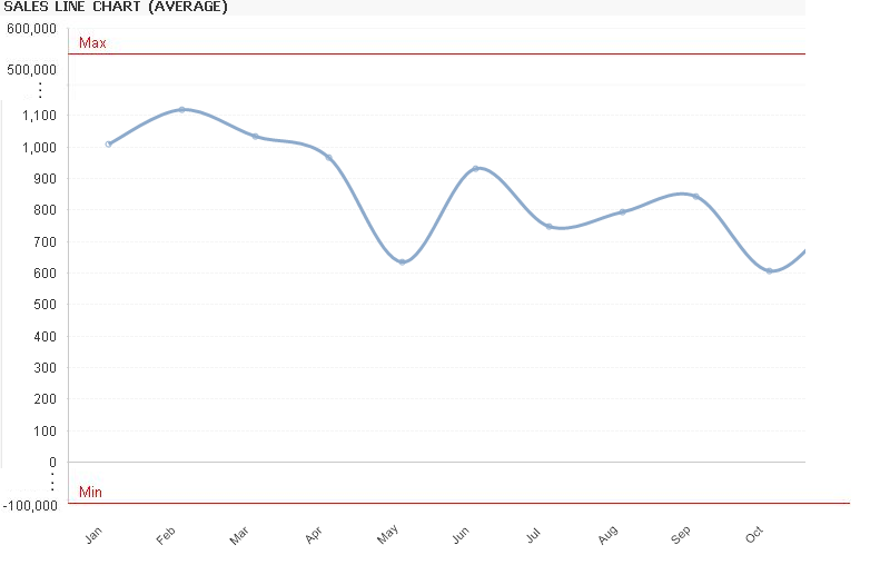
Thanks Marco, I like your answer but is there any way to see the blue line (average) bigger in the center of the chart and the red lines (max and min) on the sides so that I could focus on the average line chart, which is the most important thing I want to show? Thank you.
- Mark as New
- Bookmark
- Subscribe
- Mute
- Subscribe to RSS Feed
- Permalink
- Report Inappropriate Content
Hi,
like this?
hope this helps
regards
Marco