Unlock a world of possibilities! Login now and discover the exclusive benefits awaiting you.
- Qlik Community
- :
- All Forums
- :
- QlikView App Dev
- :
- Re: Strange view for char
- Subscribe to RSS Feed
- Mark Topic as New
- Mark Topic as Read
- Float this Topic for Current User
- Bookmark
- Subscribe
- Mute
- Printer Friendly Page
- Mark as New
- Bookmark
- Subscribe
- Mute
- Subscribe to RSS Feed
- Permalink
- Report Inappropriate Content
Strange view for char
Hello,
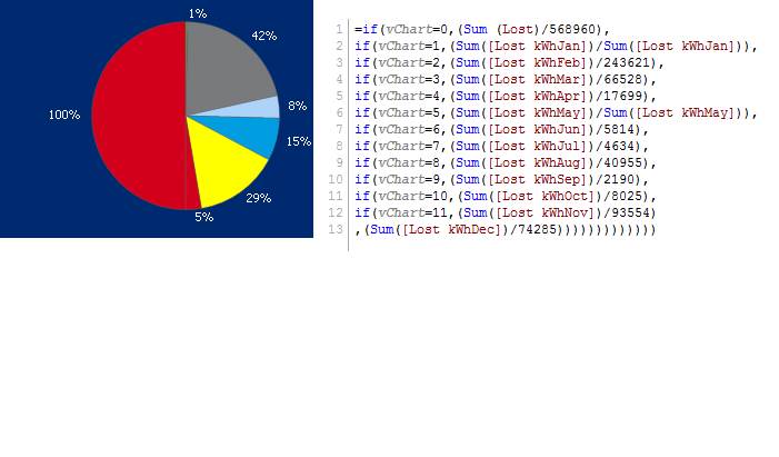
I have a strange view in a chart.
I have the dimension with 8 field and the expression that I put it is down.
Why the chart show my the chart divided in two Part? I dont want the part in red (100%) that is the sum of the other part.
Someone can help me?
Thanks in advance
 z
z
- Mark as New
- Bookmark
- Subscribe
- Mute
- Subscribe to RSS Feed
- Permalink
- Report Inappropriate Content
sorry my dimension is with 6 field, those in different color in the right part of the chart
- Mark as New
- Bookmark
- Subscribe
- Mute
- Subscribe to RSS Feed
- Permalink
- Report Inappropriate Content
I just seen one important thing.
If my "add Calculated dimension" is
=if(vChart=0,Cat,if(vChart=1,Category))
the parameter which calculates the total doesn't appear.
when I put an expression like this
=if(vChart=0,Cat,if(vChart=1,Category,if(vChart=2,Category Feb,)))
I will have the same situation of before. I have another parameter that show me the total of all.
- Mark as New
- Bookmark
- Subscribe
- Mute
- Subscribe to RSS Feed
- Permalink
- Report Inappropriate Content
if i'm not wrong that 100% is showing because of ur last else condition in the above if expression.
if possible u can share ur app,that helps to quickly reply!
- Mark as New
- Bookmark
- Subscribe
- Mute
- Subscribe to RSS Feed
- Permalink
- Report Inappropriate Content
Ciao Pasquale,
try to share a part of your qvw application.
What does vChart variable contain?
Which kind of fields are you using as dimensions?
Also consider that the Ref Manual says that Pie Charts cannot display more than two dimensions. It may be random behavior of situations that the Pie Chart object isn't designed to handle...
S.
- Mark as New
- Bookmark
- Subscribe
- Mute
- Subscribe to RSS Feed
- Permalink
- Report Inappropriate Content
Can you post your QVW?
- Mark as New
- Bookmark
- Subscribe
- Mute
- Subscribe to RSS Feed
- Permalink
- Report Inappropriate Content
I just have a Trial version. Is possible share file.qvw with this? I don't find the way to do it..
- Mark as New
- Bookmark
- Subscribe
- Mute
- Subscribe to RSS Feed
- Permalink
- Report Inappropriate Content
Hello Simone,
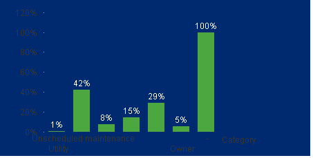
I try to changhe chart but with same expression. The result is the same I always have a part of the chart that show me the total.
The last bar I don't know why is show.

- Mark as New
- Bookmark
- Subscribe
- Mute
- Subscribe to RSS Feed
- Permalink
- Report Inappropriate Content
Ciao Pasquale,
use advanced editor to post your qvw on the form.
S.
- Mark as New
- Bookmark
- Subscribe
- Mute
- Subscribe to RSS Feed
- Permalink
- Report Inappropriate Content
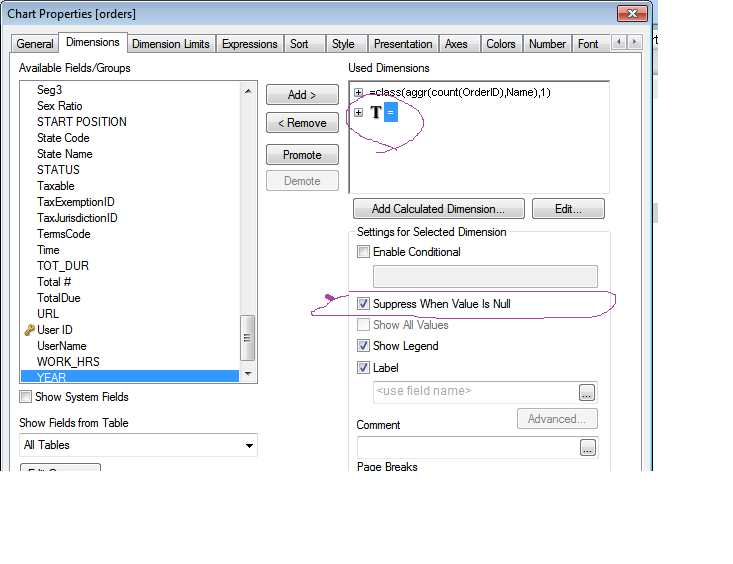
try this one,If it is not working please share your excel file