Unlock a world of possibilities! Login now and discover the exclusive benefits awaiting you.
- Qlik Community
- :
- All Forums
- :
- QlikView App Dev
- :
- Re: Text overlap in charts
- Subscribe to RSS Feed
- Mark Topic as New
- Mark Topic as Read
- Float this Topic for Current User
- Bookmark
- Subscribe
- Mute
- Printer Friendly Page
- Mark as New
- Bookmark
- Subscribe
- Mute
- Subscribe to RSS Feed
- Permalink
- Report Inappropriate Content
Text overlap in charts
Hello Community,
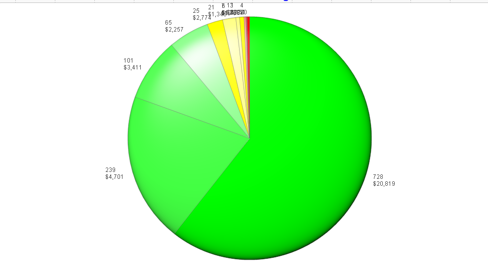
Need some help and ideas to fix the pie text that is overlapping. Is there some text function I can apply to not overlap like in the top of the pie in the pic below?
Thanks!

- Mark as New
- Bookmark
- Subscribe
- Mute
- Subscribe to RSS Feed
- Permalink
- Report Inappropriate Content
You can fix it by not using a pie chart, but a bar chart. Read this article to understand why and how.
talk is cheap, supply exceeds demand
- Mark as New
- Bookmark
- Subscribe
- Mute
- Subscribe to RSS Feed
- Permalink
- Report Inappropriate Content
I read it before….in this project though my dimensions are permanently fixed to 12 slices…and I need to show it on a pie as a bar chart will not display this type of information in the required method. Pie charts are still useful if used carefully! I know they are limited in displaying stats….but when it comes to UI, they are still very useful….
If you have any suggestions on fixing the slice to not go past a minimum pie slice so the text doesn’t get overlapped, that might help….kind of like Axis Min.
Thanks though for your reply.
- Mark as New
- Bookmark
- Subscribe
- Mute
- Subscribe to RSS Feed
- Permalink
- Report Inappropriate Content
Call me a cynic, but somehow I doubt you read that article. Or maybe you don't just understand it or don't want to believe it. Or maybe just don't know yet how to show bars horizontally in a bar chart (change the Orientation option on the Style tab). Pie charts are rarely useful and certainly not here.
Anyway, there's no way to prevent the text from overlapping with standard Qlikview. There does exist a whisker pie extension. Maybe that does better than the standard pie. If you display your horror pie ![]() in webview then you could use that extension. It's installed with Qlikview. See \Examples\Extensions\Extension Examples.qar in your Qlikview installation directory.
in webview then you could use that extension. It's installed with Qlikview. See \Examples\Extensions\Extension Examples.qar in your Qlikview installation directory.
talk is cheap, supply exceeds demand
- Mark as New
- Bookmark
- Subscribe
- Mute
- Subscribe to RSS Feed
- Permalink
- Report Inappropriate Content
Again, I read the article….
As I mentioned, I need to use this method mostly for UI purposes.
The strength of pies, and that is why they will never disappear and keep on tormenting you, is that they are extremely quick to discern which quantity (or slice is greater), or by using colors which ones needs attention asap, this is in the article.
I agree with you most of the time bars or other charts are more correct.
Thanks for your help anyways.