Unlock a world of possibilities! Login now and discover the exclusive benefits awaiting you.
- Qlik Community
- :
- All Forums
- :
- QlikView App Dev
- :
- Re: Visulaization based on selection help!
- Subscribe to RSS Feed
- Mark Topic as New
- Mark Topic as Read
- Float this Topic for Current User
- Bookmark
- Subscribe
- Mute
- Printer Friendly Page
- Mark as New
- Bookmark
- Subscribe
- Mute
- Subscribe to RSS Feed
- Permalink
- Report Inappropriate Content
Visulaization based on selection help!
Hi Folks,
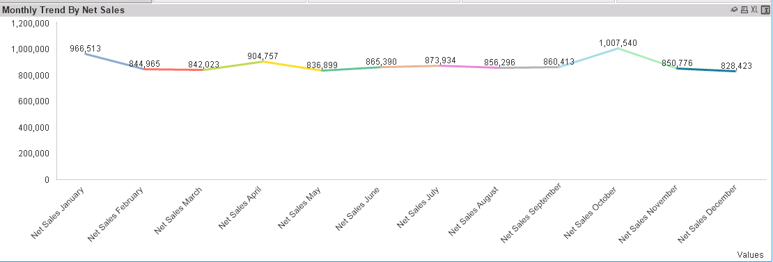
I'm created a line chart with simple
Dim : Values
Expression :
sum({<Cost_Flag ={'1'}>} Data)
and I'm having below result:

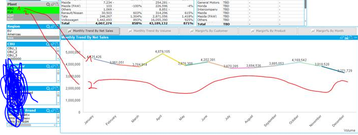
Now what user want to have is something like below:
By default it should above graph , but the moment user selects 2 Plants as in below example KBO as 1 and KLA as 2 then we should get 2 lines showing "Values" and if the selection is for 3 plants then respective 3 lines. We want same working not only for Plant , but also for 'Region' and might be for other list box selections.

I tried something like below , but it's not working as expected:
sum({<Cost_Flag ={'1'},Plant={'$(=getfieldselections(Plant))'},Region={'$(=getfieldselections(Region))'}>} Data)
Please suggest how this can be possible!
Thanks,
AS
Accepted Solutions
- Mark as New
- Bookmark
- Subscribe
- Mute
- Subscribe to RSS Feed
- Permalink
- Report Inappropriate Content
Take Plant (or any other dimension you want) as your second dimension, and use Enable Condition for this dimension exp: =GetSelectedCount(Plant)
- Mark as New
- Bookmark
- Subscribe
- Mute
- Subscribe to RSS Feed
- Permalink
- Report Inappropriate Content
Take Plant (or any other dimension you want) as your second dimension, and use Enable Condition for this dimension exp: =GetSelectedCount(Plant)
- Mark as New
- Bookmark
- Subscribe
- Mute
- Subscribe to RSS Feed
- Permalink
- Report Inappropriate Content
Thank You!
That was easy ![]() .
.