Unlock a world of possibilities! Login now and discover the exclusive benefits awaiting you.
- Qlik Community
- :
- All Forums
- :
- QlikView App Dev
- :
- Re: Weird Display in Chart with Multiple Dimension...
- Subscribe to RSS Feed
- Mark Topic as New
- Mark Topic as Read
- Float this Topic for Current User
- Bookmark
- Subscribe
- Mute
- Printer Friendly Page
- Mark as New
- Bookmark
- Subscribe
- Mute
- Subscribe to RSS Feed
- Permalink
- Report Inappropriate Content
Weird Display in Chart with Multiple Dimensions & Expression
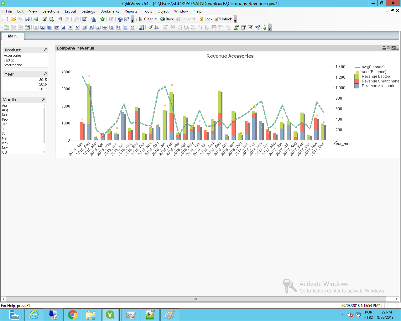
I need to create a chart to show Revenue by Product, in comparison with Total/Average Plan through the year. Excel manages to present this decently.
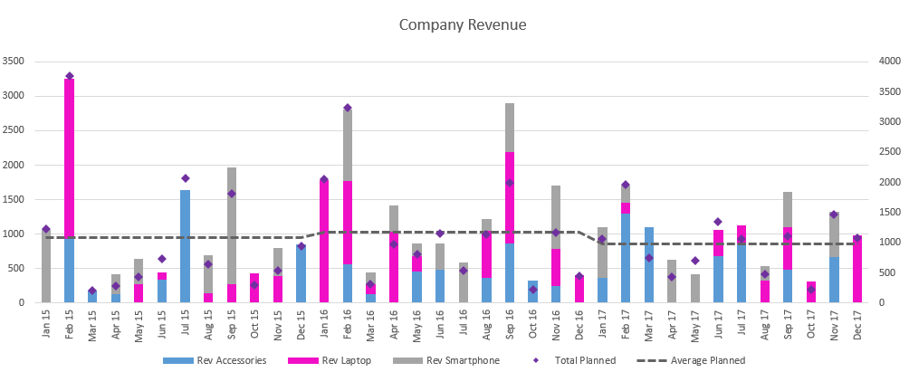
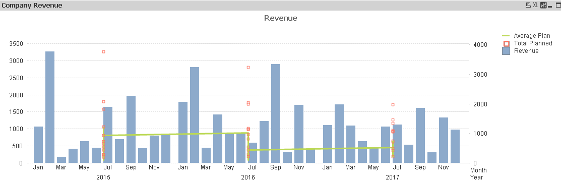
But I cannot do it with Qlik View. The data looks terrible and doesn't carry much business value. The Revenue breakdown cannot be shown with different Color. Total & Average Planned was not aligned to the time.
Any Guru has experience in managing dimension and expression in this case? I believe Qlik should be smarter than Excel. Appreciate any help.
Accepted Solutions
- Mark as New
- Bookmark
- Subscribe
- Mute
- Subscribe to RSS Feed
- Permalink
- Report Inappropriate Content
Thing is, you cant show a Year value when your opening it by Year_Month.
My solution would be to create new fields to get the result by doing:
x:
LOAD Year,
Month,
Date#(Year &'_'&Month,'YYYY_MMM') as Year_month,
Product,
Rev,
Planned
FROM
[Company Revenue.xlsx]
(ooxml, embedded labels, table is [Rev report]);
// sum of planned by year
left join
Load
Year,
sum(Planned) as [New Planned]
Resident x
group by Year;
// count of year_months by year, being possible to not have full years on dataz
left join
Load
Year,
count(Distinct Year_month) as [Count Planned]
Resident x
Group by Year;
That gets me:
- Mark as New
- Bookmark
- Subscribe
- Mute
- Subscribe to RSS Feed
- Permalink
- Report Inappropriate Content
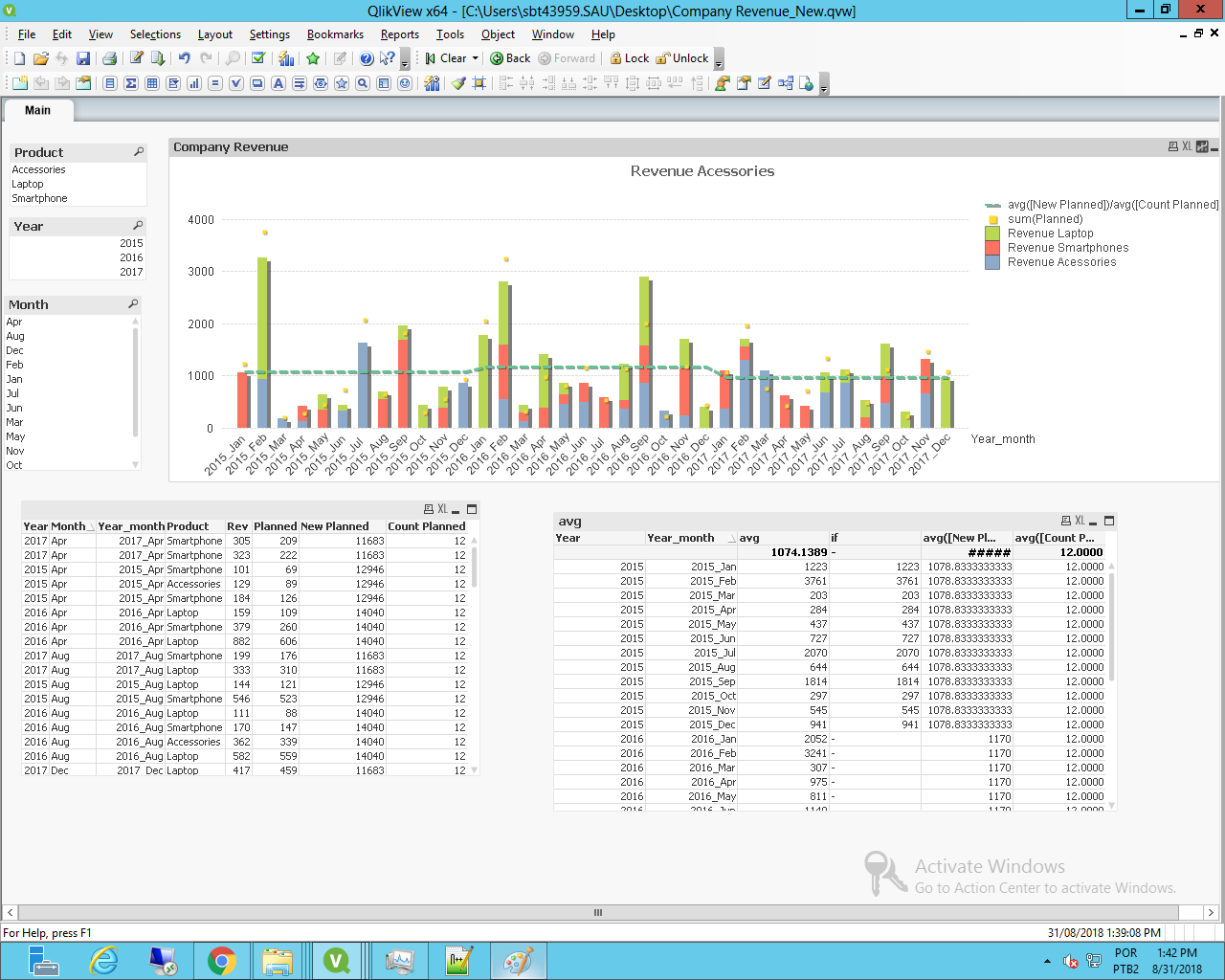
Hi Angie,
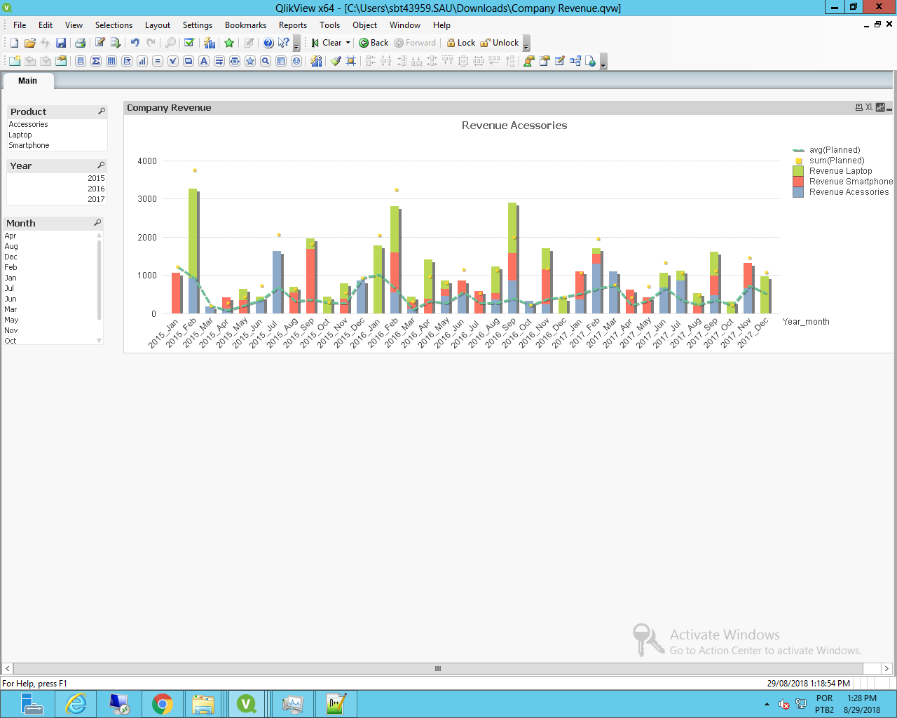
I've made the adjustments so it's possible to plot the same information.
You need to use set analysis to get the individual values for each type of product to create the stacked bar chart.
Final result is this:
Or this, if you put the avg(Planned) to the secondary axis:
- Mark as New
- Bookmark
- Subscribe
- Mute
- Subscribe to RSS Feed
- Permalink
- Report Inappropriate Content
Hi Felip,
The set analysis works fine with Revenue by Products. However, the Average for each year should be a constant. In the Excel chart, the formula would be sum(total planned) by year divided by 12.
Can you suggest expression to replace avg function in this case? Big thanks.
- Mark as New
- Bookmark
- Subscribe
- Mute
- Subscribe to RSS Feed
- Permalink
- Report Inappropriate Content
With the data you have, the avg of the planned wont be constant, due to the fact that you have multiple lines for each dimension, like so:
| Year | Month | Year_month | Product | Rev | Planned |
|---|---|---|---|---|---|
| 2016 | Feb | 2016_Feb | Smartphone | 454 | 524 |
| 2016 | Feb | 2016_Feb | Accessories | 557 | 642 |
| 2016 | Feb | 2016_Feb | Smartphone | 586 | 676 |
| 2016 | Feb | 2016_Feb | Laptop | 595 | 686 |
| 2016 | Feb | 2016_Feb | Laptop | 618 | 713 |
That's the data you have on the app for 2016_Feb and the avg will be 648.2.
You have to define your data on a different way to get a constant value.
- Mark as New
- Bookmark
- Subscribe
- Mute
- Subscribe to RSS Feed
- Permalink
- Report Inappropriate Content
Thanks Felip. Is there a work around to keep the dimension the same? As the purpose of chart is to show the breakdown by month and average by Year.
I managed to set up the formula in Excel as attached. Is it possible to have a similar expression in Qlik?
- Mark as New
- Bookmark
- Subscribe
- Mute
- Subscribe to RSS Feed
- Permalink
- Report Inappropriate Content
Thing is, you cant show a Year value when your opening it by Year_Month.
My solution would be to create new fields to get the result by doing:
x:
LOAD Year,
Month,
Date#(Year &'_'&Month,'YYYY_MMM') as Year_month,
Product,
Rev,
Planned
FROM
[Company Revenue.xlsx]
(ooxml, embedded labels, table is [Rev report]);
// sum of planned by year
left join
Load
Year,
sum(Planned) as [New Planned]
Resident x
group by Year;
// count of year_months by year, being possible to not have full years on dataz
left join
Load
Year,
count(Distinct Year_month) as [Count Planned]
Resident x
Group by Year;
That gets me:
- Mark as New
- Bookmark
- Subscribe
- Mute
- Subscribe to RSS Feed
- Permalink
- Report Inappropriate Content
Thanks Felip for detailed explanation. I can get the correct chart now.
- Mark as New
- Bookmark
- Subscribe
- Mute
- Subscribe to RSS Feed
- Permalink
- Report Inappropriate Content
Glad it helped  .
.