Unlock a world of possibilities! Login now and discover the exclusive benefits awaiting you.
- Qlik Community
- :
- All Forums
- :
- QlikView App Dev
- :
- Re: Why the dots in my combo chart are shown as a ...
- Subscribe to RSS Feed
- Mark Topic as New
- Mark Topic as Read
- Float this Topic for Current User
- Bookmark
- Subscribe
- Mute
- Printer Friendly Page
- Mark as New
- Bookmark
- Subscribe
- Mute
- Subscribe to RSS Feed
- Permalink
- Report Inappropriate Content
Why the dots in my combo chart are shown as a line chart???
Why the dots in my combo chart are shown as a line chart???
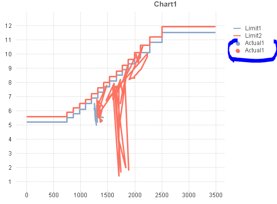
But when I chose one filter this chart can show correct.
Maybe my data points are too close to each other.
But I cannot change the raw data.
Anyone how to solve this problem? I want the chart show correctly.
Thanks in advance!
- « Previous Replies
-
- 1
- 2
- Next Replies »
- Mark as New
- Bookmark
- Subscribe
- Mute
- Subscribe to RSS Feed
- Permalink
- Report Inappropriate Content
The input sheet is for the dots, and the limit sheet is for the limit (step chart).
- Mark as New
- Bookmark
- Subscribe
- Mute
- Subscribe to RSS Feed
- Permalink
- Report Inappropriate Content
I changed the scale, but it doesn't work. 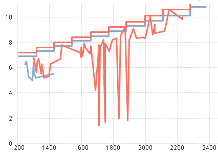
- Mark as New
- Bookmark
- Subscribe
- Mute
- Subscribe to RSS Feed
- Permalink
- Report Inappropriate Content
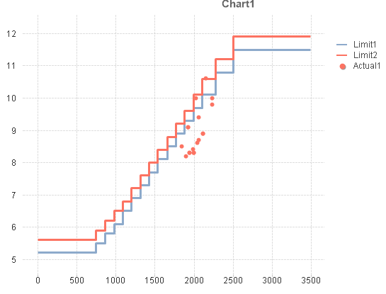
I need to compare the dots and the limit (step chart), so I don't want to divide the expression axes.
- Mark as New
- Bookmark
- Subscribe
- Mute
- Subscribe to RSS Feed
- Permalink
- Report Inappropriate Content
Go to settings option of your qvw->User Preferences->Objects
Here set the Max Symbols in Charts as 1000.
Please find the below attachment for more information.
- Mark as New
- Bookmark
- Subscribe
- Mute
- Subscribe to RSS Feed
- Permalink
- Report Inappropriate Content
As Shiwani said
Go to settings option of your qvw->User Preferences->Objects
after that
Go to Chart Properties >> Presentation >> increase symbol size
- Mark as New
- Bookmark
- Subscribe
- Mute
- Subscribe to RSS Feed
- Permalink
- Report Inappropriate Content
Thank you very much!!!
- « Previous Replies
-
- 1
- 2
- Next Replies »