Unlock a world of possibilities! Login now and discover the exclusive benefits awaiting you.
- Qlik Community
- :
- All Forums
- :
- QlikView App Dev
- :
- Re: annoying bar chart behaviour
- Subscribe to RSS Feed
- Mark Topic as New
- Mark Topic as Read
- Float this Topic for Current User
- Bookmark
- Subscribe
- Mute
- Printer Friendly Page
- Mark as New
- Bookmark
- Subscribe
- Mute
- Subscribe to RSS Feed
- Permalink
- Report Inappropriate Content
annoying bar chart behaviour
Hi all,
I have a simple bar chart in a qlikview 8.5 document that is just not doing what I want it to.
The dimension field is simply date, and the expression field is simply a 1 or a 0.
Here is my graph:
As you can see its simply a plot, over time, of whether or not a detection has occured on that date, represented by a 1.
Now while this looks fine above there are several issues with it.
Firstly, its not showing all the data. The data goes on to the right up to 19th Jan, but the graph is cutting it off, rather than fitting the data to the size of the graph. There is no way to change the static min, max and interval as the boxes are greyed out. If I stretch the graph out to the right, then more data displays but then the graph is too wide for the page.
Secondly, I have tried switching on and off various graph options to make it fit properly to the width. If I select 'continuous' on the dimension area of the axis tab, then the static min, max and interval become available. However the graph appears like this no matter what I do.
As you can see its doing something really odd with the axis.
I also tried using the thin bars setting:
Which is slightly better but still not fitting to the full width of the graph - its gone too far the other way now its gone from being too wide to not wide enough! And there is still no way to define an interval on the date axis (I wanted a 7 day interval), as its greyed out in the dialog.
Any help would be appreciated. There must be a setting Im missing it can't be that difficult to fit a graph and change the scale interval.
Thanks
Dan
- « Previous Replies
-
- 1
- 2
- Next Replies »
- Mark as New
- Bookmark
- Subscribe
- Mute
- Subscribe to RSS Feed
- Permalink
- Report Inappropriate Content
Suffering the same issue. I dont suppose you have had a breakthrough?
- Mark as New
- Bookmark
- Subscribe
- Mute
- Subscribe to RSS Feed
- Permalink
- Report Inappropriate Content
Suffering the same issue. I dont suppose you have had a breakthrough?
- Mark as New
- Bookmark
- Subscribe
- Mute
- Subscribe to RSS Feed
- Permalink
- Report Inappropriate Content
I have not. Sorry.
- Mark as New
- Bookmark
- Subscribe
- Mute
- Subscribe to RSS Feed
- Permalink
- Report Inappropriate Content
I have raised it as a partner support case. Fingers-crossed I get more traction.
- Mark as New
- Bookmark
- Subscribe
- Mute
- Subscribe to RSS Feed
- Permalink
- Report Inappropriate Content
Same issue here. It is so frustrating not to be able to do simple bar chart!!
- Mark as New
- Bookmark
- Subscribe
- Mute
- Subscribe to RSS Feed
- Permalink
- Report Inappropriate Content
Got no traction whatsoever 😞
- Mark as New
- Bookmark
- Subscribe
- Mute
- Subscribe to RSS Feed
- Permalink
- Report Inappropriate Content
Dear Dan,
I've noticed your images are gone - but maybe you are still looking for a solution.
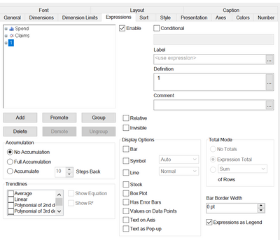
You need to add an expression which calculates everytime and select none of the display options.
Expression: 1
Calculates for every dimension. And I hope it is a very low calculation as well.
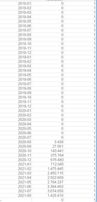
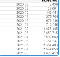
I think the issue is, imagine your chart as a table, you only calculate a few dimensions and generate a rather small table, which leads QlikView to get the impression that bars could be drawn wider. The minimum dimesion is only applicable for charts and continues axes - for tables QV would cutoff every unused dimension.
vs
Still, this is a workaround in my opinion.
Hope you aren't looking for the solution at all since, you asked 10 years ago 🙂
- Mark as New
- Bookmark
- Subscribe
- Mute
- Subscribe to RSS Feed
- Permalink
- Report Inappropriate Content
I need to add:
If one dimesion is filtered so that nothing is calculated over the x axis this won't work. Then you would need to make a calculation w/ set expression {1} something like
Count({1} Cost).
Point is you want a calculation that works for the entire x axis, but isn't shown.
- « Previous Replies
-
- 1
- 2
- Next Replies »


