Unlock a world of possibilities! Login now and discover the exclusive benefits awaiting you.
- Qlik Community
- :
- All Forums
- :
- QlikView App Dev
- :
- Re: how show value in separated line in line chart
- Subscribe to RSS Feed
- Mark Topic as New
- Mark Topic as Read
- Float this Topic for Current User
- Bookmark
- Subscribe
- Mute
- Printer Friendly Page
- Mark as New
- Bookmark
- Subscribe
- Mute
- Subscribe to RSS Feed
- Permalink
- Report Inappropriate Content
how show value in separated line in line chart
Dears
I have below container that include 3 line charts that they show revenue, subscription and charged MSISDNS pew Categories based on date_key.
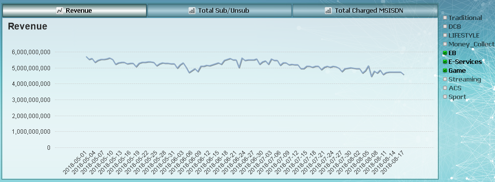
the question is that I want show in first look the total revenues then when I click on my list box that shows categories (for example when I select 2 or 3 categories) my chart show them in different lines with different color.
but in my chart it show all of them in one line. (you an see in picture)
would you please help how can manage them?
dimension : date_key
expression : sum({<Category-={"Test","Free ShortCode","Xtratime"}>}REVENUE)
Accepted Solutions
- Mark as New
- Bookmark
- Subscribe
- Mute
- Subscribe to RSS Feed
- Permalink
- Report Inappropriate Content
Add "Category" as a second dimension to your chart. For this dimension tick "Enable Condition" and use the conditional expression:
GetSelectedCount(Category)>0
-Rob
- Mark as New
- Bookmark
- Subscribe
- Mute
- Subscribe to RSS Feed
- Permalink
- Report Inappropriate Content
Try to add dimension with categories and set conditional show like
=If(GetSelectedCount(categories) > 0 and GetSelectedCount(categories) < 5, 1, 0)
- Mark as New
- Bookmark
- Subscribe
- Mute
- Subscribe to RSS Feed
- Permalink
- Report Inappropriate Content
Not sure, may be:
Modify the expression like this:
=If(GetSelectedCount(Category) > 0, sum({<Category-={"Test","Free ShortCode","Xtratime"}>}REVENUE))
- Mark as New
- Bookmark
- Subscribe
- Mute
- Subscribe to RSS Feed
- Permalink
- Report Inappropriate Content
This is the case, You need 2 charts and overlapping into one and use Conditional Layout to achieve.
- Mark as New
- Bookmark
- Subscribe
- Mute
- Subscribe to RSS Feed
- Permalink
- Report Inappropriate Content
Add "Category" as a second dimension to your chart. For this dimension tick "Enable Condition" and use the conditional expression:
GetSelectedCount(Category)>0
-Rob
- Mark as New
- Bookmark
- Subscribe
- Mute
- Subscribe to RSS Feed
- Permalink
- Report Inappropriate Content
it workkkkkkkkkkkkkkkkkkkkkkkkkkks fine, Thank youuuuuuuuuuuuuuuuuu Dear
