Unlock a world of possibilities! Login now and discover the exclusive benefits awaiting you.
- Qlik Community
- :
- All Forums
- :
- QlikView App Dev
- :
- scatter plot quadrant chart where min = max for x ...
- Subscribe to RSS Feed
- Mark Topic as New
- Mark Topic as Read
- Float this Topic for Current User
- Bookmark
- Subscribe
- Mute
- Printer Friendly Page
- Mark as New
- Bookmark
- Subscribe
- Mute
- Subscribe to RSS Feed
- Permalink
- Report Inappropriate Content
scatter plot quadrant chart where min = max for x & y
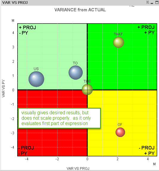
I have a 4 quadrant scatter-plot bubble chart where I am having issues with the maximum/minimum values for the x & y axis. I am trying to have the Max and Min of both the X & Y be the same based on the most extreme value. The scatter plot represents variance from actual for projection and prior year.
I need to do the following
1) keep the scale consistent so as not to confuse the users.
2) ensure that all points are on the scatter-plot
3) zoom in to the closest view possible.
4) be at the Division level of the hierarchy vs region or warehouse (reason for the aggr() function)
I have used several scripts for the XY static MIN/MAX and they tend to all have a problem with them the keeps me from getting the required results
the below script for each XY MIN/MAX only evaluates the first section of the MAX function and gave me false hope until I realized my error...
=-NUM(MAX(
aggr(FABS(sum(ACT_SALES-PROJ_SALES)),DIV),
aggr(FABS(sum(ACT_SALES-PY_SALES)),DIV)
)) 
This script doesn't seem to do anything at all
=-NUM(rangemax(
aggr(FABS(sum(ACT_SALES-PROJ_SALES)),DIV),
aggr(FABS(sum(ACT_SALES-PY_SALES)),DIV)
))
Hoping someone has some insight into a fix. seems fairly intuitive, but not so much...
- Mark as New
- Bookmark
- Subscribe
- Mute
- Subscribe to RSS Feed
- Permalink
- Report Inappropriate Content
When you say visually correct but not to scale means what? could you explain a bit more?
I would suggest you to make a copy of the scatter plot chart and convert into a straight table , add the min and max expressions into it to see if the upper/lower values are correctly being returned or not.
Once you fix your expressions in the straight table, you may move them on to the graph.
hth
Sasi
- Mark as New
- Bookmark
- Subscribe
- Mute
- Subscribe to RSS Feed
- Permalink
- Report Inappropriate Content
Hey Noah!
I'm also trying to build a scatter chart similar to the one in the picture that you have attached. Could you please explain how you were able to get the quadrant lines and the text in each quadrant?
I did use the reference line option under the Presentation tab, but the reference line gets calculated every time I select a part of the chart area.
Thanks!