Unlock a world of possibilities! Login now and discover the exclusive benefits awaiting you.
- Qlik Community
- :
- All Forums
- :
- QlikView
- :
- Re: How to achieve scatter/bubble chart with four ...
- Subscribe to RSS Feed
- Mark Topic as New
- Mark Topic as Read
- Float this Topic for Current User
- Bookmark
- Subscribe
- Mute
- Printer Friendly Page
- Mark as New
- Bookmark
- Subscribe
- Mute
- Subscribe to RSS Feed
- Permalink
- Report Inappropriate Content
How to achieve scatter/bubble chart with four quadrants?
Hi,
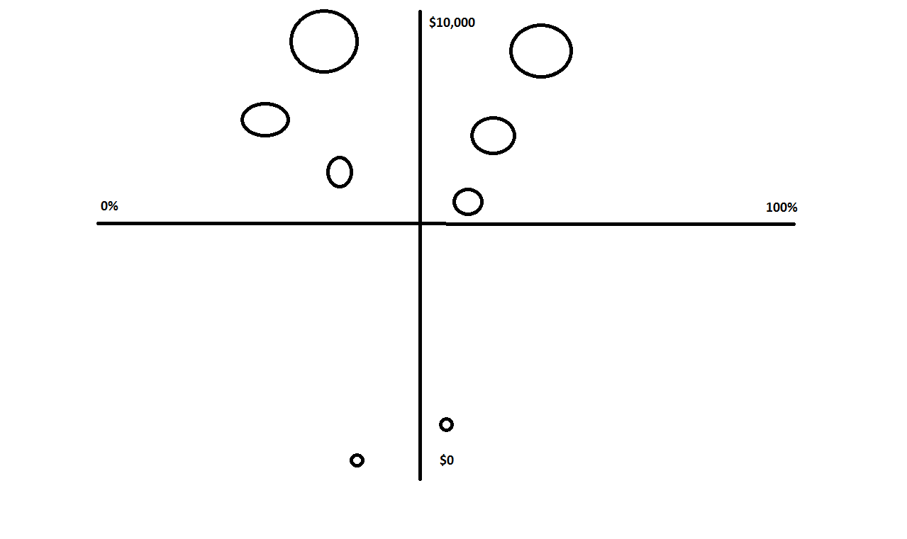
Is this kind of chart possible in Qlikview? I want to see the amount of profit vs their probability. The bubble size is controlled by the amount of profit while the colors of bubbles will be identified by different categories
- Mark as New
- Bookmark
- Subscribe
- Mute
- Subscribe to RSS Feed
- Permalink
- Report Inappropriate Content
You can use reference lines as axes for the quadrants. You can add these reference lines to the chart on the Presentation tab of the properties window.
talk is cheap, supply exceeds demand
- Mark as New
- Bookmark
- Subscribe
- Mute
- Subscribe to RSS Feed
- Permalink
- Report Inappropriate Content
The issue is that I need the lines to be properly scaled and the scales are going to be dynamic.
Arif
- Mark as New
- Bookmark
- Subscribe
- Mute
- Subscribe to RSS Feed
- Permalink
- Report Inappropriate Content
You're not limited to fixed values. You can use expressions too to calculate dynamic values for the reference lines.
talk is cheap, supply exceeds demand
- Mark as New
- Bookmark
- Subscribe
- Mute
- Subscribe to RSS Feed
- Permalink
- Report Inappropriate Content
Does it allow scaling the lines evenly and puting labels on the scales? for example put five major scales on vertical line. The way a normal axis is scaled? Not too much familiar with this kind of presentation
Arif
- Mark as New
- Bookmark
- Subscribe
- Mute
- Subscribe to RSS Feed
- Permalink
- Report Inappropriate Content
No, reference lines are not axis and cannot have scale labels. The real axes will be on the left and bottom side of the plot. Those axes can have labels. See the Axes tab for the available settings.
talk is cheap, supply exceeds demand
- Mark as New
- Bookmark
- Subscribe
- Mute
- Subscribe to RSS Feed
- Permalink
- Report Inappropriate Content
Hello Syed,
Could you get the solution? I need to do the same thing by project. Is like a Gartner Quadrant.
Thanks!
- Mark as New
- Bookmark
- Subscribe
- Mute
- Subscribe to RSS Feed
- Permalink
- Report Inappropriate Content
hope it helps you
- in scatter chart you can use expression to center axes
- google for
qvdesign indexed explosion quadrant
"qvdesign.wordpress.com"
and you'll find a gartner magic quadrant (for bi tools)
thanks to Matthew Crowther
- Mark as New
- Bookmark
- Subscribe
- Mute
- Subscribe to RSS Feed
- Permalink
- Report Inappropriate Content
The indexed explosion quadrant blog is very good... But there is no example so I have created one to present the idea.. The reference lines and forced 0 axis are set in this chart so also show the quadrant issue that this post requests... Hope this is clear enough for you, it's a very powerful chart!