Unlock a world of possibilities! Login now and discover the exclusive benefits awaiting you.
- Qlik Community
- :
- Forums
- :
- Analytics & AI
- :
- QlikView
- :
- Documents
- :
- Control Chart
- Subscribe to RSS Feed
- Mark as New
- Mark as Read
- Bookmark
- Subscribe
- Printer Friendly Page
- Report Inappropriate Content
Control Chart
- Mark as New
- Bookmark
- Subscribe
- Mute
- Subscribe to RSS Feed
- Permalink
- Report Inappropriate Content
Control Chart
Sep 25, 2024 3:27:27 PM
Mar 20, 2016 3:37:57 AM
What is Control Chart?
The control chart is a statistical analysis used to study how a process changes over time. Data are plotted in time order. Control charts are used to routinely monitor quality or simply you can say, control chart is process improvement technique.
There are many types of control charts, but we will focus on the basic control chart using the standard deviation method to understand the concept.
The following are some scenarios where control charts can be applied:
-
In manufacturing, to test whether machinery is producing products within specifications.
-
If you want to reduce the time it takes to admit a patient to the hospital.
-
To analyze how the number of views is increasing or decreasing for a particular website.
Components of Control Chat
1) Avg line
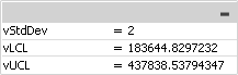
2) UCL (Upper Control line) = Avg Value + Std Deviation* Std Dev Multiplier
3) LCL (Lower control line) = Avg Value - Std Deviation* Std Dev Multiplier
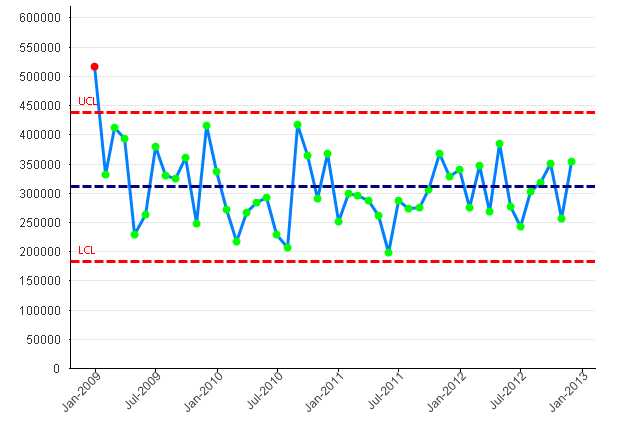
So, basically we can see which are the points "Out of Control" or "In Control".
You can control your Std Dev multiplier using variable.
How to Create a Control Chart:
-
Create a Combo Chart.
-
Select a Time Dimension: Choose a time dimension that suits your analysis; for this example, I have selected MonthYear. Also, ensure that it is set to continuous in the axis settings.
-
Create Two Expressions: Create one expression for the line and another for the symbol.
-
Create expressions for the average line, Upper Control Limit (UCL), and Lower Control Limit (LCL), which will be used as reference lines in the chart. To set these reference lines, go to Chart Properties and navigate to the Presentation section.
-
Create the Background color setting for the Symbol expression


if( sum(Sales) < vUCL and sum(Sales) > vLCL, LightGreen(), LightRed())
Finally, the chart will appear as shown below
Please refer to the below link for further details
Additionally, please see:
- Mark as Read
- Mark as New
- Bookmark
- Permalink
- Report Inappropriate Content
Good one Kushal.
- Mark as Read
- Mark as New
- Bookmark
- Permalink
- Report Inappropriate Content
Good information. Thanks for sharing
- Mark as Read
- Mark as New
- Bookmark
- Permalink
- Report Inappropriate Content
TFS Kushal
- Mark as Read
- Mark as New
- Bookmark
- Permalink
- Report Inappropriate Content
Good work,
Thank's for sharing
Saludos,
Enrique Colomer
- Mark as Read
- Mark as New
- Bookmark
- Permalink
- Report Inappropriate Content
Be sure to use the correct calculation for standard deviation.
It won't be correct if you use the 'regular 'standard deviation (also applies to Excel etc).
- Mark as Read
- Mark as New
- Bookmark
- Permalink
- Report Inappropriate Content
Thank you for the interesting information.
- Mark as Read
- Mark as New
- Bookmark
- Permalink
- Report Inappropriate Content
good work Mr. Kushal.
really nice.
Thanks for such info.
- Mark as Read
- Mark as New
- Bookmark
- Permalink
- Report Inappropriate Content
Good Work Kushal.
Keep sharing such great stuff 
- Mark as Read
- Mark as New
- Bookmark
- Permalink
- Report Inappropriate Content
Hello Kushal,
I've noticed that the scope of the color expression, unfortunately, does not match the dimension of the chart. For example, what if the dimension was a grouping of work orders, the expression was the sum of all hours logged to that work order, and the work orders were sorted by latest timestamp in each work order. When you go to set the color expression, the scope of the color is not specific to the work order.
To make this analogous to your example, imagine if your Sales data were individual sales timestamped at the date of transaction, rather than grouped by month, and your dimension was something like month(date). When you went to get the color, this dimensional scope would be lost, and sum(Sales) would return the sum of all sales rather than just those for that month.
My assumption is that your individual Sales data are already grouped by month.
Is there a workaround for this?
- Mark as Read
- Mark as New
- Bookmark
- Permalink
- Report Inappropriate Content
We held an on-demand session with National Health Services (NHS) about how they built and leverage Statistical Process Control Charts (SPC) and Run Charts in QlikView and Qlik Sense. johnmackintosh covers these topics in depth:
- Variation and importance in Quality Improvement (QI) projects within healthcare
- The Run Chart
- Run Chart Rules
- Simple QlikView run chart
- (Statistical) Process Control (SPC)
- ‘I’ ‘P’ ‘C’ ‘U’ - Examples
- Rare events / time between
Be sure to check this out: https://youtu.be/OVkUOTA-GQw