Unlock a world of possibilities! Login now and discover the exclusive benefits awaiting you.
- Qlik Community
- :
- All Forums
- :
- QlikView App Dev
- :
- visualize condition
- Subscribe to RSS Feed
- Mark Topic as New
- Mark Topic as Read
- Float this Topic for Current User
- Bookmark
- Subscribe
- Mute
- Printer Friendly Page
- Mark as New
- Bookmark
- Subscribe
- Mute
- Subscribe to RSS Feed
- Permalink
- Report Inappropriate Content
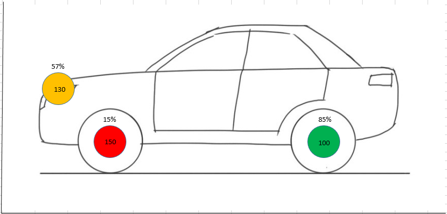
visualize condition
For my raspberry pi project I want to visualize the condition of my equipment. The following image should give you an impression of my intentions. My database contains information like:
* location name
* x-coordinate location
* y-coordinate location
* number of hits
* max of hits allowed
It is no problem to create a graph (distribution) to indicate the number of hits in a specific area. But for me, the following functionalities are impossible to create:
* indication of the number of hits
* the percentage (number of hits / max of hits allowed)
* color: red (percentage<25%), orange (percentage 25-75%), green (percentage >75%)
Any ideas?
Thanks in advance
Per
- Mark as New
- Bookmark
- Subscribe
- Mute
- Subscribe to RSS Feed
- Permalink
- Report Inappropriate Content
Hi Perry,
check out this link - Create a KML polygon shape file manually and use it in Qlik Sense
You could create a KML file defining the various regions / panels of your car. Then use a Map Chart object to display the related values.
Marcus
- Mark as New
- Bookmark
- Subscribe
- Mute
- Subscribe to RSS Feed
- Permalink
- Report Inappropriate Content
One way to achieve this requirement is , select a scatter chart and add this as the background image and the feed the X and Y values to position the Circle and use the size expression to make the variation on the circle size
- Mark as New
- Bookmark
- Subscribe
- Mute
- Subscribe to RSS Feed
- Permalink
- Report Inappropriate Content
Thnx for the suggestion, problem is I only have Qlikview ;-(