Suggest an Idea

Vote for your favorite Qlik product ideas and add your own suggestions.

Announcements
This page is no longer in use. To suggest an idea, please visit Browse and Suggest.

Increase the number of points to be displayed on a line chart

Diego_Busilacchi
Contributor II
Contributor II

Increase the number of points to be displayed on a line chart

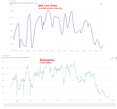
A continuous line graph needs to allow you to see as many points as you want, NOT just 2000 because the curve shown is wrong. I think this is basic.
There should be a property that you can enable and select the number of points to display.

Thanks!


PD: Attached sample image


Comparison.png

19 Comments
Patric_Nordstrom
Employee
Employee

Thank you all for your feedback on ways to improve our product. In reality graphs will always show a limited amount of data, to protect integrity of systems with large amount of data and help the user to understand the data. It's easy to see what a billion row line graph distributed to a thousand users would do. Today that limit is the same for all users, it's trade off between performance and usability. In the future it may be adjustable to for special use cases.

Best practice is to provide overview first and details later, can be done with drill downs or switching representation based on the size of the selection. For tips see sheet "Dynamic charts".

Please continue to show your support for this idea.

Thanks, 

Patric

Status changed to: Open - Collecting Feedback
Diego_Busilacchi
Contributor II
Contributor II

Thank you @Patric_Nordstrom  for your comment!
I understand your arguments perfectly, that's why I ask they to allow the user to change the limit on a particular graph or dashboard, since it is not the same to drill down because you need to see the REALITY of the curve with all the values.
You can do this in POWERBI (for example).

I understand that it is a limitation of the product but it is a weak point against the competition not being able to do this... actually, with an extension, you can do that but lose other important functionalities and you must maintain it yourself with the risk and work that implies... not good.

Greetings!


pmcgovern
Contributor
Contributor

Stating this limitation to Qlik is not a problem seems like making a virtue of necessity. The tools should support exploring data at whatever resolution the user requires. Qlik has chosen an arbitrary cut-off, one that bears no relation to the data or the analysis task at hand. If someone wants to chart data from the last twenty years in daily resolution, the tools should support it. The utility of such a visualization is neither here nor there. Your hammer shouldn't refuse to pound nails because it thinks nobody will like the bookcase you are building.

The problem Qlik has is that its visualizations are rendered as SVG, so it is easy to exhaust the browser's memory. Adding tens of thousands of elements to a DOM is not practical. What is required is to render the data with WebGL instead.

The High Density Line Chart extension from Qlik Branch uses Plotly to render line charts with WebGL. We are using it in production to render over 20k points. Unfortunately, Plotly only renders point and line charts with WebGL, its other chart types are rendered with SVG.

We have been investigating using LightningCharts to get around this limitation. It renders its charts with WebGL and can graph hundreds of thousands of points without complaint. There are still practical limits about the amount of data that can be handled and rendered in a page, but this limit is far higher than Qlik's current cut-off.

https://www.arction.com/lightningchart-js/

It would be great if Qlik would integrate this or something similar into its set of visualizations. Please feel free to contact me if you would like to discuss further.


Meghann_MacDonald

Increase in number of visible data points in line chart coming this quarter.

Meghann

Status changed to: Open - In Development
busilacchi
Partner - Contributor II

 Great!!!

pmcgovern-ecn
Contributor
Contributor

@Meghann_MacDonald Excellent news! Can you tell us if the graphs will be rendered using a canvas, and what the practical limits of the number of points might be?

Meghann_MacDonald

I believe that the number of point improvements will be similar to the scatterplot data increase, which you can read about in the SaaS Change Log (search scatter plots, Oct 20th). Keep an eye on the change log in the next 2 weeks for the release documentation on the limits and improvements to this chart and others, and we will update here soon!

Meghann

Patric_Nordstrom
Employee
Employee

Delivered for the line chart, continuous axis, as of Feb 16 in Qlik Cloud, in cm in the coming release after.

From https://help.qlik.com/en-US/cloud-services/Subsystems/Hub/Content/Sense_Hub/Visualizations/LineChart...

Displaying large amounts of data in a line chart
You can set the maximum number of visible points and lines in advanced edit mode. In the properties panel, go to Presentation. Then adjust the following:

Max visible points: Set the maximum number of points that will be displayed. The default is 2,000. The maximum is 50,000. If you set a number less than 1,000, the line chart will behave as if the maximum is 1,000 visible points.
Max visible lines: Set the maximum number of lines that will be displayed. The default is 12. The maximum is 1,000.
If there are more data points than the number set in Max visible points, you will not see any points, only lines. If there are more than 5,000 visible points, then labels will not be shown. If you have a large number of lines, not all lines will be displayed, or lines may overlap.

If you have a large number of points or lines, it may take your chart longer to render when you zoom or pan. You cannot make selections when the line chart is rendering.

Note! This is an advanced setting. Increasing threshold leads to longer rendering time and may cause downloads and generated reports to time out.

Status changed to: Delivered
busilacchi
Partner - Contributor II

@Patric_Nordstrom excelent! Thanks for the new!

Question... Is it only in SAAS? On Premise?

Regards!