Hi,
I think the dynamic selection of colors on the charts has to be improved.
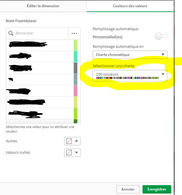
In fact, even if we select 100 colors for a dimension, we can't make a visual difference between some colors on the charts.
For example :

Our business users need to have clear colors on the charts they want to view on Qliksense or export.

The solution to customize manually each value of the dimension with a defined color can't be a solution, because :
* We have more than 100 values on a referenced dimension
* We can't manualy do this because the colors have to be automaticly selected by QS on the chart in order to have the best visualization, depending to what we have on KPI's etc.
Olivier W.
Business & Decision Bordeaux