Unlock a world of possibilities! Login now and discover the exclusive benefits awaiting you.
- Qlik Community
- :
- Forums
- :
- Analytics & AI
- :
- Products & Topics
- :
- Visualization and Usability
- :
- Customize data label color of combo-chart bars usi...
- Subscribe to RSS Feed
- Mark Topic as New
- Mark Topic as Read
- Float this Topic for Current User
- Bookmark
- Subscribe
- Mute
- Printer Friendly Page
- Mark as New
- Bookmark
- Subscribe
- Mute
- Subscribe to RSS Feed
- Permalink
- Report Inappropriate Content
Customize data label color of combo-chart bars using CSS script
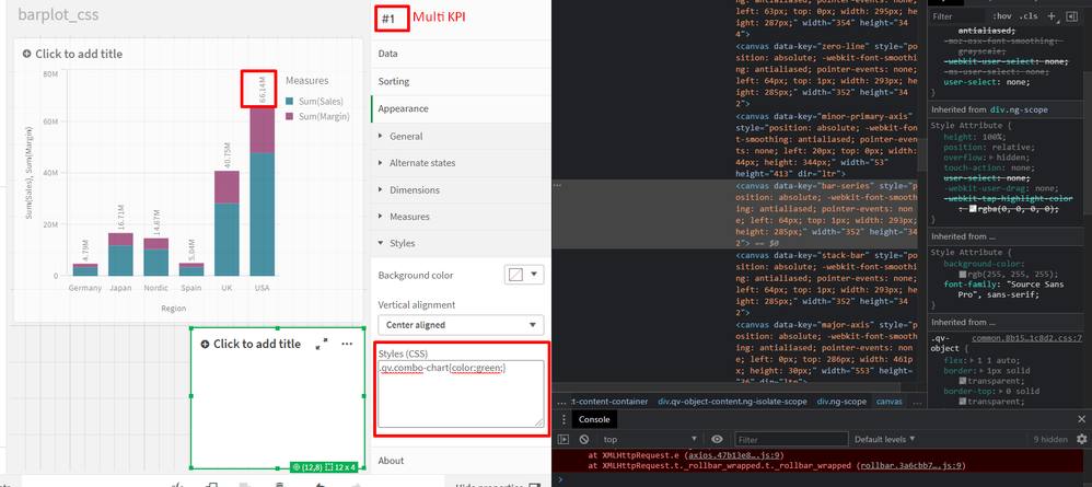
Using a small hack of multi kpi measure I want to change the default color of data labels in a combo-chart using css styling.
My chart looks like:
When I inspect the HTML document of the file I am not able to identify the div class or tid value related to the bar labels. Is any work around? Or it's not feasible at the moment?
Any suggestions are much appreciated.
- Tags:
- color
Accepted Solutions
- Mark as New
- Bookmark
- Subscribe
- Mute
- Subscribe to RSS Feed
- Permalink
- Report Inappropriate Content
Hello @NikosSpanos
This only can be achieved by using a custom theme and changing the JSON file.
I changed the property of barchart -> label -> color:
        "barChart": {
            "outOfRange": {
                "color": "@white"
            },
            "label": {
                "value": {
                    "color": "@green",
                    "fontSize": "14px"
                }
            }
        }
Eli.
- Mark as New
- Bookmark
- Subscribe
- Mute
- Subscribe to RSS Feed
- Permalink
- Report Inappropriate Content
Hi @NikosSpanos ,
This Qlik documentation sustains the explanation provided by @Spivey
https://community.qlik.com/t5/Knowledge/Difference-between-the-CSS-and-JSON-file-in-a-Qlik-Sense-The...
To use custom theme check this as proposed by @EliGohar
Regards,
- Mark as New
- Bookmark
- Subscribe
- Mute
- Subscribe to RSS Feed
- Permalink
- Report Inappropriate Content
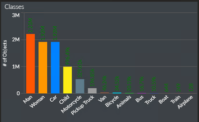
I change the mashup:
I downloaded the theme:
https://github.com/clusterdesign/nightmode-extension
Then set the theme in the mashup.

- Mark as New
- Bookmark
- Subscribe
- Mute
- Subscribe to RSS Feed
- Permalink
- Report Inappropriate Content
I also had a need to edit these chart labels using CSS but, unfortunately, they appear to be displayed in a <canvas> element, which indicates that the labels are generated using JavaScript and cannot be modified via CSS.
Here's the CSS selector for that <canvas> element:
canvas[data-key*="label"]
- Mark as New
- Bookmark
- Subscribe
- Mute
- Subscribe to RSS Feed
- Permalink
- Report Inappropriate Content
Any solution for this problem?
I put the graph in a dark mashup, and the labels were bad to read.
- Mark as New
- Bookmark
- Subscribe
- Mute
- Subscribe to RSS Feed
- Permalink
- Report Inappropriate Content
Hello @NikosSpanos
This only can be achieved by using a custom theme and changing the JSON file.
I changed the property of barchart -> label -> color:
        "barChart": {
            "outOfRange": {
                "color": "@white"
            },
            "label": {
                "value": {
                    "color": "@green",
                    "fontSize": "14px"
                }
            }
        }
Eli.
- Mark as New
- Bookmark
- Subscribe
- Mute
- Subscribe to RSS Feed
- Permalink
- Report Inappropriate Content
Hi @NikosSpanos ,
This Qlik documentation sustains the explanation provided by @Spivey
https://community.qlik.com/t5/Knowledge/Difference-between-the-CSS-and-JSON-file-in-a-Qlik-Sense-The...
To use custom theme check this as proposed by @EliGohar
Regards,
- Mark as New
- Bookmark
- Subscribe
- Mute
- Subscribe to RSS Feed
- Permalink
- Report Inappropriate Content
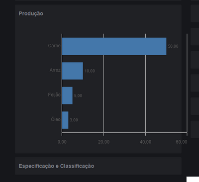
I change the mashup:
I downloaded the theme:
https://github.com/clusterdesign/nightmode-extension
Then set the theme in the mashup.

- Mark as New
- Bookmark
- Subscribe
- Mute
- Subscribe to RSS Feed
- Permalink
- Report Inappropriate Content
Hello, I created a gaant chart based on a bar chart in qlik sense fev 2024
i have a small issue the y-axis lable is a phrase and i can"t see the whole information since this is automatically displying so i need css code so i can control the overflow and make it all visible.
seconde problem, i have duration on the gaant chart car it's a task timeline and i need to add on each bar, the sale amount but i don't see how i i can add and display this mesure on each bar.
Have guys any idea how can i solve this issue?
Thank you in advance.


