Unlock a world of possibilities! Login now and discover the exclusive benefits awaiting you.
- Qlik Community
- :
- Forums
- :
- Analytics & AI
- :
- Products & Topics
- :
- Visualization and Usability
- :
- Re: How can i change a dimension in a chart by cli...
- Subscribe to RSS Feed
- Mark Topic as New
- Mark Topic as Read
- Float this Topic for Current User
- Bookmark
- Subscribe
- Mute
- Printer Friendly Page
- Mark as New
- Bookmark
- Subscribe
- Mute
- Subscribe to RSS Feed
- Permalink
- Report Inappropriate Content
How can i change a dimension in a chart by click on a field?
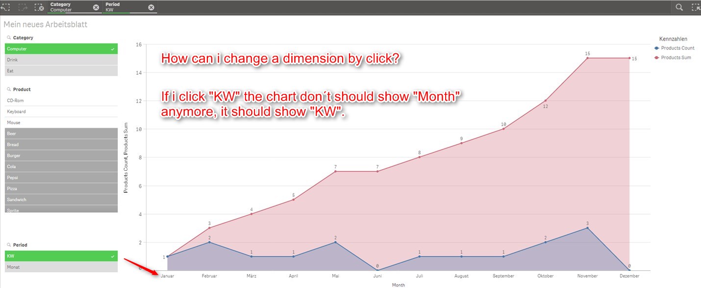
Regards,
Fritz
- « Previous Replies
-
- 1
- 2
- Next Replies »
Accepted Solutions
- Mark as New
- Bookmark
- Subscribe
- Mute
- Subscribe to RSS Feed
- Permalink
- Report Inappropriate Content
An example of doing this using a variable set by a button using qsvariabkele extension is here.
- Mark as New
- Bookmark
- Subscribe
- Mute
- Subscribe to RSS Feed
- Permalink
- Report Inappropriate Content
Hi Fritz,
Yes you can can change dimension of a visualisation on selecting a value in a field.
Island:
load * inline [
Values
Year
Quarter
Month
Week
];
Create a bar chart with 1 dimension and 1 measure
dimension: pick(match(GetCurrentSelections([Values]),'Year','Quarter','Month','Week'),<YearDim>,<QuarterDim>,<MonthDim>,<WeekDim>)
This will pick a dimension based on the selection of the field Value
Measure: sum(Sales) - > example
This will help you change the dimensions on selecting a value from the field 'Value'
Thanks and Regards,
Sangram.
- Mark as New
- Bookmark
- Subscribe
- Mute
- Subscribe to RSS Feed
- Permalink
- Report Inappropriate Content
Hi Fritz,
The image is not clear for me.
Assume you have two fields A & B that should change based on selection.
You assign values A & B into another field F using inline load.
Then you assign the field F into a variable and that variable can be used as Dimension.
Cheers,
Naresh
- Mark as New
- Bookmark
- Subscribe
- Mute
- Subscribe to RSS Feed
- Permalink
- Report Inappropriate Content
An example of doing this using a variable set by a button using qsvariabkele extension is here.
- Mark as New
- Bookmark
- Subscribe
- Mute
- Subscribe to RSS Feed
- Permalink
- Report Inappropriate Content
Hi Andy,
it works perfect, thank you and the others 🙂
Regards,
Fritz
- Mark as New
- Bookmark
- Subscribe
- Mute
- Subscribe to RSS Feed
- Permalink
- Report Inappropriate Content
Hi Andy,
is this possible for measure´s?
Regards,
Fritz
- Mark as New
- Bookmark
- Subscribe
- Mute
- Subscribe to RSS Feed
- Permalink
- Report Inappropriate Content
No problem glad I could help.
- Mark as New
- Bookmark
- Subscribe
- Mute
- Subscribe to RSS Feed
- Permalink
- Report Inappropriate Content
In principle yes. you could use a similar method the change the method from Sales to Qty for example using another variable. I've not been able to so far as the measure values always total I think due to the fact the dimension is being set dynamically.
- Mark as New
- Bookmark
- Subscribe
- Mute
- Subscribe to RSS Feed
- Permalink
- Report Inappropriate Content
Here it is with dynamic measure. you just need to hide the labels as cannot be set dynamically.
- Mark as New
- Bookmark
- Subscribe
- Mute
- Subscribe to RSS Feed
- Permalink
- Report Inappropriate Content
Thank you very much!
I need a function, where can i show and hide the graphs in a chart by clicks on a button.
For example i make a field with two buttons.
1. "Button Count"
2. "Button Sum"
If i activate the button "Button Count" the blue line should showing in the chart.
If i activate the button "Button Sum" the red line should showing in the chart, too.
If i deactivate the button "Button Count" the blue line don´t should showing in the chart, but the red line (because "Button Sum" is always activated.
etc.
How can i do this?
Regards,
Fritz
- « Previous Replies
-
- 1
- 2
- Next Replies »