Unlock a world of possibilities! Login now and discover the exclusive benefits awaiting you.
- Qlik Community
- :
- Forums
- :
- Analytics
- :
- Topics
- :
- Visualization and Usability
- :
- Re: LOAD specific cell according to its value from...
- Subscribe to RSS Feed
- Mark Topic as New
- Mark Topic as Read
- Float this Topic for Current User
- Bookmark
- Subscribe
- Mute
- Printer Friendly Page
- Mark as New
- Bookmark
- Subscribe
- Mute
- Subscribe to RSS Feed
- Permalink
- Report Inappropriate Content
LOAD specific cell according to its value from excel
Hi
I have a column in excel sheet that contains random values from the set {A, B, C, D, E}.
I want to plot each value (A, B, ...,etc.) as a single line in line chart. How can I do that using script?
- Mark as New
- Bookmark
- Subscribe
- Mute
- Subscribe to RSS Feed
- Permalink
- Report Inappropriate Content
Hi Adnan,
could you expand your requirement please? Maybe supply an example data source file and a mock up of you expected output?
Thanks
Andy
- Mark as New
- Bookmark
- Subscribe
- Mute
- Subscribe to RSS Feed
- Permalink
- Report Inappropriate Content
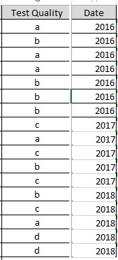
Hey Andrew
In the attached photo you can find two columns; one for quality grade and the other is for the year.
I want to plot each quality grade (a, b, c ...) as a single line in line chart progressing over time.
In this case I would get one line chart; dimension is "Date" and measure is "Test Quality" with a line for each grade (a, b, c ...).
- Mark as New
- Bookmark
- Subscribe
- Mute
- Subscribe to RSS Feed
- Permalink
- Report Inappropriate Content
Hi Adnan,
Yes its possible.
In this case you need to do something similar to this:
Check this out:
Thanks,
Sangram Reddy
- Mark as New
- Bookmark
- Subscribe
- Mute
- Subscribe to RSS Feed
- Permalink
- Report Inappropriate Content
Sample File!
- Mark as New
- Bookmark
- Subscribe
- Mute
- Subscribe to RSS Feed
- Permalink
- Report Inappropriate Content
Thanks Sangram
But, according to my attached photo, what I actually want is plotting each quality grade in a single line in the chart. That is: a line for grade 'a', a line for 'b', a line for 'c', ...., etc.
- Mark as New
- Bookmark
- Subscribe
- Mute
- Subscribe to RSS Feed
- Permalink
- Report Inappropriate Content
Hi Adnan,
Try this:
Table:
Load
if(Test_quality='a',measure,0) as a
,if(Test_quality='b',measure,0) as b
,if(Test_quality='c',measure,0) as c
From [YourFile];
G.