Unlock a world of possibilities! Login now and discover the exclusive benefits awaiting you.
- Qlik Community
- :
- Forums
- :
- Analytics & AI
- :
- Products & Topics
- :
- Visualization and Usability
- :
- Re: count distinct with dynamic condition
- Subscribe to RSS Feed
- Mark Topic as New
- Mark Topic as Read
- Float this Topic for Current User
- Bookmark
- Subscribe
- Mute
- Printer Friendly Page
- Mark as New
- Bookmark
- Subscribe
- Mute
- Subscribe to RSS Feed
- Permalink
- Report Inappropriate Content
count distinct with dynamic condition
Hello everyone,
I'm a beginner on Qlik Sense, and I'm stuck with the issue described below.
the sample data as below:
| Year_Quarter | Year_Month | Product | Sales | Class |
| 2021Q1 | 202101 | A | 100 | |
| 2021Q1 | 202101 | B | 40 | |
| 2021Q1 | 202101 | C | 120 | |
| 2021Q1 | 202102 | A | 30 | |
| 2021Q1 | 202102 | B | 20 |
the "class" field is a master item calculated by below formula:
if sum(sales) in each product >=50 then "good"
if sum(sales) in each product <50 then "bad"
and I need a bar chart to count the number of each class in different time level(month or quarter)
the table result as below(by month )
| Year_Quarter | Year_Month | Product | Sales | Class |
| 2021Q1 | 202101 | A | 100 | good |
| 2021Q1 | 202101 | B | 40 | bad |
| 2021Q1 | 202101 | C | 120 | good |
| 2021Q1 | 202102 | A | 30 | bad |
| 2021Q1 | 202102 | B | 20 | bad |
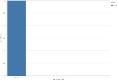
and the dashboard result should be as below:
and the table result as below(by quarter )
| Year_Quarter | Product | Sales | Class |
| 2021Q1 | A | 100+30=130 | good |
| 2021Q1 | B | 40+20=60 | good |
| 2021Q1 | C | 120 | good |
and the dashboard result should be as below:
How can I do for this dashboard?
thanks very much!
Accepted Solutions
- Mark as New
- Bookmark
- Subscribe
- Mute
- Subscribe to RSS Feed
- Permalink
- Report Inappropriate Content
Use aggr and use it as dimension
Aggr(If(Sum(Sales)>50,'Good','Bad')),Product,Year-Month)
- Mark as New
- Bookmark
- Subscribe
- Mute
- Subscribe to RSS Feed
- Permalink
- Report Inappropriate Content
Use aggr and use it as dimension
Aggr(If(Sum(Sales)>50,'Good','Bad')),Product,Year-Month)
- Mark as New
- Bookmark
- Subscribe
- Mute
- Subscribe to RSS Feed
- Permalink
- Report Inappropriate Content
I solved this problem by using aggr function, thank you very much!

