Unlock a world of possibilities! Login now and discover the exclusive benefits awaiting you.
- Qlik Community
- :
- Blogs
- :
- Technical
- :
- Design
- :
- The right chart for your data set (and for your de...
- Subscribe to RSS Feed
- Mark as New
- Mark as Read
- Bookmark
- Subscribe
- Printer Friendly Page
- Report Inappropriate Content
Patrik Lundblad wrote an interesting article in this blog called “Dissecting How to Choose the Right Chart”. It explains which chart best communicates what we want to convey with the data set we have. Taking this concept one step further, there are additional variables when considering what chart works best. What other variables? Things like screen size and type of interaction model are important factors that affect the suitability of a chart.
Let’s pick a classic example: Sales by region by quarter. We should start by asking ourselves, “What would I like to show?” I want to compare between regions and dates. Secondly, ask “What data do I have?” I have one variable per item, Sales, and have a few categories. This will prompt me to choose a bar chart. A grouped bar chart will help me see exactly the information I need.
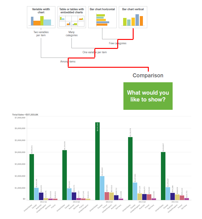
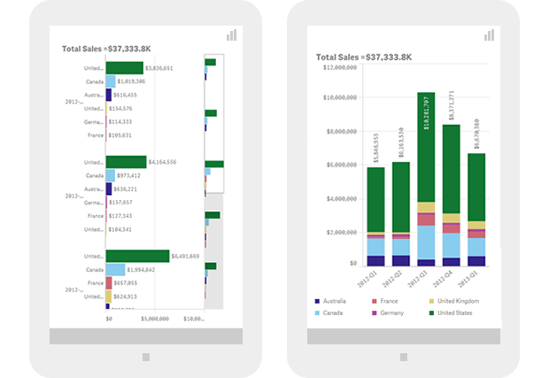
Even if the grouped bar chart is a perfect legible data visualization in a desktop or laptop computer, would it be my first choice if the chart is going to be consumed on the screen of a 4” mobile device? The answer will probably be no. Instead, I might want to create a horizontal bar chart, or even perhaps change the chart type to a stacked bar chart in order to simplify the user experience.
CPU, memory, and network connectivity responsive model
Since each device’s CPU and memory are two factors that may limit the amount of data a device can handle, it would be good to aggregate large data sets prior to sending it over to the device. This will minimize the in-device processing time but also generate a new dataset that might require a whole new visual representation. Ideally we should be able to display different levels of data aggregation and therefore different chart types based on the device’s processing power.
The same rationale applies to mobile data connectivity. In order to optimize the user experience, we should be able to detect when a device is in a poor reception area or belongs to a slow network. This would allow us to dynamically choose the chart type that best fits the particular conditions.
Responsive data visualization is still a challenge for developers and designers and in the years to come we need to develop new responsive data visualization principles similar to the “How to choose the right chart.” These principles would set guidelines on how to present data considering factors such as device screen dimensions, computational power, or wireless data connectivity. This new model will guide us through the decision making process on what chart type to choose but also on how the chart will morph and transform to effectively communicate data insights on different devices, from desktops and mobiles phones to tiny wearables screens.
You must be a registered user to add a comment. If you've already registered, sign in. Otherwise, register and sign in.