Unlock a world of possibilities! Login now and discover the exclusive benefits awaiting you.
- Qlik Community
- :
- Forums
- :
- Analytics & AI
- :
- Products & Topics
- :
- App Development
- :
- Re: Table chart with progress bar
- Subscribe to RSS Feed
- Mark Topic as New
- Mark Topic as Read
- Float this Topic for Current User
- Bookmark
- Subscribe
- Mute
- Printer Friendly Page
- Mark as New
- Bookmark
- Subscribe
- Mute
- Subscribe to RSS Feed
- Permalink
- Report Inappropriate Content
Table chart with progress bar
Hey peoplee,
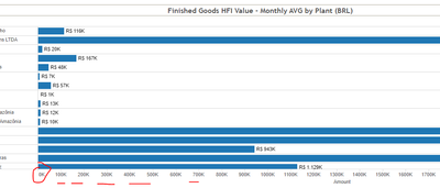
I am wondering is it possible to add some kind of more detailed x-axis in Qlik table, something easier for user to follow the numbers and values.
More easy to understand my question: is it possible and how to add this red thing I draw at the picture 🙂 ?
(this is Qlik table chart)
Thankkk you in advance!
Accepted Solutions
- Mark as New
- Bookmark
- Subscribe
- Mute
- Subscribe to RSS Feed
- Permalink
- Report Inappropriate Content
Unfortunately we don't have anything like this in QlikSense yet, but you may submit a feature request for Qlik to hopefully add this in future releases
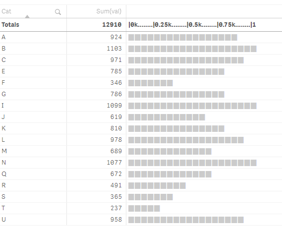
This is what I tried, kind of a hack! I won't recommend using this because
- you need to define static steps
- and the gaps need to be taken care of manually which can be off at times and can be misleading
but just sharing anyways
=IF(ROWNO()=0,concat( distinct '|' &valueloop(0,ceil(MAX(TOTAL AGGR(Sum(val),Cat)),100),250) /1000  ,'k........'),
repeat('▉',ceil((Sum(val)/MAX(TOTAL AGGR(Sum(val),Cat)))*20))
)
If a post helps to resolve your issue, please accept it as a Solution.
- Mark as New
- Bookmark
- Subscribe
- Mute
- Subscribe to RSS Feed
- Permalink
- Report Inappropriate Content
you can add a new column like below
=repeat('▉',ceil((Sum(sales)/Sum(total sales))*20))
If a post helps to resolve your issue, please accept it as a Solution.
- Mark as New
- Bookmark
- Subscribe
- Mute
- Subscribe to RSS Feed
- Permalink
- Report Inappropriate Content
Thank you, that is cool idea for some occasions, but this time i want it to be like this visualization in Tableau (see below number sections)
- Mark as New
- Bookmark
- Subscribe
- Mute
- Subscribe to RSS Feed
- Permalink
- Report Inappropriate Content
Hi,
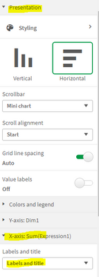
Please find attached image from Qlik sense,
To achieve this, you need to select Labels and title from X-axis property, you will get it from below path,
Presentation-> x axis -> Labels and title.
Regards,
Vishal
- Mark as New
- Bookmark
- Subscribe
- Mute
- Subscribe to RSS Feed
- Permalink
- Report Inappropriate Content
Unfortunately we don't have anything like this in QlikSense yet, but you may submit a feature request for Qlik to hopefully add this in future releases
This is what I tried, kind of a hack! I won't recommend using this because
- you need to define static steps
- and the gaps need to be taken care of manually which can be off at times and can be misleading
but just sharing anyways
=IF(ROWNO()=0,concat( distinct '|' &valueloop(0,ceil(MAX(TOTAL AGGR(Sum(val),Cat)),100),250) /1000  ,'k........'),
repeat('▉',ceil((Sum(val)/MAX(TOTAL AGGR(Sum(val),Cat)))*20))
)
If a post helps to resolve your issue, please accept it as a Solution.
- Mark as New
- Bookmark
- Subscribe
- Mute
- Subscribe to RSS Feed
- Permalink
- Report Inappropriate Content
This is for bar chart, i need this for TABLE Chart 🙂
Thx anywayy
- Mark as New
- Bookmark
- Subscribe
- Mute
- Subscribe to RSS Feed
- Permalink
- Report Inappropriate Content
Hello @ena1309 ,
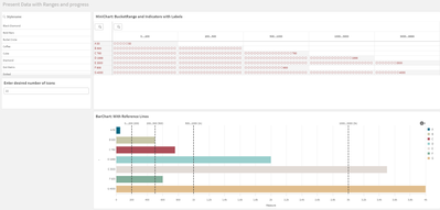
I know you marked this one as solved and I am glad that @vinieme12 came to the rescue. However, I was reading this post yesterday and I couldn't get my mind of it. I really wanted to know what your example represents, or what you are exactly you are trying to achieve. The why behind this problem. In Qlik there is an obvious choice to use a bar chart with reference lines that you could use for visualizing the progress. But you really wanted a table, so I wonder why...
Unfortunately there is no option for adding a minichart with your requirement. See also this post/answer by @Dalton_Ruer . https://community.qlik.com/t5/New-to-Qlik-Sense/Horizontal-bar-in-table/td-p/1804814
I came up with a solution (and thanks for the inspiration @vinieme12 ) in a pivot table. This requires that the data must be prepared within the load editor though. See screenshot.
Have a nice day,
Regards Eddie
- Mark as New
- Bookmark
- Subscribe
- Mute
- Subscribe to RSS Feed
- Permalink
- Report Inappropriate Content
Heyy Eddie,
Love your contribution every time! 🙂
Well, I am doing some recreation of Tableau dashboards to Qlik, so idea is that they have to be as similar as possible. In this particular case I have multiple columns/dimensions and that's why U need it to be table, instead of bar chart. (see the picture: it has three columns first, and then the measure)
Check the printsrceen from Tableau(so you could see what was the idea i will just scramble the values because of the data sensitivity) :
So in Tableau it is more easy for human eye to follow these mini bars, and I wanted that effect in Qlik 😄
Anyway thankkkk you
- Mark as New
- Bookmark
- Subscribe
- Mute
- Subscribe to RSS Feed
- Permalink
- Report Inappropriate Content
Hello @ena1309 ,
Thanks for your compliment and also thanks for the reply.
I first thought you would like to segment the data, but you are looking for a table with a scale. Hmmm, that should be possible, but also with some 'hacks' I think. The question that still remains, how do you keep such a table readable for a user? Are they filtering for the dimensions they need? Or are they comparing the data like what is 'this part' doing compared to 'other parts'? If the use case is something that could be generic for all Qlikkies or users, than I would suggest to post this as an idea in the idea section here .
In the meantime I will think about a 'solution' to solve this.
Regards
Eddie


