Unlock a world of possibilities! Login now and discover the exclusive benefits awaiting you.
- Qlik Community
- :
- Forums
- :
- Archive
- :
- Archived Groups
- :
- Line chart with stacic max
- Subscribe to RSS Feed
- Mark Topic as New
- Mark Topic as Read
- Float this Topic for Current User
- Bookmark
- Subscribe
- Mute
- Printer Friendly Page
- Mark as New
- Bookmark
- Subscribe
- Mute
- Subscribe to RSS Feed
- Permalink
- Report Inappropriate Content
Line chart with stacic max
Hi,
this is an issue I don't know to solve:
I have a line chart where sometime I have value very hight:
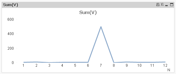
So variations on the rest of the values cant be appreciated. On this scenario, a value over 10 is a "very hight value", and I don't care about the value.
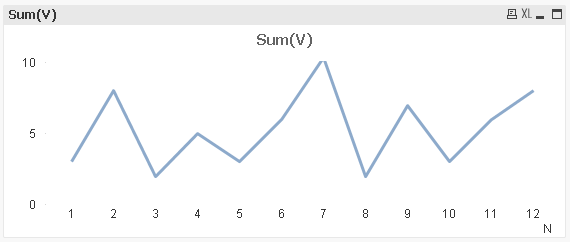
To solve this I set the static max on the scale to 10, but get this result:
What I expected to get is a graph where the line goes out the upper limit. Something like this:
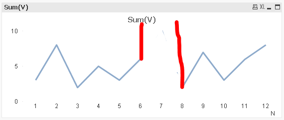
This way I can see the evolution of rest of values, and see there is a very hight value. As I said, I don't need to know the value of this value, only that it exists.
Anyone know how to solve it?
Accepted Solutions
- Mark as New
- Bookmark
- Subscribe
- Mute
- Subscribe to RSS Feed
- Permalink
- Report Inappropriate Content
As a workaround, you may fill your linchart or use a plateau presentation of your line.
- Mark as New
- Bookmark
- Subscribe
- Mute
- Subscribe to RSS Feed
- Permalink
- Report Inappropriate Content
Consider that you want to show line chart for Sales by Customer
Dimension = Customer
Expression = SUM(Sales)
You can use below two expression under Axes >> Scale >> Static Min and Static Max
=Min(Aggr(SUM($(vSaleinEURO)),[Customer Name]))*1.1
=Max(Aggr(SUM($(vSaleinEURO)),[Customer Name]))*1.1
Hope this will help you
- Mark as New
- Bookmark
- Subscribe
- Mute
- Subscribe to RSS Feed
- Permalink
- Report Inappropriate Content
Hi, thanks for the reply, but this is not what I want do...
your solution fits the static max and min in the scale to the max and min values of the the sales...
what I want is set a static max that is lower than the max value, but if I do this, the graph shows wrong information: Graph 1 and graph 2 have the same data, but on graph 2 shows that "customer 7" has a sales of 10, when the real value is 500
btw, you should change the *1.1 in the min formula to *0.9 to avoid the same problem than me.
- Mark as New
- Bookmark
- Subscribe
- Mute
- Subscribe to RSS Feed
- Permalink
- Report Inappropriate Content
Can you upload your sample file or apps?
- Mark as New
- Bookmark
- Subscribe
- Mute
- Subscribe to RSS Feed
- Permalink
- Report Inappropriate Content
Here there is
- Mark as New
- Bookmark
- Subscribe
- Mute
- Subscribe to RSS Feed
- Permalink
- Report Inappropriate Content
As a workaround, you may fill your linchart or use a plateau presentation of your line.
- Mark as New
- Bookmark
- Subscribe
- Mute
- Subscribe to RSS Feed
- Permalink
- Report Inappropriate Content
Hi, thanks Sven
Fill the line chart solves the bug, but now I can´t add another line to the chart, because it adds the two values. The problem with the plateau is that the two lines overlaps and is not clear.
I think I will put two charts.