Unlock a world of possibilities! Login now and discover the exclusive benefits awaiting you.
- Qlik Community
- :
- Forums
- :
- Archive
- :
- Archived Groups
- :
- Line Graph Bug
- Subscribe to RSS Feed
- Mark Topic as New
- Mark Topic as Read
- Float this Topic for Current User
- Bookmark
- Subscribe
- Mute
- Printer Friendly Page
- Mark as New
- Bookmark
- Subscribe
- Mute
- Subscribe to RSS Feed
- Permalink
- Report Inappropriate Content
Line Graph Bug
I have some problems representing the data:
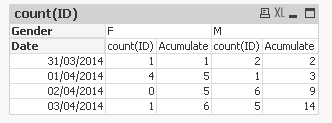
I have a table with users, where I store the day it was created and the gender:
I want to draw two graphs: One with number of new users each day and the accumulate total of users each day, both by gender.
I can build a pivot table that shows the data fine:
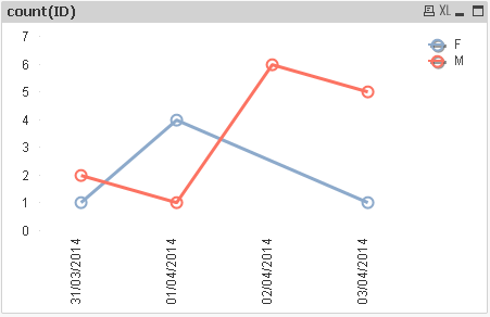
But when I try to draw it, qlikview fails. The problem is produced because on '02/04/2014' there were 0 new female users.
If I draw a graph with new users each day:
Looks like day 2 there were 2 new females.
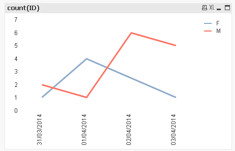
Also, when I try to draw the accumulate graph:
Looks like day 2, the female users were removed.
I have uploaded a qvw sample file.
Anyone knows how solve those two bugs?
- Tags:
- Group_Discussions
- Mark as New
- Bookmark
- Subscribe
- Mute
- Subscribe to RSS Feed
- Permalink
- Report Inappropriate Content
Like this?
- Mark as New
- Bookmark
- Subscribe
- Mute
- Subscribe to RSS Feed
- Permalink
- Report Inappropriate Content
line charts are continuous in nature that's the reason we use them to show trend.(growth or decline)
for you problem you may use symbols along with lines in your chart.
where ever you have a valid data point there the symbol will appear and easy to read.