Unlock a world of possibilities! Login now and discover the exclusive benefits awaiting you.
- Qlik Community
- :
- Blogs
- :
- Technical
- :
- Design
- :
- Branching out with Treemaps
- Subscribe to RSS Feed
- Mark as New
- Mark as Read
- Bookmark
- Subscribe
- Printer Friendly Page
- Report Inappropriate Content
In our journey to explore the vast selection of chart options that Qlik has to offer we have covered most of the well-known offerings, but now we begin to explore those that might be new to you. While these charts might be lesser known, they are still a powerful tool for users to display their data and create visualizations. Today we will be exploring the lesser known, Treemap charts.
What is a Treemap?
Treemaps show hierarchical data as a series of rectangles. Each data rectangle’s size is proportionate to the specific variable. Treemaps are wonderful for showing a vast amount of data without taking up much room in your sheet. Let’s take a look at a few examples to better understand.
What information do we gain from this example?
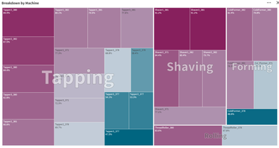
Here we have treemap chart from an app called Overall Equipment Efficiency. For context: the purpose of this app is to show performance and potential inefficiencies in a sheet metal manufacturing factory. The manufacturing process is divided into four stages, Tapping, Shaving, Forming and Rolling, all of which are displayed in our chart above. Each of these stages have various machines that handle that stage of the process. Our treemap is showing the efficiency of each of the machines and giving us a visual of which machines are most efficient and least efficient.
In application
Let’s think of this from the viewpoint of a plant manager, why would this visualization be useful to us, and how could we use it? Quickly at a glance we’d notice the distribution of machines for each stage, Tapping being the biggest followed by Shaving, Forming then Rolling.
With this information we might concentrate on training operators, accordingly, assigning most to Tapping and the least to the specialization of Rolling. This information could be used when ordering replacement parts, ordering parts for the Tapping machines because the efficiency is so low on half of the machines in that area, while doing the same for Rolling. Even though there are less machines for Rolling, 1 of the 2 machines has a low efficiency, requiring repairs often. Additionally, we see that the Shaver, while having many machines, does not lose efficiency often, thus not requiring repairs often. We’re able to display this information in only a 12x6 portion of our sheet leaving room for additional visualizations.
So that is treemaps and how you can use them. Do you have any ideas that I might have missed pertaining to treemaps? Can you think of a better way to use them? Have you been able to write an expression to get a treemap to achieve a certain idea of yours? If so, write it in a comment down below and share it with the community.
You must be a registered user to add a comment. If you've already registered, sign in. Otherwise, register and sign in.
