Unlock a world of possibilities! Login now and discover the exclusive benefits awaiting you.
- Qlik Community
- :
- Blogs
- :
- Technical
- :
- Design
- :
- Copy & Paste Style
- Subscribe to RSS Feed
- Mark as New
- Mark as Read
- Bookmark
- Subscribe
- Printer Friendly Page
- Report Inappropriate Content
There have been new Qlik Sense features the past few months that I was excited to see. One of my favorites, which I am sure you are aware of, is the layout container. If you have not heard about it, check out Michael’s blog post here. Another favorite of mine is the copy and paste style feature which allows developers to copy and paste styles from one visualization to another. With all the styling options available in visualizations, being able to copy and paste styles saves time and eliminates the need to go into the styling properties of each visualization and set all the styling options you would like to use.
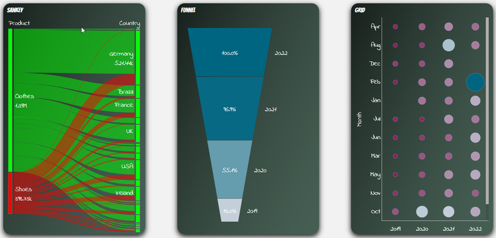
Some of the latest charts that have been upgraded to the new styling property panel are the Grid, Funnel and Sankey, giving users the ability to customize the title, subtitle, footnote, and background of a chart as well as the style the axes, labels, legends, and values in a visualization. Borders and shadows can be added to these visualizations as well.
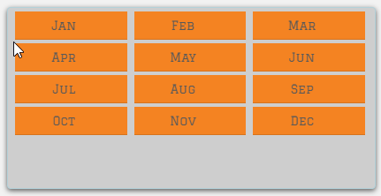
The Filter Pane now has font styling for the title, subtitle, footnote, and header as well as font header and content styling. Like the charts above, borders and shadows can be added as well. Developers can change the background color or use an image in the background and control the color of the selected state. Here are a few examples.
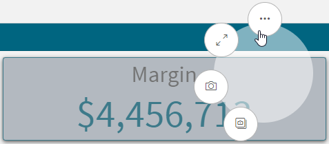
With all these styling options, it is awesome that developers can now copy and paste the style from one visualization to another. If you remember the QlikView days, you know how valuable this feature is. Assume I have an app with a theme applied and have made some styling changes to the Margin KPI (see image below). If I want to apply the same styling changes to the Margin %, I have two options. One option is to open the styling properties of the Margin % KPI and make the same changes to the background color, border color and shadowing.
The second option and the easiest option is to right click on the Margin KPI while in Edit mode, click on the three dots (…) and select Copy style.
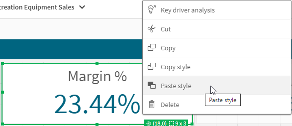
Then right click on the Margin % KPI, click on the three dots (…) and select Paste style.
That is a lot easier than styling the KPI manually, especially if there are multiple visualizations to update.
There are a few limitations to using the copy and paste style - you cannot copy and paste the style in a map or a master visualization. New styling properties for visualizations are being add all the time, giving users many options to style and make their app stand out. The copy and paste functionality is a great addition to Qlik Sense and makes designing and styling apps easier.
Thanks,
Jennell
You must be a registered user to add a comment. If you've already registered, sign in. Otherwise, register and sign in.
