Unlock a world of possibilities! Login now and discover the exclusive benefits awaiting you.
- Qlik Community
- :
- Blogs
- :
- Technical
- :
- Design
- :
- Dashboard 101 - Creating a dashboard
- Subscribe to RSS Feed
- Mark as New
- Mark as Read
- Bookmark
- Subscribe
- Printer Friendly Page
- Report Inappropriate Content
If I say the word “Dashboard”, most readers probably think of a software tool that gives an overview of enterprise health, rather than of a control panel in front of the driver in a vehicle. One is in a computer, and the other is in a car, but they should play the same role; it should alert you when something is wrong. So where do we start when creating a dashboard for business users?
I follow a D-A-R concept: dashboard-analysis-report. The first QlikView tab, the dashboard, tells users what is good or bad. It’s the “what” sheet. The next batch of tabs is for analysis and has graphs and tables which tell users “how” or “why” things are good or bad. The last part, the report sheet, has more detailed information such as invoice details, order details, employees’ shifts and so on where users can identify the exact action item to act on. So when creating a dashboard, it’s important to highlight the “what” in it.
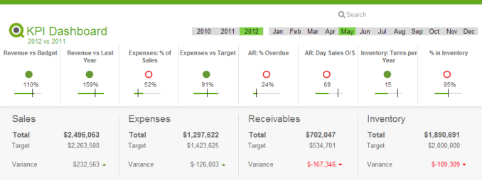
The first step is to identify the key metrics. The fewer the better. Don’t place 50 KPI’s to try to characterize the entire company in a dashboard, but rather the major ones that matter the most. Pick metrics that change every day if the dashboard is to be utilized daily.
Secondly, make sure all KPI’s have a comparison. Human beings are trained to compare everything 24/7. If your sales figure is 3 million dollars, then so what? Is it better than yesterday’s number? You need to place a comparison number to indicate whether it is better or worse.
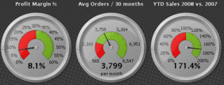
Next, don’t use the color green when something is good. If you have 4 KPI’s (key performance indicators) and two of them are green and the other two are red, then people take it as 50% good, not 50% bad. You want users to focus on the ‘bad’ part so they can act on it. Only color-code what is bad, that is, red.
Compare with a dashboard in a car. It does not alert you when something is doing well, but it is designed to alert you on the bad things. Think about the fuel light. It’s not lit in green when your car has enough fuel. Instead it alerts you when fuel is critically low. Then it comes on in red and you notice it right away. It grabs your attention and personally I even get nervous when I see it.
Think about a usage of gauges. A big number with a small red color indicator will do a better job to alert users than a round gauge with both green and red in it.

Bottom line: When designing a dashboard, make sure to keep it as simple as possible. When a user looks at it for 10 seconds and looks away, she or he should remember what was bad. Otherwise, it is not playing its fundamental role and is just pretty to look at.

Executive Dashboard on demo.qlik.com.
Here is a technical brief on this topic.
You must be a registered user to add a comment. If you've already registered, sign in. Otherwise, register and sign in.