Unlock a world of possibilities! Login now and discover the exclusive benefits awaiting you.
- Qlik Community
- :
- Blogs
- :
- Technical
- :
- Design
- :
- QlikView Control (SPC) Chart
- Subscribe to RSS Feed
- Mark as New
- Mark as Read
- Bookmark
- Subscribe
- Printer Friendly Page
- Report Inappropriate Content
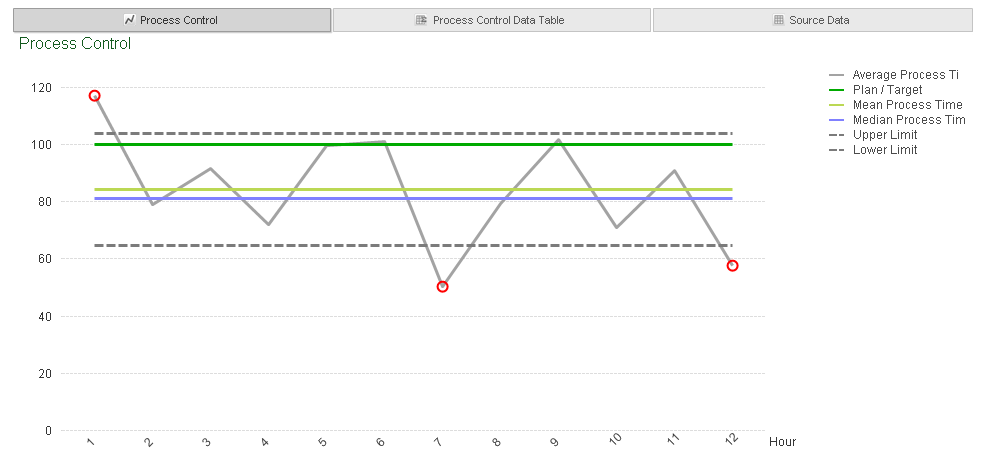
I was asked recently if I could produce a standard control chart or SPC chart in QlikView. So I thought I would share this on the blog.
SPC and Control charts are ways of tracking if a process is "in control". If you take a look at the Wikipedia entry below you can see that Control charts have been in existence for nearly a 100 years, and are still used today, especially with the introduction of 6 sigma in 1995.
"The control chart was invented by Walter A. Shewhart while working for Bell Labs in the 1920s. The company's engineers had been seeking to improve the reliability of their telephony transmission systems. Because amplifiers and other equipment had to be buried underground, there was a business need to reduce the frequency of failures and repairs. By 1920, the engineers had already realized the importance of reducing variation in a manufacturing process. Moreover, they had realized that continual process-adjustment in reaction to non-conformance actually increased variation and degraded quality. Shewhart framed the problem in terms of Common- and special-causes of variation and, on May 16, 1924, wrote an internal memo introducing the control chart as a tool for distinguishing between the two."
(https://en.wikipedia.org/wiki/Control_chart)
In this QlikView example of a control chart I have tried to give you a number of reference lines and also used the Standard Deviation functon to drive our control limits. The chart itself is dynamic and will react to any selections made wihtin the application. This will let you monitor your process control by any dimension you add such as Country, Region, Plant and also specific products and time periods.
You can find the application and document here.
You must be a registered user to add a comment. If you've already registered, sign in. Otherwise, register and sign in.