Unlock a world of possibilities! Login now and discover the exclusive benefits awaiting you.
- Qlik Community
- :
- Blogs
- :
- Technical
- :
- Design
- :
- The Canadian Newsroom Diversity Survey data visual...
- Subscribe to RSS Feed
- Mark as New
- Mark as Read
- Bookmark
- Subscribe
- Printer Friendly Page
- Report Inappropriate Content
Happy 2022 to everyone, and this time for real we need a good one 😉
In this occasion we teamed up with The Canadian Association of Journalists to explore the landscape of newsrooms and journalists in Canada. The Canadian Association of Journalists run an annual diversity survey for the first time ever in Canada inquiring more than 200 newsrooms nationwide about the race and gender profile of its newsroom’s employees. It is Canada’s largest survey of the race and gender of those who work in media, including data from almost 4000 journalists.
We architected the site to welcome casual readers into to the topic by starting with a description of the demographics of the Canadian newsrooms. We discovered that, from those who reported gender or race, the majority are white (75%). Across all races/ethnicities slightly more women (53%) work in Canadian newsrooms.
To help readers to understand the data and the composition of the newsrooms in Canada we plotted and interesting first chart. It contains one area block (colored squares) per each journalist in the survey, that is 3873 squares. Then we assigned each journalist, each square, to a group based on their attributes. This way we can explore the landscape of journalism in Canada.
Readers can toggle between different mix options and explore the data freely learning along the way.
Once the reader is familiarized with the “raw” data using the chart described above, any of us can see how 75% of the reported journalists are “white” in Canada, but what that really means? is that a lot?
Adding context
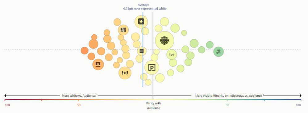
Each newsroom serves an audience, some work for the entire country and some only for a small community. We mixed the survey data with Canadian Census data about audience specific race and gender. Now we can compare each newsroom to its audience and determine if it’s a good representation of the people it serves.
In the chart below readers can see each newsroom in the survey and identify those that are in parity with their audience. We discovered that, on average, white journalists are over-represented in the newsrooms. Similar analysis is available for gender
The follow up question leads up to the next charts, now that we know how each newsroom are compared with the audiences they serve, we want to know who really makes the decisions in the newsrooms, are more women in charge?
Visualizing leadership
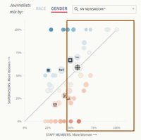
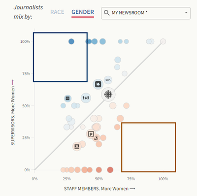
We compared the percentage of women supervisors to the percentage of women staff to add context to our chart as well. We can read this chart in different ways, if we pay attention to the y-axis, we can explore all the newsrooms that have 50% or more women that men in a supervisor role. Alternatively, we could look at the other axis (x-axis) to discover the newsrooms that employees more women.
By looking at our reference line we can easily spot those newsrooms where the number of women supervisors is proportional to the number of women in the newsroom.
These two spots I highlighted in the capture above show the extremes. On one hand the blue squared area contains the newsrooms that have a disproportionally large percentage of women in a supervisor role compared with a low number of staff women percentage. The area enclosed in the red square would show the newsrooms where a very low percentage of women supervisors would work in a women intensive newsroom.
Who is getting better jobs
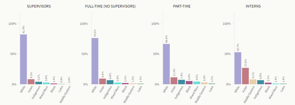
Now that we know the gender and race/ethnicity shape of the Canadian Newsrooms a question arise, who is getting better jobs? Are more better jobs reserved for a particular race/ethnicity or a gender?
We used simple charts to represent this data, all the chart share the same y-axis so we can quickly compare the results as you move left to right, from better paid jobs to the entry level ones.
I’d say that it is safe to affirm that journalists, as all of us are, are biased beings. Many journalists tend to focus more on topics that are related to the social class they interact with, or about issues of their own gender or race/ethnicity. Thus, knowing the composition of newsrooms in Canada, or elsewhere, becomes a very important matter for all of us when it comes to better understand the food we are being served by the media.
I hope you enjoy this project as much as I did working on it.
You must be a registered user to add a comment. If you've already registered, sign in. Otherwise, register and sign in.


