Unlock a world of possibilities! Login now and discover the exclusive benefits awaiting you.
- Subscribe to RSS Feed
- Mark as New
- Mark as Read
- Bookmark
- Subscribe
- Printer Friendly Page
- Report Inappropriate Content
The Dashboard bundle contains six of the most popular extensions available in Qlik Branch (Garden).
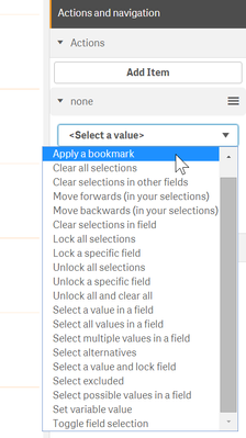
Button for navigation: it’s a very handy piece that let users to add buttons that trigger selection actions and/or navigation actions. Users can use it for simple navigation shortcuts, like navigating to next page or they could use it for more advanced actions, such as selection actions.
A user could use one or multiple actions on click making the button a very attractive tool to create complex workflows within an app. This extension is commonly used to set variables values.
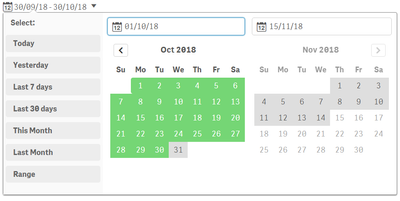
Date range picker: this nicely finished date picker allows users to quickly and easily select dates and ranges. It’s very simple to configure, a user need to specify what data field the Data range picker will be displaying and single date or interval. The extension let users to define advanced options such as min, max, and/or start date.
On-Demand reporting: generation of Qlik NPrinting reports is now possible from inside apps. This extension will display a button that will launch the execution of a Qlik NPrinting report. Simply add a NPrinting server path, pick an app, the report and the preferred export format.
Show/hide container: it’s a placeholder for master items. This extension let users to decide when to show or hide each one of the elements that are contained in the object. To get the show/hide conditions to work users typically need an action on a second object.
For example, it’s very common to use this extension in conjunction with the “Button for navigation” extension that comes in the bundle. The Button extension triggers an action that will make a chart show and other to hide.
Another use example could be based on selection actions. Let’s say we have two fields, product categories (5) and product (200) and we are analyzing sales numbers, we want to display sales date by category as a bar chart and when a single category is selected we want the chart to display the products sales as a tree map. We could create both charts add them to the master library and then define the show/hide conditions when including the charts in the extension.
Tabbed container: like the Show/hide container, the Tabbed container can hold multiple master items. This time to navigate from on item to another there’s a pre-built tab system, so there’s no need for a second element. Users could create multiple views of the same data, different objects, or as in the screenshot below to add a long description that helps users’ comprehension of the displayed chart.
Variable input: users can set values with buttons, drop-downs, sliders, and input boxes. More info about this extension in one of my previous posts.
Please check the online help to learn more about the new Dashboard Bundle and its limitations:
Hope you like it. AMZ
You must be a registered user to add a comment. If you've already registered, sign in. Otherwise, register and sign in.


