Unlock a world of possibilities! Login now and discover the exclusive benefits awaiting you.
- Qlik Community
- :
- Forums
- :
- Analytics & AI
- :
- Products & Topics
- :
- Integration, Extension & APIs
- :
- Re: Qlik Sense - Forecasting with R
- Subscribe to RSS Feed
- Mark Topic as New
- Mark Topic as Read
- Float this Topic for Current User
- Bookmark
- Subscribe
- Mute
- Printer Friendly Page
- Mark as New
- Bookmark
- Subscribe
- Mute
- Subscribe to RSS Feed
- Permalink
- Report Inappropriate Content
Qlik Sense - Forecasting with R
Hi All,
we would like to implement a line chart which shows a trend about actual data and also for the future it has to show forecasted values generated by R script ( for ex.: fit = nnetar(rev(q$close)); rev(data.frame(forecast(fit,h=$(Forecast_Days)))[,1]))
).
Can it be done in one chart ?
We only was able to do this in two, first had the actual data from the data model second had the forecasted values.
Regards,
Istvan
- « Previous Replies
-
- 1
- 2
- Next Replies »
Accepted Solutions
- Mark as New
- Bookmark
- Subscribe
- Mute
- Subscribe to RSS Feed
- Permalink
- Report Inappropriate Content
Here's my take on this, add some empty lines in the response.
Sorry, not really an R programmer.
- Mark as New
- Bookmark
- Subscribe
- Mute
- Subscribe to RSS Feed
- Permalink
- Report Inappropriate Content
hi
it can be done ,
you'll need to create a extra values in your date field , and then
you can display both actual and forecast
- Mark as New
- Bookmark
- Subscribe
- Mute
- Subscribe to RSS Feed
- Permalink
- Report Inappropriate Content
Hi lironbaram,
like this:
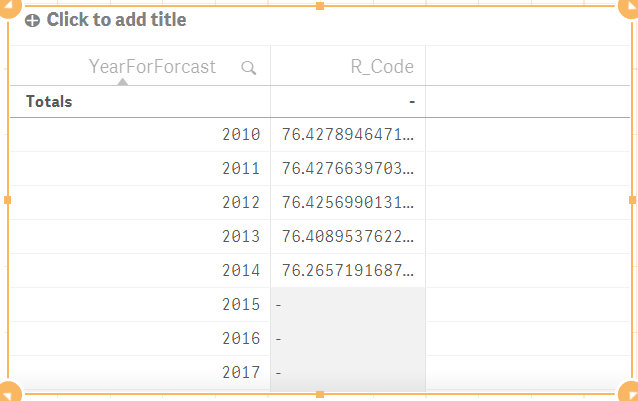
JustForTest:
Load * Inline [
Year, Measure, YearForForcast
2010, 100, 2010
2010, 50, 2010
2011, 100, 2011
2011, 60, 2011
2012, 88, 2012
2012, 77, 2012
2013, 200, 2013
2013, 10, 2013
2014, 16, 2014
2014, 250, 2014
2015, 250, 2015
2015, 230, 2015
,, 2016
,, 2017
,, 2018
,, 2019
,, 2020
];
BTW we are using 17 Jun.
Regards,
Daniel
- Mark as New
- Bookmark
- Subscribe
- Mute
- Subscribe to RSS Feed
- Permalink
- Report Inappropriate Content
yes
or you can create different table with prediction dates
and just call the field with the same name
when creating a report the values from the two tables will be combined
- Mark as New
- Bookmark
- Subscribe
- Mute
- Subscribe to RSS Feed
- Permalink
- Report Inappropriate Content
Hi,
We tried it, but always put the forecasted data to the begining of the timeline, as the pictures shows: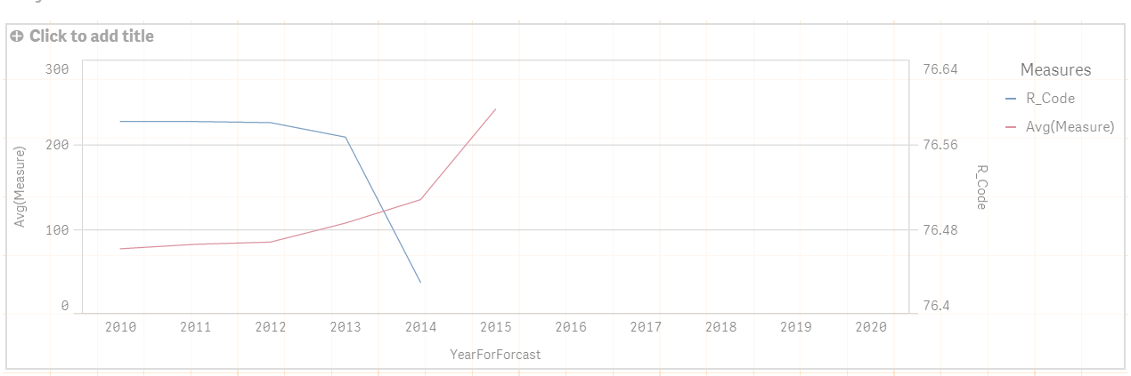
Is it possible to put the two line one after the another?
Regards,
Istvan.
- Mark as New
- Bookmark
- Subscribe
- Mute
- Subscribe to RSS Feed
- Permalink
- Report Inappropriate Content
can you share the app
- Mark as New
- Bookmark
- Subscribe
- Mute
- Subscribe to RSS Feed
- Permalink
- Report Inappropriate Content
Hi,
Yes. We made some changes, but basically the problem is still the same.
Regards,
Istvan.
- Mark as New
- Bookmark
- Subscribe
- Mute
- Subscribe to RSS Feed
- Permalink
- Report Inappropriate Content
HI
if you change the number of periods you want to forecast
then it draws a line for future periods also
so what excatly is missing from your point of view
- Mark as New
- Bookmark
- Subscribe
- Mute
- Subscribe to RSS Feed
- Permalink
- Report Inappropriate Content
Hi,
We want to place the actual data and forecasted data in one chart and in one line, but when we tried this, the forecasted data always placed in the beginning of the line chart, not the end of it e.g. 2018 since it is a forecast.
So we have this:
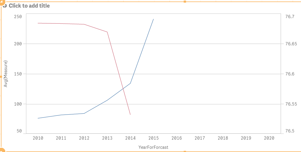
But we want like this:

We also tried to binding the actual data with the forecasted data within R script and used calculation condition for the coloring, but the order of the rows of the result wasn't correct.
Regards,
Istvan.
- Mark as New
- Bookmark
- Subscribe
- Mute
- Subscribe to RSS Feed
- Permalink
- Report Inappropriate Content
Here's my take on this, add some empty lines in the response.
Sorry, not really an R programmer.
- « Previous Replies
-
- 1
- 2
- Next Replies »