- Mark as New
- Bookmark
- Subscribe
- Mute
- Subscribe to RSS Feed
- Permalink
- Report Inappropriate Content
Scatterplot with no aggregation and with conditional expression
Hi Everyone,
I am trying to create a simple Scatter Plot without aggregation but with a condition.
My dataset is like this:
CD OFC_NO BKT VOL PCTG
XY 1 30 5 100
XY 2 30 15 100
XY 3 30 9 64.3
XY 3 100 5 35.7
AB 1 30 36 97.3
AB 2 100 1 2.7
AB 3 30 15 75
AB 3 45 1 5
The data is pre-aggregated.
I want to show a simple Scatter Plot (no aggregation) of OFC_NO as Dimension (so 1 bubble per OFC_NO), BKT as x-measure, PCTG as y-measure, VOL as size of bubble.
Following the examples given in Qlik community board, I see that I just have to give (BKT) instead of Sum(BKT) and (PCTG) instead of Sum(PCTG), and (VOL) instead of Sum(VOL).
However, an additional requirement is to restrict the chart to CD=="XY".
I can't do this using a filter panel/selection as I need to show the chart exactly for CD=="XY".
After looking up solved problems in the board, I see Qlik Sense lets me use a conditional expression like this but only if I do a Sum():
Sum({<CD = {"FS"}>} BKT)
but this is not allowed:
({<CD = {"FS"}>} BKT)
Is there any way of doing this without aggregation?
Thanks,
Atish
- Tags:
- sense
- « Previous Replies
-
- 1
- 2
- Next Replies »
Accepted Solutions
- Mark as New
- Bookmark
- Subscribe
- Mute
- Subscribe to RSS Feed
- Permalink
- Report Inappropriate Content
Quick question
below 2 rows. how do you want to show them if its not aggregated. because it doesnt make sense not to aggregate in some way. (maybe i am missing something).
XY,3,30,9,64.3
XY,3,100,5,35.7
because dimension is the same (OF NO = 3). Only function for above dimension value will fail because of multiple values (see below).
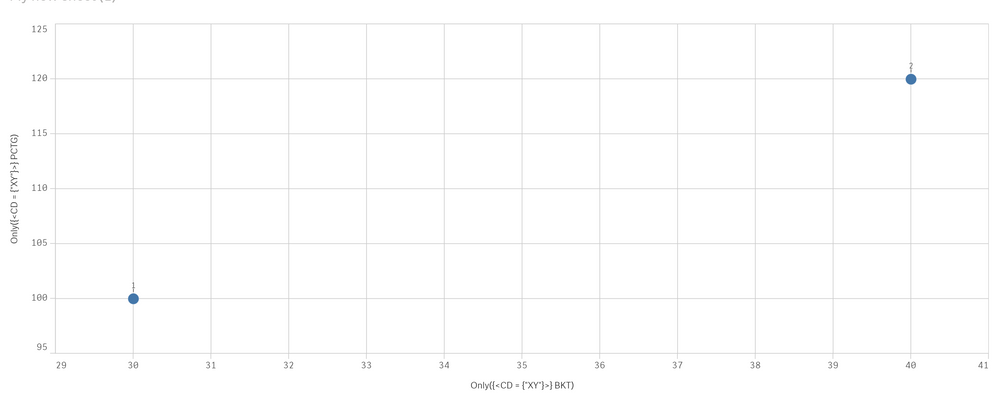
i updated the values slightly and measure below gives a result
load * inline [
CD,OFC_NO,BKT,VOL,PCTG
XY,1,30,5,100
XY,2,40,15,120
XY,3,30,9,64.3
XY,3,100,5,35.7
AB,1,30,36,97.3
AB,2,100,1,2.7
AB,3,30,15,75
AB,3,45,1,5
];
x - Only({<CD = {"XY"}>} BKT)
y- Only({<CD = {"XY"}>} PCTG)
result (OF NO 3 missing because of multiple values) -
- Mark as New
- Bookmark
- Subscribe
- Mute
- Subscribe to RSS Feed
- Permalink
- Report Inappropriate Content
Only ({<CD = {"FS"}>} BKT)
please note only function will return '-' if more than 1 value is present based on the dimension
https://community.qlik.com/t5/Qlik-Design-Blog/The-Only-Function/ba-p/1468056
- Mark as New
- Bookmark
- Subscribe
- Mute
- Subscribe to RSS Feed
- Permalink
- Report Inappropriate Content
Unfortunately, it didn't work.
In fact, I tried the solution proposed in the url below with a simpler dataset (only the CD=="FS" data, loaded from a separate CSV), and it didn't work either:
https://community.qlik.com/t5/New-to-Qlik-Sense/simple-scatter-plot-without-aggregation/td-p/59586
This was where the solution of removing Sum from the expression was proposed.
- Mark as New
- Bookmark
- Subscribe
- Mute
- Subscribe to RSS Feed
- Permalink
- Report Inappropriate Content
- Mark as New
- Bookmark
- Subscribe
- Mute
- Subscribe to RSS Feed
- Permalink
- Report Inappropriate Content
Share a sample app/data if you can.
Will check it out.
Only is the way to go if you don't want to aggregate and have set analysis.
Try the function on a table first to debug
- Mark as New
- Bookmark
- Subscribe
- Mute
- Subscribe to RSS Feed
- Permalink
- Report Inappropriate Content
I kept the following data in test2,csv:
OFC_NO,BKT,VOL,PCTG
1,30,5,100
2,30,15,100
3,30,9,64.3
3,100,5,35.7
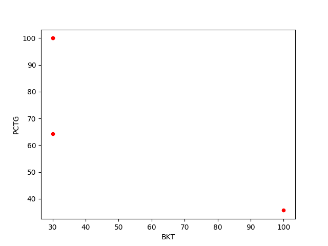
and then imported into pandas and plotted as a scatterplot:
import pandas as pd
import matplotlib.pyplot as plt
df = pd.read_csv("test2.csv")
df
Out[9]:
OFC_NO BKT VOL PCTG
0 1 30 5 100.0
1 2 30 15 100.0
2 3 30 9 64.3
3 3 100 5 35.7
df.plot(kind='scatter',x='BKT', y='PCTG',color='red')
plt.show()
and the scatterplot showed ok.
- Mark as New
- Bookmark
- Subscribe
- Mute
- Subscribe to RSS Feed
- Permalink
- Report Inappropriate Content
test.csv contains the data I gave in my example:
CD,OFC_NO,BKT,VOL,PCTG
XY,1,30,5,100
XY,2,30,15,100
XY,3,30,9,64.3
XY,3,100,5,35.7
AB,1,30,36,97.3
AB,2,100,1,2.7
AB,3,30,15,75
AB,3,45,1,5
I loaded the csv into pandas:
df2 = pd.read_csv("test.csv")
This selects only the CD=='XY' data:
df2[df2.CD == 'XY']
Out[20]:
CD OFC_NO BKT VOL PCTG
0 XY 1 30 5 100.0
1 XY 2 30 15 100.0
2 XY 3 30 9 64.3
3 XY 3 100 5 35.7
So the scatterplot is:
df2[df2.CD == 'XY'].plot(kind='scatter',x='BKT', y='PCTG',color='red')
plt.show()
and it displayed ok.
I am looking for something like this (select part of dataset and plot without any aggregation).
- Mark as New
- Bookmark
- Subscribe
- Mute
- Subscribe to RSS Feed
- Permalink
- Report Inappropriate Content
CD,OFC_NO,BKT,VOL,PCTG
XY,1,30,5,100
XY,2,30,15,100
XY,3,30,9,64.3
XY,3,100,5,35.7
AB,1,30,36,97.3
AB,2,100,1,2.7
AB,3,30,15,75
AB,3,45,1,5
- Mark as New
- Bookmark
- Subscribe
- Mute
- Subscribe to RSS Feed
- Permalink
- Report Inappropriate Content
Quick question
below 2 rows. how do you want to show them if its not aggregated. because it doesnt make sense not to aggregate in some way. (maybe i am missing something).
XY,3,30,9,64.3
XY,3,100,5,35.7
because dimension is the same (OF NO = 3). Only function for above dimension value will fail because of multiple values (see below).
i updated the values slightly and measure below gives a result
load * inline [
CD,OFC_NO,BKT,VOL,PCTG
XY,1,30,5,100
XY,2,40,15,120
XY,3,30,9,64.3
XY,3,100,5,35.7
AB,1,30,36,97.3
AB,2,100,1,2.7
AB,3,30,15,75
AB,3,45,1,5
];
x - Only({<CD = {"XY"}>} BKT)
y- Only({<CD = {"XY"}>} PCTG)
result (OF NO 3 missing because of multiple values) -
- Mark as New
- Bookmark
- Subscribe
- Mute
- Subscribe to RSS Feed
- Permalink
- Report Inappropriate Content
Hi Ranjith,
Thank you for taking so much time to analyze the problem.
As you said, ONLY will not work if there are multiple values for the same OFC_NO though at different BKT values.
That is an issue because the dataset will contain multiple values per OFC_NO in most cases.
In contrast, pandas and matplotlib don't have a problem making a scatterplot with the same data:
I am accepting your solution, but am also concluding that Qliksense scatterplot can't handle this kind of situation.
Thank you for all your help.
Atish
- « Previous Replies
-
- 1
- 2
- Next Replies »

