Unlock a world of possibilities! Login now and discover the exclusive benefits awaiting you.
- Qlik Community
- :
- Blogs
- :
- Technical
- :
- Product Innovation
- :
- Visualization Tips & Tricks
- Subscribe to RSS Feed
- Mark as New
- Mark as Read
- Bookmark
- Subscribe
- Printer Friendly Page
- Report Inappropriate Content
At Qonnections 2019 I hosted a session called “Qlik Sense Visualizations, best practice and top tricks”. I have received a lot of positive feedback, so I decided to make a part 2 with 41 more or less useful new tips.
Recent feature additions to Qlik Sense have certainly helped to expand the possibilities of customizing Sense, such as the container object, the dashboard bundle, alternate states, show conditions to name a few. But it’s also the power of the calculation engine and the expression language that many times provides a way forward tweaking the look and feel of Sense.
Most of the tips I will share in this post are invented by others and have been published before on Qlik Community. I highlighted some examples below, but there are many more tips included in the app.
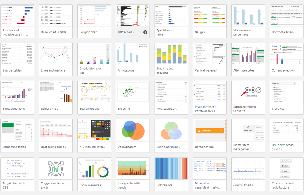
Bars and sparklines in the straight table
Pad with Unicode white breaks, add a center line and use the absolute max as denominator. Showing two version, plain bars and circles, filled or empty. Sparklines are covered in the first set of tips.
Vertical filter pane with values

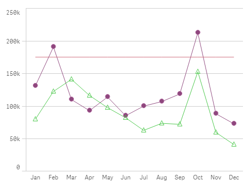
Different markers per line

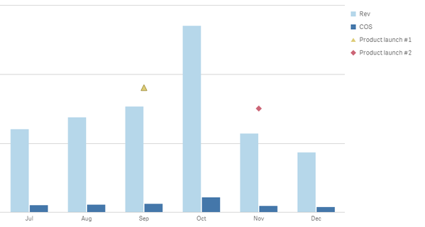
Chart with annotations
Use the combo chart and custom marker layers on a secondary axis. Add a custom expression for the marker and the label. Tweak the axis and the expression to get the markers on the right place.
Best-selling combinations
Create a copy of the combination field in the load script, in this case, ProductNames. Add to a pivot table, use count(OrderID) as measure, mask duplicates values with white text color. Credit: Swuehl, link to post.
Venn diagram

Line chart with colored bands
Can be made with the line chart in area mode with measures for the bands. Create a line chart, set to area mode, unstacked. Add master measures for the bands with the wanted color. Add master measure for actual. Add measures to chart, starting with actual and the bands in progressive order. Add reference lines for the bands with label and color.
Vertical band chart
Create bar chart, Add measure =1 label =' '. Color by the wanted measure, add label. Switch of axis, labels and value. Set number of bars to "Max". Set bar width to max in "Styling". Add legend at the bottom. Switch of legend title.
Download the app
Full instructions and working examples can be found in the app below. Some of the tips are very easy to implement while others require a little more work. Most of them are independent of the Qlik Sense version but I recommend using the latest version.
To download the app, visit the Community post, 41 tips.
If you missed my previous postings, check out the previous apps I’ve shared on our community:
- Sense Visualization tips 2019, 28 tips Qonnections.
If you interested in visualizations, you should also check out Qlik GeoAnalytics, our highly capable add-on for geographic analysis. I've published two posts with advanced tips for Qlik GeoAnalytics:
- Qlik GeoAnalytics tips 2019, 22 tips Qonnections.
- Qlik GeoAnalytics tips 2018, 19 tips Qonnections.
Thanks,
Patric Nordström
Product Manager, Qlik Sense Visualizations and Qlik GeoAnalytics
You must be a registered user to add a comment. If you've already registered, sign in. Otherwise, register and sign in.


