Unlock a world of possibilities! Login now and discover the exclusive benefits awaiting you.
- Qlik Community
- :
- Blogs
- :
- Technical
- :
- Design
- :
- Funnel Chart
- Subscribe to RSS Feed
- Mark as New
- Mark as Read
- Bookmark
- Subscribe
- Printer Friendly Page
- Report Inappropriate Content
With the release of Qlik Sense February 2019 comes the Visualization Bundle which includes seven popular visualization extensions. Today, I will blog about one of these extensions - the Funnel chart. As described in Qlik Sense Help, the Funnel chart can “show values across multiple stages in a process. They can represent anything that is decreasing in size. The funnel chart shows a process that starts at 100% and ends with a lower percentage. The decrease of each stage is noticeable and at what rate. Each chart segment represents the value of a specific item and can influence the size of other segments.”
Let’s take a closer look at the Funnel chart and how we can use this visualization in our apps. The Funnel chart requires one dimension and one measure. In the example Funnel charts below, I will use the Lead Status dimension and Number of Leads as the measure. This will allow me to illustrate the number of leads in each stage of the sales process. The Funnel chart can be presented in 4 different funnel modes:
- Area
- Height
- Width
- Ordering
Let’s review the differences between these funnel modes.
Area
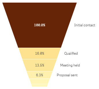
When using the Area funnel mode, the area of each item is proportionate to the measure. In this case, each stage is proportionate to the number of leads in that stage. I can visualize the percentage of leads in each stage noting how the value decreases as the leads move from one stage to another.
Height
Height funnel mode looks very similar to the Area funnel mode except when using height funnel mode, the height of each item is proportionate to the measure. In the example, the larger the number of leads in a stage, the taller the stage in the Funnel chart.
Width
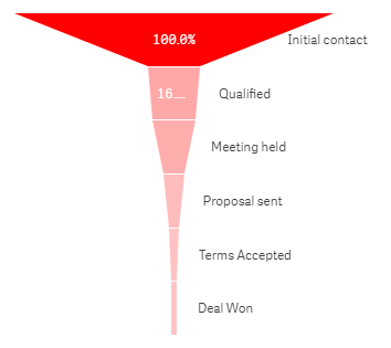
The Width funnel mode has a different look. When using the width funnel mode, the width of the upper edge is proportionate to the max value of the measure so in the example the Initial contact stage has a value of 100% therefore the width of that segment will be 100%. Note when using the width funnel mode, the top segment is always 100% and the following segments are relative in size to the first. The lowest segment will always appear as a rectangle as seen in the Deal Won stage.
Ordering
When using the ordering funnel mode, the shape of the funnel does not change only the order of the segments. The order is based on the value so in the example the stage with the largest number of leads will appear at the top and the stage with the lowest number of leads will appear at the bottom.
Giuseppe Panella put together this great video specific to the Funnel chart. Watch the Funnel Chart video for use case examples of when to use the Funnel chart and step-by-step instructions on how to create a Funnel chart.
The Funnel chart is one of many new features included in the Qlik Sense February 2019 release. Check out the many resources available to learn more about the Visualization Bundle and other features available in Qlik Sense February 2019:
- Demo - What’s New – Qlik Sense February 2019
- Qlik Product Innovation Blog - New on the scene – Qlik Sense February 2019!
Thanks,
Jennell
You must be a registered user to add a comment. If you've already registered, sign in. Otherwise, register and sign in.


