Unlock a world of possibilities! Login now and discover the exclusive benefits awaiting you.
- Qlik Community
- :
- Discover
- :
- Blogs
- :
- Product
- :
- Design
- :
- How to create a Butterfly (Tornado) Chart in Qlik ...
- Subscribe to RSS Feed
- Mark as New
- Mark as Read
- Bookmark
- Subscribe
- Printer Friendly Page
- Report Inappropriate Content
My previous post versed about what I think it is a very interesting use case of Set analysis element function P() to create dynamic sets and how to operate with those sets to solve really complex analysis scenarios in an easy and elegant way.
In the comments section of that post, I got a couple of questions regarding one of the charts we used in our web app, the so-called Tornado Chart. This post goes to answer that question by showing how to create a Tornado/Butterfly Chart.
Step by step guide:
Note: For the following example I got a sample data containing Population by Age data from the US census. It has 3 columns, Age Range, Male population and Female population.
- Drag and drop a bar chart to your sheet.
- Add a dimension. I’ll add Age Range to mine.
- Add two expressions. I need one expression to display female’s population and a second one for males.
At this point, my chart looks like this: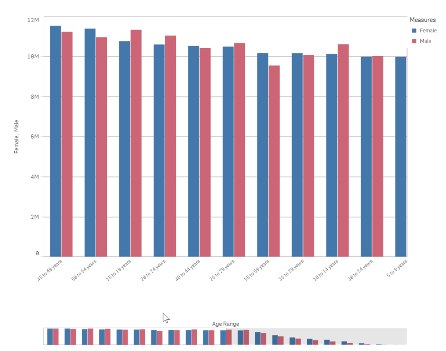
- Next, we will adjust the bar chart sorting and appearance.
Sort the chart according to your data. For this data set my best option is to sort Age Range using load order, to do so, move Age Range to the top and then uncheck all the sorting options to sort on load order.
In the Appearance section of the chart property panel, switch Presentation to Horizontal and Stacked and set Value labels to Auto.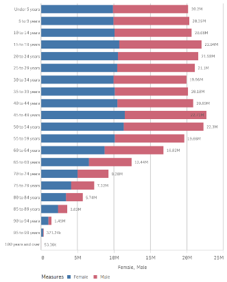
- Now we need to figure out how to “move the y axis to the center of the chart". To do so I’ll transform the data to make Female population negative by changing my expression to: Sum(FemalePopulation)*-1
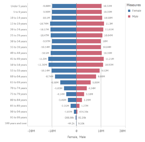
- My chart looks almost right but there’s still a detail that doesn't fits well in the picture above. Note that the value labels for Female Population are displayed as negative numbers. While technically correct, it doesn't work for this chart, I need it to be displayed as positive vales as well.
As a general note remember we can set up the format for positive and negative values for any expression. Format argument in the Num function can take 2 parameters, first one indicates how to format the number if it is >0 and the second piece if number <0.
=num(sum(x), 'postivenumberFormat;negativenumberFormat')
As I want negative and positive number to look exactly the same I could use the following format arguments:
num(sum(FemalePopulation)*-1,’#,##0;#,##0’)
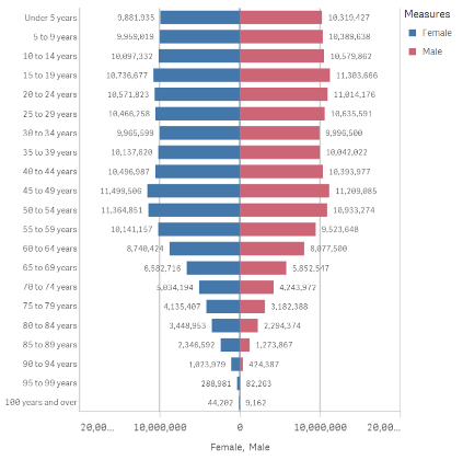
Note: Please be aware of some potential issues when exporting the chart as data since the resulting file could contain negative values.
Enjoy it.
You must be a registered user to add a comment. If you've already registered, sign in. Otherwise, register and sign in.