Unlock a world of possibilities! Login now and discover the exclusive benefits awaiting you.
- Qlik Community
- :
- Forums
- :
- Forums by Product
- :
- Products (A-Z)
- :
- Qlik Sense
- :
- Documents
- :
- Set Analysis - Part 2 - Cool Stuff You Can Do (vid...
- Move Document
- Delete Document
- Subscribe to RSS Feed
- Mark as New
- Mark as Read
- Bookmark
- Subscribe
- Printer Friendly Page
- Report Inappropriate Content
Set Analysis - Part 2 - Cool Stuff You Can Do (video)
- Move Document
- Delete Document and Replies
- Mark as New
- Bookmark
- Subscribe
- Mute
- Subscribe to RSS Feed
- Permalink
- Report Inappropriate Content
Set Analysis - Part 2 - Cool Stuff You Can Do (video)
May 13, 2022 5:58:28 PM
Mar 25, 2015 3:29:11 PM
Set analysis offers a way of defining a set (or group) of data values that is different from the normal set defined by the current selections. Watch this video to learn more about the cool stuff you can do with Set Analysis as well as to get a better understanding of its expression syntax and how it can be used.
Previous Video: A Beginners' Introduction to Set Analysis
NOTE: For a more complete and deeper dive of Set Analysis check out this excellent document: Set Analysis: syntaxes, examples
Sample App: (Qlik Sense is .qvf - QlikView is .qvw)
- See attached .qvf file for sample Qlik Sense application
- If using Qlik Sense Desktop:
- Copy .qvf file to C:\Users\<user profile>\Documents\Qlik\Sense\Apps
- Refresh Desktop Hub (F5)
- If using Qlik Sense Server
- Import .qvf using the QMC and then access from My Work Stream in hub
- For the .qvw - just opened with QlikView Desktop
Set Analysis Expressions:
Conditions (hard-coded lists,searches,wild card,comparison operators, not equal):
Sum({$<CategoryName={'Bath Clothes'}>}Sales)Sum({$<CategoryName={'Bath Clothes','Babywear'}>}Sales)

Sum({$<CategoryName={"*Clothes"}>}Sales)

Sum({$<CategoryName={"*Clothes",'Babywear'}>}Sales)

Sum({$<Year={'2013'}>}Sales)

Sum({$<Year={2013,2014}>}Sales)

Sum({$<Year={"<2014"}>}Sales)

Sum({$<Year-={2014}>}Sales)
Conditions using variables:
SET vDefaultCat = 'Bath Clothes';

Sum({$<CategoryName={$(vDefaultCat)}>}Sales)
$ Expansion - using functions to evaluate comparisons values:
Sum({$<Year={"$(=Year(Today()))"}>}Sales)Conditions with multiple dimensions:
Sum({$<CategoryName={'Babywear'},Year={2014}>}Sales)Conditions with measures:
Sum({<[Model Variation]={"=SUM(PartSales) >=1000"}>}PartSales)
- Move Comment
- Delete Comment
- Mark as Read
- Mark as New
- Bookmark
- Permalink
- Report Inappropriate Content
Thanks Michael for the video and the attached apps ![]()
- Move Comment
- Delete Comment
- Mark as Read
- Mark as New
- Bookmark
- Permalink
- Report Inappropriate Content
Hi Michael,
Very informative video!
i will try to be as specific as possible - how can I create a simple Line Chart as the following:
-imagine that i have a column ( column name: [initial insert date] ) of date values, format: dd/mm/yyyy
-the dimension would be: MonthName([initial insert date])
-the measure would be: count of [initial insert date] --> IF the value is from the last 6 months
in addition and for general knowledge, is there a work around possible not utilizing set analysis?
Thanks,
Tal
- Move Comment
- Delete Comment
- Mark as Read
- Mark as New
- Bookmark
- Permalink
- Report Inappropriate Content
Hi Michael,
is it planed to add a GUI for simple set analysis task to qlik sense in the future?
I am asking this question as set analysis skills can not be excpected from business users, and that is the main target group of qliksense. Especially for correlation analysis, where one KPI that is filterd by the current selection needs to be combined with another KPI that represents the whole set independently of the selection. This can be done with defining set analysis by writing formulas. It would be cool if that can also be done graphically with icons inside the exploration menu, so that business useres can define there needed data set easily. Best regards!
- Move Comment
- Delete Comment
- Mark as Read
- Mark as New
- Bookmark
- Permalink
- Report Inappropriate Content
Hi Paul,
That is a great question. I would LOVE to see something like this out-of-the-box and I will ask R&D. I know there are many things planned to improve this experience - but not exactly sure of those things until we got through planning sessions.
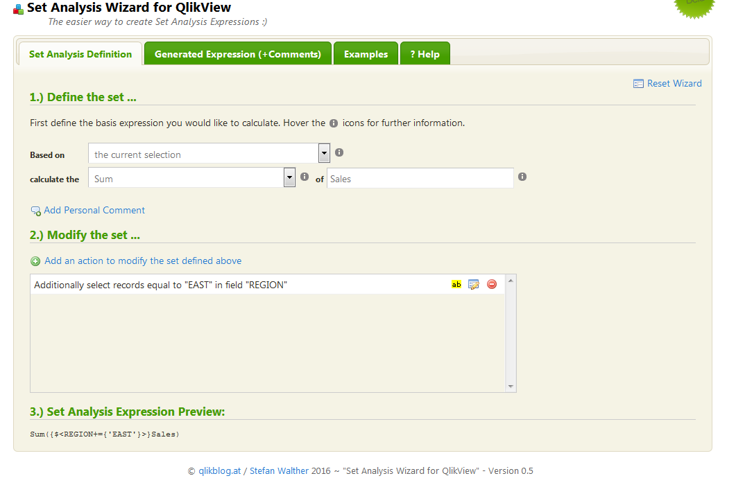
What I can offer you in the meantime, is a 3rd party Set Analysis expression builder that was developed by one of R&D stars. You can see it here:
Set Analysis Wizard for QlikView | qlikblog.at

It builds the expression for you.
Let me know what you think.
Regards,
Mike Tarallo
Qlik
- Move Comment
- Delete Comment
- Mark as Read
- Mark as New
- Bookmark
- Permalink
- Report Inappropriate Content
Still new to QlikView but with your videos I am learning fast. being a mathematician at heart, I like the logic behind set analysis and this was my favourite video so far.
Thanks
- Move Comment
- Delete Comment
- Mark as Read
- Mark as New
- Bookmark
- Permalink
- Report Inappropriate Content
Sweet! 🙂
- Move Comment
- Delete Comment
- Mark as Read
- Mark as New
- Bookmark
- Permalink
- Report Inappropriate Content
Outer Join Association, a different type of set analysis:
Consider a table called CONTRACTS and one called CANCELLATIONS. Is there a way for and end user to do the equivalent of an outer join of this data to ask questions like "What percentage of all the contracts have cancellations?" Can this be achieved by the data visualization and loading screen or does one have to write a script? Or is it the case that the association is not join specific and you write these conditions into your visualizations by virtue of the attributes you choose and the conditions you place on them?
- Move Comment
- Delete Comment
- Mark as Read
- Mark as New
- Bookmark
- Permalink
- Report Inappropriate Content
llafollette The outer join is automatic if the tables are linked by a like named field. I'll assume the two tables are linked by the common field "ContractID" and have a one-to-one relationship. A visualization can calculate the cancellation rate by counting a field from the CANCELLATIONS table divided by the count of a field in the CONTRACTS table. For example, the expression:
Count(CancellationDate) / Count(ContractDate)
assuming "CancellationDate" is in the CANCELLATIONS table and "ContractDate" is in the CONTRACTS table.
You can make this more formal by adding a counter field in each table LOAD statement:
CONTRACTS:
LOAD ...,
1 as ContractCounter,
...;
CANCELLATIONS:
LOAD ...
1 as CancellationCounter,
...;
then the chart expression would be:
Sum(CancellationCounter) / Sum(ContractCounter)
Again, the join is automatic. The Qlik Associative model is "Full outer join all the time".
- Move Comment
- Delete Comment
- Mark as Read
- Mark as New
- Bookmark
- Permalink
- Report Inappropriate Content
Hello Michael,
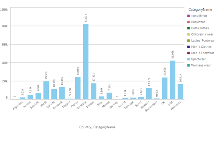
First, thanks for this explanatory video. I´ve managed to follow through but I have a small problem regarding the CategoryName leyend.
When filtering by a specific category, e.g. Year 2015 or Babywear, the data displayed is indeed the one specified, but the leyend displays all other categories. Why is this?

Many thanks in advance
Regards,
Deborah
- Move Comment
- Delete Comment
- Mark as Read
- Mark as New
- Bookmark
- Permalink
- Report Inappropriate Content
Is it possible to use this on a list of things that does not have aggregation? A report with a single column of product names?