Unlock a world of possibilities! Login now and discover the exclusive benefits awaiting you.
- Qlik Community
- :
- All Forums
- :
- QlikView App Dev
- :
- BAR CHART ISSUE
- Subscribe to RSS Feed
- Mark Topic as New
- Mark Topic as Read
- Float this Topic for Current User
- Bookmark
- Subscribe
- Mute
- Printer Friendly Page
- Mark as New
- Bookmark
- Subscribe
- Mute
- Subscribe to RSS Feed
- Permalink
- Report Inappropriate Content
BAR CHART ISSUE
Attached are the Dashboard, QVD and the issue image.
I have a Bar Chart with ValueList dimension and I am shoing 4 Quarters. Each Quarter is a bar.
Then for each Quarter I have an expected value which I wanna show as a Line above each Bar.
Right now I am showing the expected as circles but they are not working either .
Please see the attached image I would like to accomplish
Accepted Solutions
- Mark as New
- Bookmark
- Subscribe
- Mute
- Subscribe to RSS Feed
- Permalink
- Report Inappropriate Content
Look at the lower straight table. That's what your 'Q2 Expected' expression returns.
- Mark as New
- Bookmark
- Subscribe
- Mute
- Subscribe to RSS Feed
- Permalink
- Report Inappropriate Content
Please try to avoid posting multiple times the same request, which makes it hard to follow a discussion.
what about the solution shown in your other thread?
- Mark as New
- Bookmark
- Subscribe
- Mute
- Subscribe to RSS Feed
- Permalink
- Report Inappropriate Content
That solution didnt work, I attached the Dashboard , QVD and the Image. Can you please help me out with that
- Mark as New
- Bookmark
- Subscribe
- Mute
- Subscribe to RSS Feed
- Permalink
- Report Inappropriate Content
'Didn't work' is not very helpful.
There was an issue with the negative / positive signs of the error bars calculation, I've corrected that in attached sample.
- Mark as New
- Bookmark
- Subscribe
- Mute
- Subscribe to RSS Feed
- Permalink
- Report Inappropriate Content
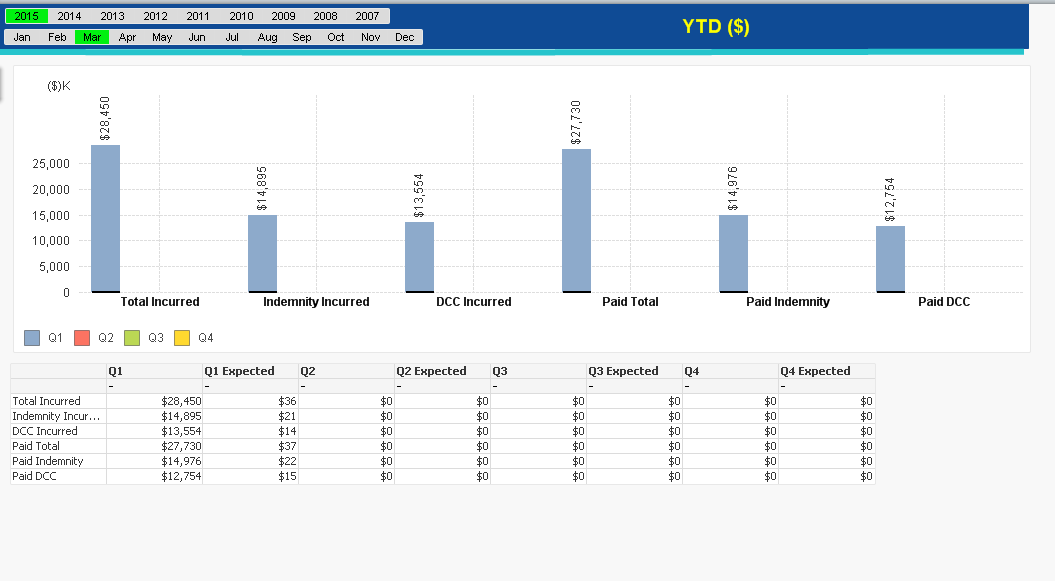
Thanx for the resolution. One last thing is when I select Oct or Nov its great but when I select months less then Oct, like Mar or April, Error Bars are messed up .
Any Suggestions
- Mark as New
- Bookmark
- Subscribe
- Mute
- Subscribe to RSS Feed
- Permalink
- Report Inappropriate Content
Seems like the error bars are messing up the automatic scaling when the error bar position is much lower than the bar height (like for the first few months).
I've added a custom max axis scale calculation to fix this, you might need to adapt this to your data as appropriate.
- Mark as New
- Bookmark
- Subscribe
- Mute
- Subscribe to RSS Feed
- Permalink
- Report Inappropriate Content
Still the same result and is there a way to see values of error bars as pop up?
- Mark as New
- Bookmark
- Subscribe
- Mute
- Subscribe to RSS Feed
- Permalink
- Report Inappropriate Content
Could you describe a bit more detailed what the issue is?
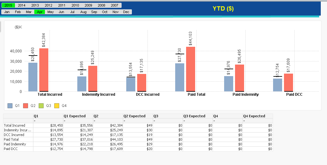
With the latest QVW, I see this for March / April:


Seems quite ok to me.
If you want to see the expected values, you can either use a straight table chart as in my sample, or create another expression with only 'text as pop up' display option enabled.
- Mark as New
- Bookmark
- Subscribe
- Mute
- Subscribe to RSS Feed
- Permalink
- Report Inappropriate Content
if u see that the orange bar has the line at the bottom why is that??
- Mark as New
- Bookmark
- Subscribe
- Mute
- Subscribe to RSS Feed
- Permalink
- Report Inappropriate Content
Look at the lower straight table. That's what your 'Q2 Expected' expression returns.