Unlock a world of possibilities! Login now and discover the exclusive benefits awaiting you.
- Qlik Community
- :
- All Forums
- :
- QlikView App Dev
- :
- Re: BUG IN LINE CHART WITH SYMBOLS DOTS
- Subscribe to RSS Feed
- Mark Topic as New
- Mark Topic as Read
- Float this Topic for Current User
- Bookmark
- Subscribe
- Mute
- Printer Friendly Page
- Mark as New
- Bookmark
- Subscribe
- Mute
- Subscribe to RSS Feed
- Permalink
- Report Inappropriate Content
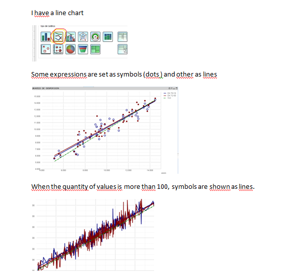
BUG IN LINE CHART WITH SYMBOLS DOTS

- Mark as New
- Bookmark
- Subscribe
- Mute
- Subscribe to RSS Feed
- Permalink
- Report Inappropriate Content
Can you share your app? Would like to look into it why it is doing?
- Mark as New
- Bookmark
- Subscribe
- Mute
- Subscribe to RSS Feed
- Permalink
- Report Inappropriate Content
hi here is the qlikview
this example has few values (see script editor, load inline)
but when i have more than 100 values, it shows lines instad of circle symbols
- Mark as New
- Bookmark
- Subscribe
- Mute
- Subscribe to RSS Feed
- Permalink
- Report Inappropriate Content
this example has few values (see script editor, load inline)
but when i have more than 100 values, it shows lines instad of circle symbols
- Mark as New
- Bookmark
- Subscribe
- Mute
- Subscribe to RSS Feed
- Permalink
- Report Inappropriate Content
Not sure why. Can you send me your actual App with more than 100 values if possible?
- Mark as New
- Bookmark
- Subscribe
- Mute
- Subscribe to RSS Feed
- Permalink
- Report Inappropriate Content
Yes sure, here i send you another qvw which reads from an excel. i also attach excel.
- Mark as New
- Bookmark
- Subscribe
- Mute
- Subscribe to RSS Feed
- Permalink
- Report Inappropriate Content
Yeah I am not sure, I tried selecting the field prom and i could select only 202 rows of that field, after any selection, it is displaying the line, I thought it is due to the value and dots getting overlapped and looking like a line, but its not. May be some one else might help. I am not pretty familiar with LINEST_M and other functions used in there.
- Mark as New
- Bookmark
- Subscribe
- Mute
- Subscribe to RSS Feed
- Permalink
- Report Inappropriate Content
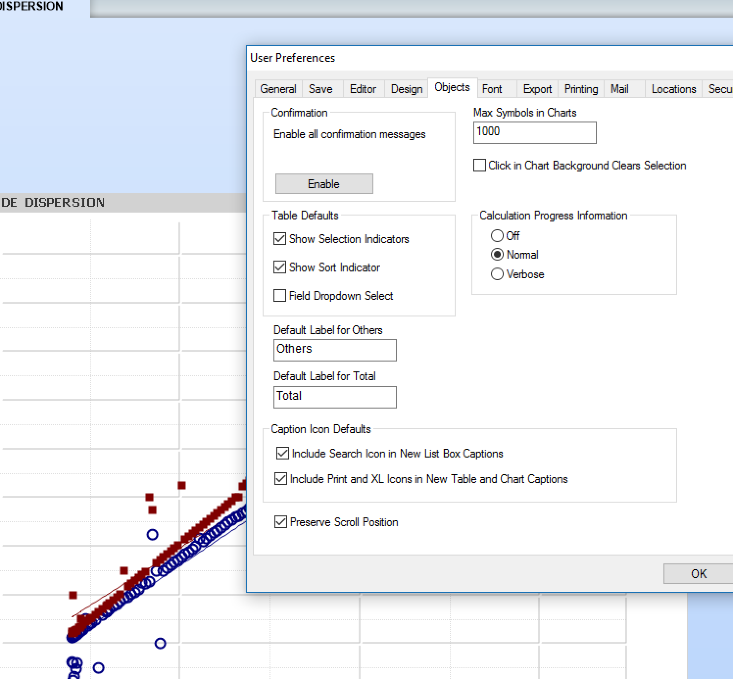
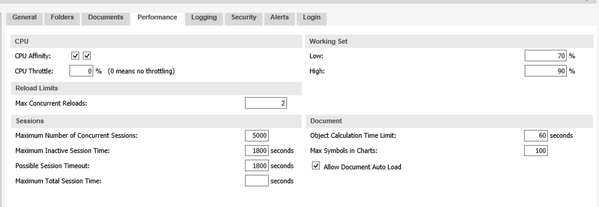
It is a QlikView feature that you can adjust in Desktop and also in the server, that is the number of dots you want to show in a chart by default. The reason behind is that the more dots, the more hardware resources you use, so you can limit this, by default to 100. Increase this value and you will see the dots normally (see attached1 your app just open in my Desktop).
Also, so many dots in a very small space may be more confusing that helping, so converting to a line is not that bad idea.
For server settings check attachment 2, below.
Attachment 1:

Attachment 2:

- Mark as New
- Bookmark
- Subscribe
- Mute
- Subscribe to RSS Feed
- Permalink
- Report Inappropriate Content
Thanks Miguel, was very long time i have seen this User Preferences max symbols. Thanks for your response.
- Mark as New
- Bookmark
- Subscribe
- Mute
- Subscribe to RSS Feed
- Permalink
- Report Inappropriate Content
the solution helped me! thanks!